The One Button Mystique
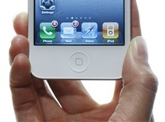
I enjoy my iPhone, but I can’t quite come to terms with one aspect of its design: Apple’s insistence that there can be only ever be one, and only one, button on the front of the device.
I also own a completely buttonless Kindle Fire, and you’ll get no argument from me that there should be at least one obvious “Jesus Handle” button on the front of any gadget. I do wonder why Amazon decided to make the Fire buttonless, when every other Kindle they ship has a home button. Amazon has a track record of making some awfully rough version 1.0 devices; I’m sure they’ll add a home button in a version or two. And, hey, at only $199 I’m willing to cut them a little slack. For now.
Even Apple is no stranger to buttonless devices. Consider the oddly buttonless third generation iPod Shuffle, where you had to double and even triple click the controls on the headphones to do basic things like advance tracks. Oh, and by the way, this also made every set of headphones you own obsolete, at least for use with this model. The fourth gen shuffle rapidly switched back to physical controls on the device, and the fifth gen went to touch controls on the device, as expected.

Microsoft is just as guilty. I sometimes struggle with the otherwise awesome Xbox 360 Wireless Microphone. It has only a power button and some lights.
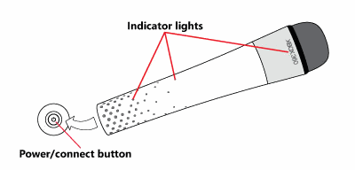
In its defense, for the most part it does just work when you pick it up and start singing (badly, in my case), but I admit to being slightly perplexed every time I have to sync it with an Xbox, or figure out what’s going on with it. Can you blame me?
When you turn on the microphone, the built-in lights shine to display the microphone status as follows:
- Power on: lights flash green one time every second
- Connecting: lights flash green four times every second
- Connection complete: lights flash blue, and then stops
When your battery power is low, the built-in lights shine to display the battery charge status as follows:
- Low: Lights flash amber one time every three seconds
- Critical: Lights flash amber one time every second
When your microphone moves out of the wireless range of your console, the lights flash green one time every second. The lights can also change color together with supported game titles.
If we can agree that no buttons is clearly a bad idea, I think it follows that one button is problematic in its own way. I have the same issue with the single button on the iPhone that I do with the single button mouse – it may be OK-ish at the very beginning, but over time it leads to absurd, almost comical overloading of functionality. Consider how many different things the single button on the face of an iPhone now controls:

(diagram courtesy Andrew Durdin, source)
The iPhone home button? Why, it’s easy! You have your choice of…
- single-click
- double-click
- triple-click
- click and hold
- click and pause and click again
All of which have different meanings at different times, of course. In particular I spend a lot of time double-clicking to get to the active apps list, and I often mis-tap which kicks me over to the home screen. I have so many apps installed on my iPhone that search is the only rational way to navigate. This means I search a lot, which requires clicking once to get to the default home page, pausing, then clicking again. Sometimes I click too long, which is then detected as click-and-hold, and I get the voice search app which I am… er, not a fan of, to put it mildly.
I’ve gotten to the point where I dread using the home button on my iPhone because it Makes Me Think. And I get it wrong a significant percentage of the time. This isn’t the way it’s supposed to be.
You might be expecting me to turn into a rabid Windows Phone or Android fanboy about now and snarkily note how they get it right. I’m not sure they do. Either of them. They all manage to suck in their own special way.

When there’s one button on the device, at least it’s clear what that button is supposed to do, right? Well, sometimes.
There is one theme I agree with here – the clearly marked back button on both Android and Windows phones, just like a web browser. I mostly use my iPhone as a platform for the Internet, and the simplicity of the Internet is its primary strength: a collection of obvious things to click, and an easy, giant honking back button so you never get lost in its maze of twisty passages, all alike. It is true that browsers have a home button, but the latest versions of Chrome, Firefox, and Internet Explorer have all but pushed that home button off the UI in favor of the ginormous back button. While I’ll tentatively agree that not all phone apps have to behave like the Internet, the Internet is becoming more and more of a platform for bona fide applications every day. The back button is a UI paradigm that works like gangbusters for webapps, and I’d argue strongly in favor of that being a hard button on a device.
But once you add three buttons, thinking starts to creep in again. Am I pressing the correct button? That’s never good. And I don’t even know what that third button is supposed to be on the Android phone! I could possibly be in favor of the hard search button on the Windows phone, I suppose, but I’d rather see good, consistent use of two buttons on the face of a device before willy-nilly adding Yet Another Button. I think there’s a reason the industry has more or less standardized on a two-button mouse, for example. (Yes, there is that pesky middle button, but it’s a nice to have, not an essential part of the experience.)
What about the one finger solution? Even with touch devices, one finger does not seem to be enough; there’s a curious overloading of the experience over time.
On the iPad, there are a number of system-wide gestures, such as swiping left or right with four fingers to switch between apps. Four-finger swipes? That’s convoluted, but imagine a virtual mixing console with horizontal sliders. Quickly move four of them at once... and you switch apps. Application designers have to work around these, making sure that legitimate input methods don’t mimic the system-level gestures.
The worst offender is this: swipe down from the top of the screen to reveal the Notification Center (a window containing calendar appointments, the weather, etc.). A single-finger vertical motion is hardly unusual, and many apps expect such input. The games Flight Control and Fruit Ninja are two prime examples. Unintentionally pulling down the Notification Center during normal gameplay is common. A centered vertical swipe is natural in any paint program, too. Do app designers need build around allowing such controls? Apparently, yes.
Yes, our old friend overloading is now on the touch scene in spades: for all but the simplest use of a tablet, you will inevitably find yourself double-tapping, tapping and holding, swiping with two fingers, and so on.
Apple’s done a great job of embodying simplicity and clean design, but I often think they go too far, particularly at the beginning. For example, the first Mac didn’t even have cursor keys. Everything’s a design call, and somewhat subjective, but like Goldilocks, I’m going to maintain that the secret sauce here is not to get the porridge too cold (no buttons) or too hot (3 or more buttons), but just right. I’d certainly be a happier iPhone user if I didn’t have to think so much about what’s going to happen when I press my home button for the hundredth time in a day.


