The Non-Maximizing Maximize Button
One of my great frustrations with the Mac is the way the maximize button on each window fails to maximize the window. In a comment, Alex Chamberlain explained why this isn’t broken, it’s by design:
This is a textbook example of how Microsoft’s programmers got the original Mac GUI wrong when they copied it for Win 3.1, and never bothered to fix it: there’s no zoom button on Mac OS windows because it’s unnecessary. What you’re mistaking for a “maximize” button is actually a “snap window to size of contents” button. Far more useful and elegant. Once again, Microsoft has no taste and no clue when it comes to the GUI. All that money and Gates has never been able to hire a decent human factors person.
In other words, pressing the maximize button shouldn’t maximize the window to the size of your monitor...
... according to Apple, pressing the maximize button should maximize the window to the size of the content.
This is oddly reminiscent of the recent font smoothing debate, where Apple sided with the designers, and Microsoft sided with the realities of current hardware. Neither approach is wrong, per se; it depends what you want to emphasize and which tradeoff you think is more important.
I think the maximization problem is even more ambiguous than font rendering. With font rendering, the answers are based on objective mathematics: at low DPI you should favor the pixel grid and thus the user; at higher DPI you have enough pixels to favor the designer and render the font more accurately. And it’s not an either-or distinction; the operating system could choose the font rendering strategy opportunistically depending on the capabilities of the display.
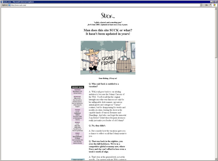
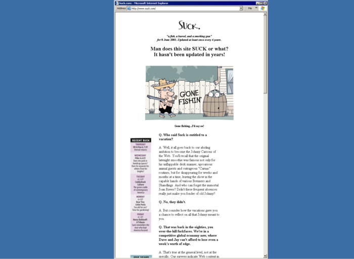
Unfortunately, there is no optimal window maximizing strategy. As you can see in the above screenshot, we end up with a vast expanse of unwanted whitespace when suck.com is maximized to a 1600x1200 monitor. Excessively long lines are hard to read, which is why most newspapers are formatted into columns. It’s also why websites with any design chops at all never let text extend the full width of the browser.

I agree in principle that windows shouldn’t be larger than their maximum usable size. But I also think windows with a fixed layout shouldn’t be resizable in the first place. This is the subject of an entire sidebar in Neilsen’s latest book, Prioritizing Web Usability.
While the Maximize button tempts many users, they are often poorly served by it. For example, a 1024-pixel-wide window will result in overly long lines for text-heavy applications such as web browsing. The preponderance of maximized windows also makes it difficult for users to understand the multiwindow nature of modern GUIs. In theory people are supposed to work with overlapping windows but in practice they can’t when windows take up the entire screen. Maximized windows deceive people into thinking of the computer as a full-screen environment rather than one with multiple, simultaneously active areas.
Fortunately, maximized windows will gradually vanish as people get bigger monitors. With a 2048-pixel-wide screen, a maximized window is so grotesquely oversized that most users will resize it and work with two or more windows at a time. Tiled windows may also enjoy a renaissance with huge screens, making it easy to deal with two to four windows simultaneously.
Here’s where I think this argument starts to break down in a big way. Dealing with multiple windows is far too difficult, even for sophisticated computer users. Adding Z-order in addition to the traditional X and Y positioning is one variable too many. I don’t think it’s a coincidence that single window interfaces, such as the web browser, or Tivo, dominate the market. Microsoft killed off the multiple document interface in Office – a form of per-application windowing – years ago. Can you name one application with a multiple window interface that’s even popular?
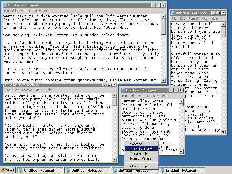
Manipulating windows is pure excise – extra work that stands between the user and completing their task. The more windows you have to deal with, the less work you get done, and the more time you spend sizing them, moving them, bringing them to the top, and dragging them around so they aren’t overlapping. That’s one reason I’m such a fan of double and triple monitor setups; more desktop space equals fewer overlapping windows, and less time spent futzing around with window layout.
That’s my problem with Apple’s non-maximizing maximize button. Allowing users to maximize any window to a monitor has its problems, to be sure. But Apple’s method of forcing users to deal with more windows by preventing maximization is not good user interface design. It is fundamentally and deeply flawed. Users don’t want to deal with the mental overhead of juggling multiple windows, and I can’t blame them: neither do I. Designers should be coming up with alternative user interfaces that minimize windowing, instead of forcing enforcing arbitrary window size limits on the user for their own good.