What You Can’t See You Can’t Get
I suppose What You See Is What You Get has its place, but as an OCD addled programmer, I have a problem with WYSIWYG as a one size fits all solution. Whether it’s invisible white space, or invisible formatting tags, it’s been my experience that forcing people to work with invisible things they cannot directly control… inevitably backfires. A lot.
I have a distinctly Ghostbusters attitude to this problem.

I need to see these invisible things, so that I can zap them with my proton pack. I mean, er, control them. And more importantly, understand them; perhaps even master them.
I recently had the great privilege of meeting Ted Nelson, who gave me an in-person demo of his ZigZag project and his perpetually in-progress since 1960 Xanadu project, currently known as Xanadu Space. But one thing he mentioned as he gave the demo particularly intrigued me. Being Ted Nelson, of course he went much further than my natural aversion to invisible, hidden markup in content – he insisted that markup and content should never be in the same document. Far more radical.
I want to discuss what I consider one of the worst mistakes of the current software world, embedded markup; which is, regrettably, the heart of such current standards as SGML and HTML. (There are many other embedded markup systems; an interesting one is RTF. But I will concentrate on the SGML-HTML theology because of its claims and fervor.)
There is no one reason this approach is wrong; I believe it is wrong in almost every respect.
I propose a three-layer model:
- A content layer to facilitate editing, content linking, and transclusion management.
- A structure layer, declarable separately. Users should be able to specify entities, connections and co-presence logic, defined independently of appearance or size or contents; as well as overlay correspondence, links, transclusions, and “hoses” for movable content.
- A special-effects-and-primping layer should allow the declaration of ever-so-many fonts, format blocks, fanfares, and whizbangs, and their assignment to what’s in the content and structure layers.
It’s an interesting, albeit extremely hand-wavy and complex, alternative. I’m unclear how you would keep the structure layer in sync with the content layer if someone is editing the content. I don’t even know if there are any real world examples of this three layer approach in action. (And as usual, feel free to correct me in the comments if I’ve missed anything!)
Instead, what we do have are existing, traditional methods of intermixing content and markup ala HTML or TeX.
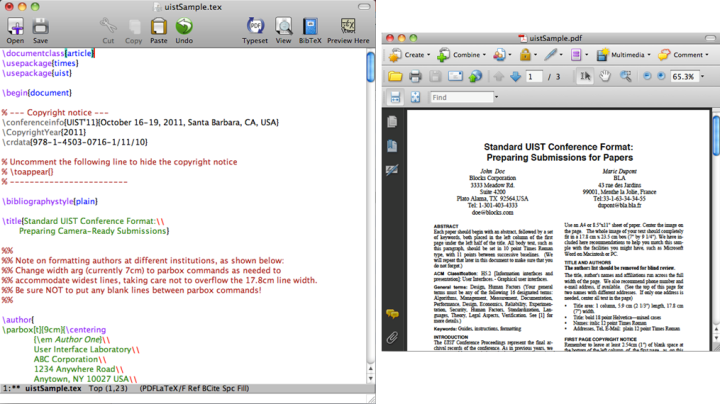
When editing, there are two possible interfaces:
- WYSIWYG where the markup layer is magically hidden so, at least in theory, the user doesn’t ever have to know about markup and can focus entirely on the content. It is an illusion, but it is simple enough when it’s working. The downside is that the abstraction – this idea that the markup is truly “invisible” – is rarely achieved in practice and often breaks down for anything except the most basic of documents. But it can be good enough in a lot of circumstances.
- Two windows where the markup is fully visible in one window, and shown as a live rendered preview in the other window, updated as you type, either side-by-side or top-and-bottom. Users have a dynamic sandbox where they can experiment and learn how markup and content interact in the real world, rather than having it all swept under the rug. Ultimately, this results in less confusion for intermediate and advanced users. That’s why I’m particularly fond of this approach, and it is what we use on Stack Exchange. The downside is that it’s a bit more complex, depending on whether or not you use humane markup, and it certainly takes a bit more screen space and thinking to process what’s going on.
What I didn’t realize is that there’s actually a third editing option: keep the markup visible, and switch rapidly back and forth between the markup and rendered view with a single keystroke. That’s what the Gliimpse project reveals:
Please watch the video. The nearly instantaneous and smooth transition that Gliimpse demonstrates between markup and preview has to be seen to be appreciated. The effect is a bit like Expose on the Mac, or Switcher on PC. I’m not sure how I feel about this, mainly because I don't know of any existing IDEs that even attempt to do anything remotely like it.
But I’d sure like to try it. As a software developer, it’s incredibly frustrating to me that we have generational improvements in games like Skyrim and Battlefield 3 that render vastly detailed, dynamic worlds at 60 frames per second, yet our source code editors are advancing only in tiny incremental steps, year after year.


