Typography: Where Engineers and Designers Meet
Over the Christmas break, my wife and I visited New York City for the first time. One of the many highlights of our trip was the Museum of Modern Art, which is running a year-long special exhibit, 50 Years of Helvetica. It’s a tiny exhibit tucked away in a corner of MoMA. Blink and you’ll miss it amongst all the other wonderful art. But even a small exhibit provides ample physical evidence that Helvetica – a humble font, nothing more than a collection of mathematical curves shaped into letterforms – had a huge impact on the world.
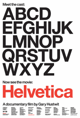
Helvetica is so highly regarded in the design world there’s a full length documentary on the topic: Helvetica the Movie.
Another little-known fact about Helvetica is the relationship between this timeless classic and another font you’ve almost certainly encountered before: Arial. John Gruber explains:
Helvetica is perhaps the most popular typeface in the world, and is widely acclaimed as one of the best. Arial is a tawdry, inferior knock-off of Helvetica, but which, to the detriment of the world, Microsoft chose to license for Windows simply because it was cheaper. Because Arial is a default Windows font and Helvetica is not, it is ubiquitous. Mark Simonson’s “The Scourge of Arial” is an excellent resource on both Arial’s history and its typographic deficiencies; his accompanying sidebar is an excellent primer on the specific differences between Arial and Helvetica.
You do have to be something of a font geek to appreciate the subtle differences between Helvetica and Arial, much less Helvetica and its precursor, Grotesk. But the discussion leads directly to another hugely important twenty-first century problem: how do you copyright the completely abstract, pure intellectual property that is a font?
All computer geeks tend to fall in love with typography at some point in their careers. Donald Knuth is a fine example; frustrated with the limited typesetting options available for his books in the late 70s, Knuth went on a “brief hiatus” to come up with something better. Seven years later, he unleashed TeX upon the world.
In 1977, Knuth halted research on his books for what he expected to be a one-year hiatus. Instead, it took 10. Accompanied by Jill, Knuth took design classes from Stanford art professor Matthew Kahn. Knuth, trying to train his programmer’s brain to think like an artist’s, wanted to create a program that would understand why each stroke in a typeface would be pleasing to the eye. “I wanted to try to capture the intelligence of the design, not just the outcome of the design,” he says. For example, how do you insert line breaks into a paragraph so there isn’t too much space between words and so that most of the lines don’t end in hyphens? Although this seems like an aesthetic challenge to be solved by human taste, Knuth says, computers do it well. “This is a combinatorial problem,” he explains. “There might be a thousand ways to break a paragraph into lines and each way has a score.” His solution was to build a computer program capable of ranking the thousand options and picking the best one.
Typography and fonts are a rare and vital intersection point between software engineers and designers. And there’s absolutely no better book on the topic than Thinking with Type: A Critical Guide for Designers, Writers, Editors, & Students. I recommend it without hesitation to all of the above, and certainly to software engineers with even the slightest passing interest in typography.
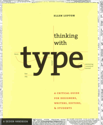
Like all great books, it teaches you “why,” not “how”:
This is not a book about fonts. It is a book about how to use them. Typefaces are an essential resource employed by graphic designers, just as glass, stone, steel, and countless other materials are employed by architects. Graphic designers sometimes create their own fonts and custom lettering. More commonly, however, they tap the vast library of existing typefaces, choosing and combining them in response to a particular audience or situation. To do this with wit and wisdom requires knowledge of how – and why – letterforms have evolved.
I think I can trace my initial interest in fonts way, way back to the pirate crack credit screens on Apple // software I encountered as a wayward teenager.
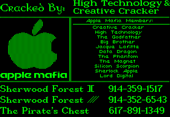
I count four fonts on this crack screen. There were countless disk sets of these low-resolution bitmap fonts to choose from. Even back in the mid-80s, these primitive fonts added a particular style, a feeling, an intonation to the text – and we only had a dismal little 280 x 192 screen to work with. How wonderfully liberating it must feel to have thousands of RGB anti-aliased pixels to render beautiful fonts with today, much less the millions we’ll eventually have.