The Two Types of Browser Zoom
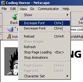
From the dawn of the web – at least since Netscape Navigator 4.x – it has been possible to resize the text on a web page. This is typically done through the View menu.

This was fine in the early, primitive days of the web, when page layouts were simple and unsophisticated. Want the font to be three times larger? No problem! Pump it up until your eyes bleed; you’re unlikely to break the design, because there’s precious little design at all.

But this was a time long before the web had become a platform for full-blown applications, with complex, dense, almost GUI-like designs.
The accepted web design guidance is that you should generally produce web page layouts that work at:
- the default font size (obviously)
- one size below the default font size
- one size above the default font size
I agree, and you should be testing for this on your own websites. The handy keyboard equivalents in most browsers are:
Ctrl + 0 Reset font size to default
Ctrl + + Make font one size larger
Ctrl + - Make font one size smaller
(yes, holding down the Ctrl key and then scrolling your mouse scroll wheel works, too, but no real programmer would use that.)
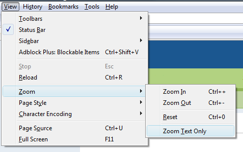
It is important to let the user control their browsing experience. But I think that the traditional method of font-only browser sizing is a solution whose time has come and gone. There’s a better way. Opera was the first browser to introduce full page zoom as an alternative to traditional font sizing, but Firefox 3 is where most people actually experience it. In fact, in Firefox 3, it’s the default page sizing mode.

Note that “Zoom Text Only” is unchecked. And for good reason. Compare for yourself. Here’s the Digg homepage using old-school Netscape 4.x style font scaling.
Browser Font Scaling: Default

Browser Font Scaling: Size +1

Browser Font Scaling: Size +2

Digg follows the design rule of thumb I suggested above: it scales to font size +1, but beyond that, all bets are off. With the fonts at +2, the top menu is scrunched, the search box clipped, and the digg numbers are spilling out over the boxes. The “most recent” navigation element has completely disappeared! Now compare this with the newer method of full page zooming:
Browser Full Page Zoom Scaling: Default

Browser Full Page Zoom Scaling: Size +1

Browser Full Page Zoom Scaling: Size +2

While the page does get wider, the full page zoom method has tremendous advantages:
- Full page zoom works on almost every web page in the world, with no changes whatsoever by the web designers
- Full page zoom scales far, far beyond the +1/-1 sizes that you can reasonably expect from traditional browser font sizing approaches.
To prove that full page zoom scales like nobody’s business, here’s a screenshot I captured of the Digg homepage scaled to fit the entire width of my 1920 x 1080 monitor. In comparison, increasing the fonts beyond +2 results in a jumbled, unreadable mess.
Honestly, I can’t see much use for traditional browser font sizing. It’s increasingly fragile on today’s web. I wish more browsers would take the lead from Firefox 3, and adopt full page zoom as the new default page sizing method.


