The Sugar UI
I’ve largely been ignoring Nicholas Negroponte’s One Laptop Per Child initiative. I appreciate the nobility of the gesture, but how interesting can sub-$100 hardware running Linux really be? Well, that was before I read about the novel user interface they’re building into those small green and white laptops.
For most of these children the XO machine, as it’s called, likely will be the first computer they’ve ever used. Because the students have no expectations for what PCs should be like, the laptop’s creators started from scratch in designing a user interface they figured would be intuitive for children.
The result is as unusual as – but possibly even riskier than – other much-debated aspects of the machine, such as its economics and distinctive hand-pulled mechanism for charging its battery. (XO has been known as the $100 laptop because of the ultra-low cost its creators eventually hope to achieve through mass production.)
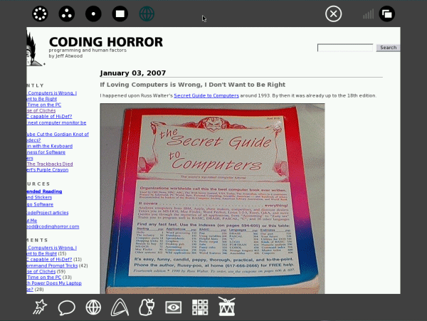
For example, students who turn on the small green-and-white computers will be greeted by a basic home screen with a stick-figure icon at the center, surrounded by a white ring. The entire desktop has a black frame with more icons.
This runic setup signifies the student at the middle. The ring contains programs the student is running, which can be launched by clicking the appropriate icon in the black frame.
When the student opts to view the entire “neighborhood” – the XO’s preferred term instead of “desktop” – other stick figures in different colors might appear on the screen. Those indicate schoolmates who are nearby, as detected by the computers’ built-in wireless networking capability.
Moving the PC’s cursor over the classmates’ icons will pull up their names or photos. With further clicks the students can chat with each other or collaborate on things – an art project, say, or a music program on the computer, which has built-in speakers.
I’m interested now.
I’ve been disappointed in the lack of GUI innovation over the last decade. Sure, Microsoft and Apple take small jabs at each other every couple of years. And the Linux community apes both companies, occasionally throwing in a curveball of their own. But when was the last time anyone tried a radically different UI on the desktop? The Sugar UI featured in the OLPC appears to finally break from the well worn conventions of Windows and MacOS.
I wanted to try it out myself. I downloaded the emulated OLPC laptop image and ran it under QEMU. The documentation even warns you to prepare yourself for this alien UI experience.
Before you launch the emulated image, we strongly recommend reading through the Sugar Instructions on how to use the environment – this does not look like the Windows or Mac operating systems!
They weren’t kidding. It’s nothing like any traditional GUI.

I was inclined to like Sugar almost immediately because it embodies a number of experimental GUI concepts I’ve talked about before:
- The frame menu makes perfect use of the infinite width at the edges of the screen.
- It abandons files and folders as an organizing concept.
- The start page, a ring of running tasks around a student, is a type of pie menu, which is a no-frills version of mouse gestures.
- The seamless integration of collaboration and sharing – with or without the internet – is very Web 2.0.
Sugar UI development appears to lag quite a bit behind the challenging, sub-$100 design goal of the OLPC hardware itself. This doesn’t surprise me, because developing UI is hard. And developing a radically different UI has to be especially difficult. Innovation and experimentation is much riskier than following the roadmaps from Redmond and Cupertino. That’s why, despite the rough edges, I’m excited about Sugar.
The Sugar instructions offer an excellent basic overview of the UI, with many more screenshots. If you’re a designer, check out the Sugar UI design guide. There’s also a video walkthrough of the Sugar UI available.
I have to admit that I didn’t find the Sugar UI particularly intuitive or discoverable, even after using it for 10 minutes and learning the basics. But I’m not a child. Maybe something unusual is necessary to get kids’ creative juices flowing. Mr. Negroponte has strong feelings on this topic:
In fact, one of the saddest but most common conditions in elementary school computer labs (when they exist in the developing world), is the children are being trained to use Word, Excel and PowerPoint. I consider that criminal, because children should be making things, communicating, exploring, sharing, not running office automation tools.
He’s got a point. I don’t know many kids that want to grow up to be “Information Workers.”


