Coding Horror

programming and human factors

Low-Fi Usability Testing

Pop quiz, hotshot. How do you know if your application works? Sure, maybe your app compiles. Maybe it passes all the unit tests. Maybe it ran the QA gauntlet successfully. Maybe it was successfully deployed to the production server, or packaged into an installer. Maybe your beta testers even signed off on it.

But that doesn't mean it works.

Can users actually understand your application? Can they get their work done in your application? That's what defines a working application. All the other stuff I listed is just noise. You don't know if your application truly works until you've performed usability tests on it with actual users.

And you regularly do usability testing on your application, right?

That's what I thought. One of the central concepts in Steve Krug's book Don't Make Me Think is that usability testing is essential to any software project. Krug calls his simplified approach to usability testing lost our lease, going-out-of-business-sale usability testing:

Usability testing has been around for a long time, and the basic idea is pretty simple: If you want to know whether your software or your Web site or your VCR remote control is easy enough to use, watch some people while they try to use it and note where they run into trouble. Then fix it, and test it again.

In the beginning, though, usability testing was a very expensive proposition. You had to have a usability lab with an observation room behind a one-way mirror, and at least two video cameras so you could record the users' reactions and the thing they were using. You had to recruit a lot of people so you could get results that were statistically significant. It was Science. It cost $20,000 to $50,000 a shot. It didn't happen very often.

But in 1989 Jakob Nielsen wrote a paper titled "Usability Engineering at a Discount" and pointed out that it didn't have to be that way. You didn't need a usability lab, and you could achieve the same results with a lot fewer users. The idea of discount usability testing was a huge step forward. The only problem is that a decade later most people still perceive testing as a big deal, hiring someone to conduct a test still costs $5,000 to $15,000, and as a result it doesn't happen nearly often enough.

What I'm going to commend to you in this chapter is something even more drastic: Lost our lease, going-out-of-business-sale usability testing. I'm going to try to explain how to do your own testing when you have no money and no time. If you can afford to hire a professional to do your testing, by all means do it -- but don't do it if it means you'll do less testing.

Krug points out that usability testing is only as difficult as you make it. It's possible to get useful results from a usability test with a single user, even:

[Usability] testing always works, and even the worst test with the wrong user will show you things you can do to improve your site. I make a point of always doing a live user test at my workshops so that people can see it's very easy to do and it always produces an abundance of valuable insights. I ask for a volunteer and have him try to perform a task on a site belonging to one of the other attendees. These tests last less than ten minutes, but the person whose site is being tested usually scribbles several pages of notes. And they always ask if they can have the recording of the test to show their team back home. Once person told me that after his team saw the recording, they made one change to their site which they later calculated had resulted in $100,000 in savings.

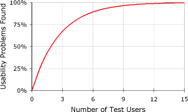
For more proof that you don't need a lot of users to have an effective usability test, Jakob Neilsen offers the following graph:
usability-problems-found-graph

Obviously, not doing any usability testing at all is a disaster. But what's not so obvious is that usability testing with just a few users is remarkably effective. And it can be relatively painless if you follow Krug's broad guidelines for low-fidelity usability testing:

  • When should I test? Ideally, once per month. You should be running small usability tests continuously throughout the development process. The tests should be short and simple, so you can conduct them almost any time with little advance planning.
  • How many users do I need? Three or four max.
  • What kind of users? Grab some people. Anyone who can use a computer will do. The best-kept secret of usability testing is that it doesn't much matter who you test. It's a good idea to get representative users, but it's much more important to test early and often. Don't be embarrassed to ask friends and neighbors.
  • How much time will it take? 45 minutes to an hour per user. Keep it simple. Keep it small. Although it does take extra time to conduct usability tests, even simple ones, ultimately you will save time. The results of the usability tests will prevent you from wasting time arguing endlessly, or redoing things at the end of a project.
  • Where do I conduct the test? Any office or conference room. All you need is a room with a desk, a computer, and two chairs where you won't be interrupted.
  • Who should do the testing? Any reasonably patient human being. Choose someone who tends to be patient, calm, emphathetic, and a good listener. With a little practice, most people can get quite good at it.
  • What equipment do I need? All you need is some form of screen recording software, such as Camtasia. If you want to get really fancy you can bring in a camcorder to record the person and the screen.
  • How do I prepare for the tests? Decide what you want to show. Have a short script (doc) ready to guide the participants through the test.
  • How much will it cost? Minus the moderator's time, a $50-$100 stipend per user.
  • How do we interpret the results? Debrief the development team and any interested stakeholders over lunch the same day. One of the nicest things about usability testing is that the results tend to be obvious to everyone who's watching. The serious problems are hard to miss.

If you don't already own a copy of Don't Make Me Think, shame on you. In the meantime, I highly recommend downloading Chapter 9 of Steve Krug's Don't Make Me Think (pdf), which has much more detail than the summary I've presented.

Usability testing doesn't have to be complicated. If you really want to know if what you're building works, ask someone to use it while you watch. If nothing else, grab Joe from accounting, Sue from marketing, grab anyone nearby who isn't directly involved with the project, and have them try it. Don't tell them what to do. Give them a task, and remind them to think out loud while they do it. Then quietly sit back and watch what happens. I can tell you from personal experience that the results are often eye-opening.

The benefits of usability testing are clear. You just have to do it to realize any of those benefits.

Discussion
Stylesheets for Print and Handheld

A commenter recently noted that it was difficult to print the Programmer's Bill of Rights post. And he's right. It's high time I set up a print stylesheet for this website. I added the following link tag to the page header:

<link rel="stylesheet" href="/blog/styles-site-print.css"
type="text/css" media="print" />

The printer-specific CSS is very simple. On a modern site using <div> based layout, optimizing for printers is easy.

  1. Hide named <div>s on the page that aren't relevant to printouts.

    #links {
    display: none;
    }
    #searchbox {
    display: none;
    }
    #newcomment {
    display: none;
    }
    

  2. Adjust a few margins and widths, and set a default font.

    body {
    margin: 0; padding: 0;
    font-family:calibri, tahoma, arial, sans-serif;
    }
    #content {
    width: 100%;
    margin: 0; padding: 0;
    }
    #container {
    width: 100%;
    position:relative;
    margin: 0; padding: 0;
    }
    .blog {
    padding: 0;
    }
    

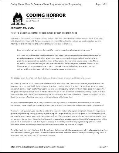
The entire printer-friendly CSS file is a mere 35 lines including generous whitespace. Testing the print stylesheet is a piece of cake, too. Just use the File, Print Preview menu:

Coding Horror website in print preview of Internet Explorer 7.0

Looks good to me.

Once you've set up a print stylesheet, you might as well set up a mobile stylesheet, too, because they're almost identical. We just add another link tag to the page header:

<link rel="stylesheet" href="/blog/styles-site-mobile.css"
type="text/css" media="handheld" />

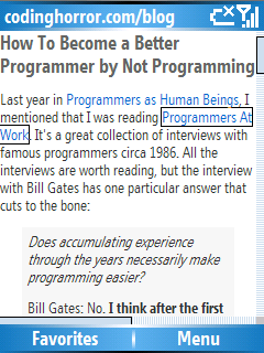
The CSS is a subset of the printer CSS, so I won't reprint it here. I only hide the links <div>. Testing rendering on a mobile device is a bit more difficult, but it is possible. Here's what it looks like on the new Samsung Blackjack phones we received at work:

Coding Horror website in Pocket IE on the Microsoft SmartPhone 5.0 OS

If you're wondering what your website looks like on a mobile device, wonder no longer. Try it yourself and see. The Windows SmartPhone / PocketPC emulator was surprisingly easy to get up and running. Here's what you'll need:

Once you've downloaded it all, install it in this order:

  1. Install ActiveSync
  2. Unzip and install V1Emulator (standalone_emulator_V1.exe)
  3. Install the Virtual Network Driver (netsvwrap.msi)
  4. Install the Emulator Images for Windows Mobile 5.0 (efp.msi)

I chose to launch the "Smartphone QVGA - Coldboot" emulator. Once it's running, the only tricky part is enabling internet connectivity. This post describes how to enable internet connectivity in the emulator; you place the emulated smartphone in the virtual "cradle" so it can access the network through ActiveSync. Note that you'll also need to set "Allow connections to one of the following" to "DMA" in the File, Connection Settings menu of ActiveSync.

Setting up proper print and handheld stylesheets was fun. And easy. I truly regret not doing it sooner. Don't make the same mistake I did. If you don't have print and handheld stylesheets set up on your website, what are you waiting for?

Discussion

How To Become a Better Programmer by Not Programming

Last year in Programmers as Human Beings, I mentioned that I was reading Programmers At Work. It's a great collection of interviews with famous programmers circa 1986. All the interviews are worth reading, but the interview with Bill Gates has one particular answer that cuts to the bone:

Does accumulating experience through the years necessarily make programming easier?

Bill Gates: No. I think after the first three or four years, it's pretty cast in concrete whether you're a good programmer or not. After a few more years, you may know more about managing large projects and personalities, but after three or four years, it's clear what you're going to be. There's no one at Microsoft who was just kind of mediocre for a couple of years, and then just out of the blue started optimizing everything in sight. I can talk to somebody about a program that he's written and know right away whether he's really a good programmer.

We already know there's a vast divide between those who can program and those who cannot.

But the dirty little secret of the software development industry is that this is also true even for people who can program: there's a vast divide between good developers and mediocre developers. A mediocre developer can program his or her heart out for four years, but that won't magically transform them into a good developer. And the good developers always seem to have a natural knack for the stuff from the very beginning.

I agree with Bill. From what I've seen, there's just no crossing the skill chasm as a software developer. You've either got it, or you don't. No amount of putting your nose to the grindstone will change that. But if you accept that premise, it also presents us with a paradox: if experience doesn't make you a better programmer, what does? Are our skill levels written in stone? Is it impossible to become a better programmer?

To answer that question, you have to consider the obsessive nature of programming itself. Good developers are good at programming. Really good at programming. You might even say fanatically good. If they're anything like me, they've spent nearly every waking moment in front of a computer for most of their lives. And naturally, they get better at it over time. Competent software developers have already mastered the skill of programming, which puts them in a very select club. But if you're already in the 97th percentile for programming aptitude, what difference does a few more percentile points really make in the big scheme of things?

The older I get, the more I believe that the only way to become a better programmer is by not programming. You have to come up for air, put down the compiler for a moment, and take stock of what you're really doing. Code is important, but it's a small part of the overall process.

This piece in Design Observer offers a nice bit of related advice:

Over the years, I came to realize that my best work has always involved subjects that interested me, or -- even better -- subjects about which I've become interested, and even passionate about, through the very process of doing design work. I believe I'm still passionate about graphic design. But the great thing about graphic design is that it is almost always about something else. Corporate law. Professional football. Art. Politics. Robert Wilson. And if I can't get excited about whatever that something else is, I really have trouble doing a good work as a designer. To me, the conclusion is inexcapable: the more things you're interested in, the better your work will be.

Passion for coding is a wonderful thing. But it's all too easy to mindlessly, reflexively entrench yourself deeper and deeper into a skill that you've already proven yourself more than capable at many times over. To truly become a better programmer, you have to to cultivate passion for everything else that goes on around the programming.

Bill Gates, in a 2005 interview, follows up in spirit to his 1986 remarks:

The nature of these jobs is not just closing your door and doing coding, and it's easy to get that fact out. The greatest missing skill is somebody who's both good at understanding the engineering and who has good relationships with the hard-core engineers, and bridges that to working with the customers and the marketing and things like that. And so that sort of engineering management career track, even amongst all the people we have, we still fall short of finding people who want to do that, and so we often have to push people into it.

I'd love to have people who come to these jobs wanting to think of it as an exercise in people management and people dynamics, as well as the basic engineering skills. That would be absolutely amazing.

And we can promise those people within two years of starting that career most of what they're doing won't be coding, because there are many career paths, say, within that Microsoft Office group where you're part of creating this amazing product, you get to see how people use it, you get to then spend two years, build another version, and really change the productivity in this very deep way, take some big bets on what you're doing and do some things that are just responsive to what that customer wants.

You won't-- you cannot-- become a better programmer through sheer force of programming alone. You can only complement and enhance your existing programming skills by branching out. Learn about your users. Learn about the industry. Learn about your business.

The more things you are interested in, the better your work will be.

Discussion

Extending The Windows Vista Grace Period to 120 Days

If you're on the fence about the impending release of Windows Vista, I recommend trying before you buy. Every Vista DVD includes the ability to install any edition of Vista without a product key. When you install without a product key, you get an automatic 30 day evaluation period.* This probably isn't news to anyone.

What may be news to you, however, is that you can easily extend the 30-day Windows Vista grace period to 120 days. No hacks required. This is an official, supported operation directly from Microsoft.

To extend the grace period another 30 days, simply start a command prompt as Administrator, and issue this command:

slmgr -rearm

Reboot for the change to take effect, and voila, you have 30 more days. You can only extend three times, so the total grace period for a Vista evaluation is 120 days. You do, however, need to be careful that you've installed the correct edition of Vista. At the end of that 120 day grace period, you'll have to pony up a license fee for the edition of Vista you've installed. Now that the OEM editions are out, the pricing breaks down like so, at least at Newegg:

  • Vista Home Basic OEM - $100
  • Vista Home Premium OEM - $120
  • Vista Business OEM - $150
  • Vista Ultimate OEM - $200

Microsoft is semi-officially supporting the OEM versions for resale to end users, but the bad news is that there's not much savings at the low-end. The pricing for the basic OEM editions are nearly identical to the full retail upgrades. The primary difference is that the OEM copies will support full install as well as upgrade install. If you're looking for deeper Vista discounts, you may be interested in the Vista Family Pack, which includes the option to buy two $49 copies of Vista Home Premium, provided you pay full retail price for a copy of Vista Ultimate.

Now that we've gotten the sticky matter of pricing out of the way, let's take a deeper look at this little utility Microsoft provides. It's actually a Windows Script Host file, slmgr.vbs. First, let's switch our default WSH handler to the command-line version so we aren't dealing with aggravating window popups from the command line.

cscript /H:Cscript

If you run slmgr without any parameters, you'll get the help.

Windows Software Licensing Management Tool
Usage: slmgr.vbs [MachineName [User Password]] [<Option>]
MachineName: Name of remote machine
User:        Account with required privilege
Password:    password for account
Global Options:
-ipk <Product Key>
Install product key (replaces existing key)
-upk
Uninstall product key
-ato
Activate Windows
-dli [Activation ID | All]
Display license information (default: current license)
-dlv [Activation ID | All]
Display detailed license information (default: current license)
-xpr
Expiration date for current license state
Advanced Options:
-cpky
Clear product key from the registry (prevents disclosure attacks)
-ilc <License file>
Install license
-rilc
Re-install system license files
-rearm
Reset the licensing status of the machine
-dti
Display Installation ID for offline activation
-atp <Confirmation ID>
Activate product with user-provided Confirmation ID

I just re-armed tonight and re-booted, and I can verify that the grace period extension worked via the -dli command:

C:UsersJeff>slmgr -dli
Name: Windows(TM) Vista, Ultimate edition
Description: Windows Operating System - Vista, RETAIL channel
Partial Product Key: RP8F7
License Status: Initial grace period
Time remaining: 43100 minute(s) (29 day(s))

This is my third and final grace period extension. I now have 29 days to decide if I want Ultimate edition or not.

(update: Ed Bott posted how to set up a scheduled task so you rearm automatically after 30 days. I set mine up to run monthly for 3 months rather than setting up 3 individual tasks as Ed suggests.)

* Note that this does not apply to the Enterprise edition of Vista, which only allows a 3 day grace period. The enterprise edition has an entirely different activation scheme; it uses a local volume license key server.

Discussion

Dynamic, Lightweight Visualization

Edward Tufte's print world is filled with stunningly beautiful visualizations. Even seemingly mundane things like visualizations of Ruby, Java, and JavaScript grammars can be beautiful. But they're static. They don't move. They're not interactive.

That's where Ben comes in.

If you haven't visited Ben Fry's website before, I envy the experience you're about to have. (Be sure to visit his old MIT site, too.) Ben Fry is Edward Tufte armed with a compiler. Ben produces incredible dynamic visualizations with his custom Java-based, open-source processing language. It even comes with its own custom IDE:

We think most "integrated development environments" (Microsoft Visual Studio, Codewarrior, Eclipse, etc.) tend to be overkill for the type of audience we're targeting with Processing. For this reason, we've introduced the 'sketchbook' which is a more lightweight way to organize projects. As trained designers, we'd like the process of coding to be a lot more like sketching. The sketchbook setup, and the idea of just sitting down and writing code (without having to write two pages to set up a graphics context, thread, etc) is a small step towards that goal.

The idea of just writing a short piece of code that runs very easily (via a little run button) is a direct descendant of John Maeda's work in Design By Numbers, and our experiences maintaining it. (Yes, other languages and environments have done this first, but in our case, the concept is drawn from DBN).

It's amazing stuff, more akin to sketching than coding. Browse through the examples gallery to get a sense of what's possible.

Processing-examples

Ben's latest Processing visualizations, baseball salary vs. performance, and isometric blocks, are like pages from an Edward Tufte book come to life. And who can forget his classic zipdecode?

If you've gone this far with Java-based visualization, you might as well continue on to IBM's Many Eyes site. You can't write your own visualization code here; you're stuck with the predefined visualizations they provide. You can, however, upload and share the data sets you're using to visualize from.

But you might wonder, what's with all the Java? Couldn't we do this dynamic visualization stuff with something more lightweight, something more appropriate for a web page?

  • JavaScript is a possibility. After all, we had Wolfenstein 5k, a JavaScript clone of Wolfenstein 3D written in only 5 kilobytes of JavaScript, way back in 2002. Sadly, it doesn't work in any modern browser, or even in any Microsoft OS newer than Windows XP Service Pack 2. But it's an impressive piece of work nonetheless. It foreshadowed just how reliant the web would become on JavaScript. One such JavaScript visualization, Kyle Scholz's music recommendation connected graph, is ponderously slow. It leaves me wondering if JavaScript is really up to the task of visualization, even with the HTML Canvas element.
  • What about Flash? Surely visualization is a better use for Flash than the legions of advertisements (and, now, video advertisements) I'm subjected to every day. Although I can find some isolated visualizations in Flash, I'm not seeing a vibrant visualization community there.
  • On the Windows side, there's some hope for Windows Presentation Foundation, which ships in every Vista box. WPF, and its lightweight cousin WPF/E, could enable lightweight, hardware accelerated visualization – something that's sorely lacking from all the other options. To see what I mean, try this WPF 3D sample, which runs entirely in the browser. But the technology is far too new to have any kind of community.

If I wanted to see static illustrations, I'd read a book. But dynamic visualizations aren't quite there yet for web pages. Right now, you have to pick your technology poison. They all have their downsides. Still, it's something worth striving for. I yearn for the day when web pages are regularly illustrated with the kind of beautiful, dynamic visualizations that Ben Fry creates.

Discussion