Online Newspapers, Offline
One of the premium features of the New York Times website is the Windows Reader. It’s free if you subscribe to home delivery of the paper, otherwise it’s $14.95 per month.
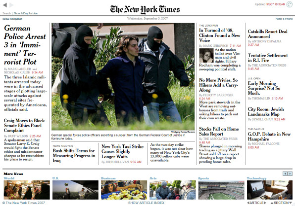
One of the key attractions of the Times Reader is that it lets you read the newspaper offline. The application runs silently in the background, caching up 7 days worth of news, which you can browse through at your leisure – with or without an internet connection. And for that, it’s great. But given the increasing prevalence of internet connectivity everywhere, through cellular networks as well as WiFi, does offline mode still matter?
In many ways, the Times Reader is a superior newspaper reading experience. It supports dynamic, scalable full page layouts, unlike the narrow column of content we’re stuck with in the web browser. And the typography features (through Windows Presentation Foundation) are desktop publishing quality. The “pages” are artfully presented, free of webjunk, and transitions between the articles are all beautifully animated, iPhone style. All of this is nearly impossible to do in a standard web browser.
I encourage people to try out the Times Reader. If nothing else, it’s a window into some of the missed opportunities of viewing the online world exclusively through the lens of a traditional web browser.
But after using the Times Reader for a few days, I can’t shake the feeling that the newspaper reading experience it delivers is still inferior to the web browser. Despite the many technical merits (and the offline mode), dividing the browsing experience between two different mediums is not a good idea.
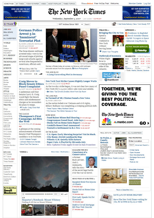
The Times Reader version of the paper lacks much of the dynamic content offered on the web page:
- opinion column links
- market summary numbers
- articles with embedded flash audio
- articles with embedded flash video
- search function
- personalization
- top (n) most popular / most emailed stories
I miss this stuff. I always jumped directly to the most popular stories, and I can’t do that in the Times Reader. I also find the the constrained view of the reader unnatural. I prefer the large scrolling content area of the web browser. I can use my mouse wheel to scroll to different sections in the reader, but it’s alien.
The web browser is clearly the design focus for the New York Times. Perhaps that’s the way it should be, as that’s how most of the world will experience the paper online. In comparison, the Times Reader feels like a B-movie version of the genericized RSS content with better special effects. It just doesn’t get the same attention as the home page.
Maybe this is a classic case of Don’t Repeat Yourself. The Times Reader is a great effort. It’s certainly pretty to look at. But I think the Times would be better served by focusing all their effort on delivering an outstanding web experience – and, if necessary, offering programs that cache sections of the website for offline browsing.


