On Expose, Flip3D, and Switcher
I’m one of the rare people who actually likes Windows Vista. Sure, it’s far from what was originally promised in terms of features, but it’s still a solid quality of life improvement from the crusty old 2001 version of Windows XP. Or at least it will be, once Service Pack 1 is released.
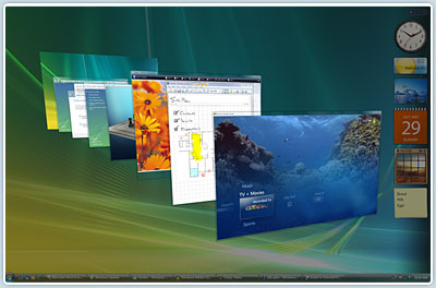
Like anything else, there’s plenty to be critical of in Vista. One particular feature of Vista that I find almost unforgivably lame is Flip3D.
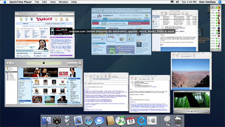
It’s a third-rate clone of Apple’s OSX Expose feature, which itself is an exploration of zoomable UI.
Vista’s Flip3D certainly looks cool enough, and you can use your mouse wheel to spin the windows around, which is entertaining for a few seconds. But it fails miserably in terms of actual usability:
- It only uses the primary monitor to show the window list, so any additional display space you have is completely wasted.
- The windows are stacked on top of each other, partially obscuring every window except the topmost one. This also makes the target area for selecting and clicking on any stacked window very small.
- The arbitrary switch from a 2D desktop into a 3D display space is mentally disconcerting. This change also slants and distorts the windows, so readability is lower than it should be.
In their effort to distinguish themselves from OSX, Redmond created a complete non-feature. Flip3D is barely better than nothing.
But we don’t have to suffer through Flip3D when we can replace it. There are several nice alternatives. Personally, I recommend disabling Flip3D and mapping Bao Nguyen’s outstanding Switcher to the Windows+Tab key combination.

I just noticed that Bao released a new beta version of Switcher:
- Middle-click a window to close it.
- The first 9 windows can be selected by number; the numeric shortcut is superimposed over the window.
- Right-click a window to open it, and minimize all other windows.
- Windows now have a large text label superimposed in the corner with the title and icon so you can tell what they are. This is helpful if you have many similar-looking windows, or if they’re thumbnailed particularly small.
- You can perform an incremental filtering search on all open windows.
These are some killer new features. I’ve wanted to close windows by middle-clicking on them from the zoomed view forever. But the last item on that list is huge. It’s a game changer. Instead of playing Where’s Waldo with my windows, I can press Windows+Tab, then type what I want. It’s exactly what I described in The Problem With Tabbed Interfaces:
So how can we fix this? How can we integrate tabs with the existing navigational features of the operating system, such as the taskbar, and Expose? I keep coming back to search as the dominant computing metaphor. The only thing I can think of is a plain-text search facility where I type “Gmail,” and the OS would automatically highlight that tab (or window) and bring it to the front. That presupposes a very high level of integration between the application tabs and the operating system, however.
It looks like Bao Nguyen was reading my mind. Pressing Windows+Tab, then typing “Gmail” is the best thing ever as far as I’m concerned. No, I can’t search tab contents, but I can now match by any window title, which is good enough. The way I can begin typing and watch the windows dynamically fling themselves offscreen as they fall out of my filter in real time is a huge productivity boost. I cannot understate how significant this feature is. It redefines the way I deal with windows; I can type what I want instead of expending the mental effort to visually scan thumbnails of 20 different windows.
Unlike Flip3d, the graphical frills of Switcher are all in service to the functionality. That’s the way it should be. I Highly recommend trying out the latest beta of Switcher. But be sure to bring a fast video card to the table for the best experience.


