Non-Native UI Sucks
It’s common knowledge that Mac users prefer Safari to Firefox. It is the browser bundled with the OS – and we know how that generally works out. But it’s not just a monopoly play; there are legitimate reasons for Mac users to choose Safari:
Mac users favor [Safari] for its rendering speed, clean interface and fast launch times.
Safari is, of course, a completely competent browser that stands on its technical merits, very much unlike IE6. But if you ask Mac users why they chose Safari, and if you keep pressing them, you’ll probably find the deciding factor was that Safari feels like a native Mac app.

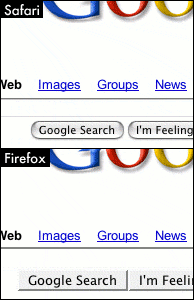
The next version of Firefox will use some native UI elements in OS X. But it’s still not a native Cocoa app. The lack of a completely native UI on OS X may seem like a minor implementation detail, but it’s actually a showstopper for a lot of people, like this commenter:
“Native cocoa widgets” refers to the use of the natively rendered components such as scroll bars and submit buttons. These are the same buttons and scroll bars used in nearly all Cocoa apps for OSX (basically every program you’ve ever used). The default theme for OSX FF2 uses these really ugly widgets that are really blocky and Netscape 4-y looking.
As vain as it may sound, those ugly widgets are actually one of the major reasons I use Safari instead of FF on OSX.
When two applications with rough feature parity compete, the application with the native UI will win. Every time. If you truly want to win the hearts and minds of your users, you go to the metal and take full advantage of the native UI.
Java has struggled with this problem for years, producing results spanning the continuum between “terrible” and “awful,” depending on who you ask. Most Java developers have given up completely on GUI applications:
Me, I defected long ago. I’m another of those Apple Java engineers who dropped out. I spent five years as a raving Java fanboy, but I gave up after optimizing AWT, implementing drag and drop, and trying to make 1,200 pages of crappy APIs do the right thing on the Mac. Then I took a one-week Cocoa training course, and wrote the first prototype of iChat.
Desktop Java never worked because Sun tried to build their own OS on top of the real OS, duplicating every API and feature. This led to terrible bloat, making every app as heavyweight to launch as Photoshop. Worse, the GUI portions of the Java platform are awful, because Sun is a server company with no core competency at GUIs. The APIs are too clumsy to code to, and compared to any decent Mac app, the results look like a Soviet tractor built on a Monday.
Ultimately, the best any Java app can do is pretend to be a native app. To fake it. And more often than not, it can’t even manage to do that:
This project should be a cautionary tale for people who think programmers should be interface designers. Apple and Microsoft at least recognize that these are different skill sets, and that looks and feels should be created by a team of programmers, graphic designers, and interaction designers. Sadly the Linux and Java communities haven’t really figured this out yet, and are still trying to have programmers do it all, with predictable results. The bottom line is that we don’t really need different look-and-feels in Java. The best Java can or should do is faithfully mimic the native user interface. Unless your name is Bruce Tognazzini or Kai Krause, you almost certainly won’t do better than that; and you’ll be very, very lucky if you don’t do worse. Pluggable look-and-feels are necessary in Swing only because Swing apps have to run on multiple platforms. They should be changed only from operating system to operating system, not application to application. The goal of a Java application is to fit in with other native applications, not to stand out.
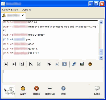
GAIM has a cross-platform UI based on GTK, which produces predictably bland, least-common-denominator results:


Most of all, I find myself empathizing with Mac Safari users because I haven’t been able to switch away from IE7 on Vista. Firefox feels so dowdy in Vista. It just doesn’t fit in. It scrolls very slowly, the keyboard stops working at random, and the overall GUI is jarringly out of place, including the legacy main menu. There’s no doubt whatsoever that Firefox is a vastly superior browser for web development, with a vibrant developer community. Firefox absolutely should be a part of every developer’s core toolkit.
But when it comes to day-to-day browsing, I’ll always pick native speed and native look and feel over the ability to install a dozen user extensions, or the ability to run on umpteen different platforms. Every single time.
If that makes me shallow, then I’m in good company. Non-native UI sucks.


