Is the Command Prompt the New Desktop?
People keep rediscovering the article Don Norman posted a few months ago criticizing what he thinks of as Google’s faux simplicity:
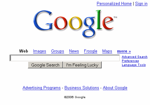
“Oh,” people rush to object, “the Google search page is so spare, clean, elegant, not crowded with other stuff.” True, but that’s because you can only do one thing from their home page: search.
Of course, I don’t agree. Philipp Lenssen notes that Don completely ignored the search results page UI:
The second point I disagree with in Donald Norman’s article is that Google only does one thing. Apparently, Donald doesn’t understand Google oneboxes – the query-specific boxes on top of organic search results, interfacing services Google News, Google Maps and so on – or he purposely omits them. While a Google onebox is not a solution to all needs (for one thing, it doesn’t allow me to explore, because I need to know what I want in order to form a search query), there’s also the “more” link leading to a Google sitemap with an overview of additional services.
But Bill de hÓra expands the argument in an intriguing direction:
Perhaps the hunt and peck approach of searching (along with gaming) is becoming the dominant computing metaphor, replacing nearly 3 decades of user interfaces based on the metaphor of an office desktop (ironically the metaphor itself being pushed into irrelevancy by desktop computing). If so, usability experts will need to reconsider what they deem to be best and appropriate.
The Google search box could be viewed as the ultimate command prompt; you type what you want, and it provides the answer. Eventually. Once you realize that the Google search box is really a type of command prompt, the criticism that Google “only does one thing” is... well, downright hilarious. Search is the beginning of every command. You can go anywhere and do anything from there.
I’ve never been a huge fan of the desktop metaphor. It’s easier to see the problems if you take it to an extreme, as General Magic’s defunct Magic Cap operating system did:
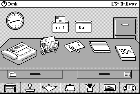
As much as I dislike the limitations of the desktop metaphor, I’m a little uneasy about the idea that the ultimate user interface we end up with in the next ten years will bear more resemblance to a command prompt...
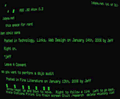
... than to the point and click GUI interfaces pioneered at PARC.
Still, there’s a lot to be said for typing stuff to quickly get to what you want. For example, I often bail out when attempting to visually point and click my way around crowded web pages; instead, I search for a relevant word on the page using incremental search. It’s nearly always faster than visually scanning the entire page for the right content or link.


