In Praise of Good Design
Which pill bottle would you rather use?
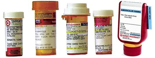
The rightmost bottle was designed by Target to address the shortcomings of traditional pill bottles. And you probably decided which pill bottle you liked best within a twentieth of a second.
When I suggested redesigning address input in web forms, there was some resistance. Current web forms are good enough. Yeah, they have some shortcomings. But why change what works? Why change what people are used to?
Why did we have to wait 50 years for a better pill bottle? Because the shortcomings of pill bottles weren’t important enough to justify a new design? I think that’s a crock. We should constantly be striving to overcome existing shortcomings with better designs.
Donald Norman has a page with examples of well-designed products that he calls In Praise of Good Design. Did the kitchen whisk need to be redesigned? No. Is it better because it was redesigned? Absolutely.


