Google’s Number One UI Mistake
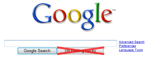
Google’s user interface minimalism is admirable. But there’s one part of their homepage UI, downloaded millions of times per day, that leaves me scratching my head:

Does anyone actually use the “I'm Feeling Lucky” button? I’ve been an avid Google user since 2000; I use it somewhere between dozens and hundreds of times per day. But I can count on one hand the number of times I’ve clicked on the “I’m Feeling Lucky” button.
I understand this was a clever little joke in the early days of Google– hey, look at us, we’re a search engine that actually works! – but is it really necessary to carry this clever little joke forward ten years and display it on the monitors of millions of web users every day? We get it already. Google is awesomely effective. That’s why I use it so much. That’s why Google is the start page for the internet, loading the Google homepage is virtually synonymous with internet access, and the verb “to Google” is at risk of becoming a genericized trademark. Google has won so decisively, so utterly, and so completely that the power they now wield over the internet actually scares me a little. Okay, it scares me a lot.
So can we get rid of the superfluous button now?
You might say it’s only one more button, so where’s the harm. I say giving a feature that’s used less than one percent of the time parity with the “Search” button is a needless distraction for users. Furthermore, the “I’m Feeling Lucky” button is only available on the homepage – it’s not a part of any browser toolbar searches, and Google’s intermediate search page results don’t offer it, either. Why not standardize and stick with the simple, single “Search” button that everyone understands and expects, on every page? Why muddy the waters with a button that’s so rarely useful, and on the homepage of all places? The thought necessary to mentally omit this needless button from the page may be miniscule – but multiply that by the millions upon millions of users who are affected, and all of a sudden it starts to add up to real time. Don’t make us think!
If you’re an advanced computer user, you may be wondering why we bother with Search buttons at all when we have a perfectly good ENTER key on our keyboards. As shocking as this may be to us homo logicus, not everyone understands how that works. Sure, we think it’s crazy to take our hand off the keyboard, where we were just typing our search query, move it all the way over to the mouse, then carefully move the mouse pointer to a button and left-click it... when we could just take that very same hand, already poised over the keyboard, and lazily tap the ENTER key.
But typical users don’t really understand basic keyboard shortcuts. They love their mice, and their big, fat, honking “Search” buttons. That’s why the current versions of Firefox and IE both have an integrated “go” button directly next to the address bar – so users have something obvious to click once they’ve typed the URL into the address bar. Otherwise, I guess, they’d sit there wondering if their computer had frozen.

Personally, I always use the keyboard ENTER key to complete my searches, but I’d be open to a keyboard shortcut such as SHIFT+ENTER that invoked the Lucky function. I still can’t imagine using it more than once a week at most – and that’s probably an optimistic estimate.
Strunk and White urged us to Omit Needless Words:
Vigorous writing is concise. A sentence should contain no unnecessary words, a paragraph no unnecessary sentences, for the same reason that a drawing should have no unnecessary lines and a machine no unnecessary parts. This requires not that the writer make all his sentences short, or that he avoid all detail and treat his subjects only in outline, but that every word tell.
I urge us to Omit Needless Buttons. I hope the “I’m Feeling Lucky” button isn’t considered a sacred cow at Google. Removing it would be one small step for Google, but a giant collective improvement in the default search user interface for users around the world.


