Creating User Friendly 404 Pages
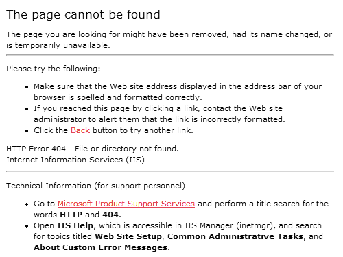
We understand what 404 means: Page Not Found. But the average internet user has no idea what 404 means or what to do about it. To them, it’s yet another unintelligible error message from the computer. Most 404 pages are unvarnished geek-speak. Consider the default 404 page under IIS:
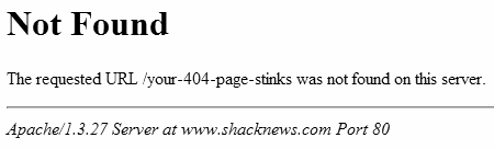
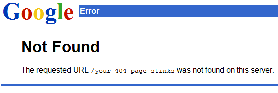
The default 404 page under Apache is no better:
Internet Explorer tries to shield the user from these poorly constructed 404 pages by automatically substituting friendlier error messages:
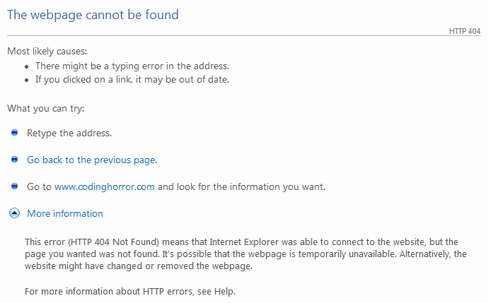
It’s not bad. It’s certainly an improvement over the default 404 from Apache or IIS. But we can do better.
We can stop relying on the default behavior of our webservers and web browsers, and create our own custom 404 page. Unfortunately, many sites have custom 404 pages that are barely discernable from the generic webserver defaults. You wonder why they bother.
So, what exactly should a user-friendly custom 404 page do? Although there’s an entire website dedicated to documenting funny 404 pages, funny isn’t necessarily helpful. What can we do to help the user at this point? I have some ideas.
- Drop the 404
Yes, the HTTP response code is 404, but there’s absolutely no reason that ever needs to be shown on the actual page. Error codes aren’t helpful. A simple explanation of the problem in plain English is all that’s required. Any 404 page that has the characters “404” on it, if not already an outright failure, is already well on its way to becoming one. - Automatically notify you of the 404
Repeat after me: it is not the user’s job to inform you about problems with your website. If you require the user to click a button to notify you about a 404, or if you require the user to fill out a broken link form, you have utterly failed your users. 404 notification should be automatic, and by that I do not mean “sit in my log files until I eventually have time to look for it.” I suggest weekly or monthly 404 rollup reports, emailed automatically to the powers that be. I’d also recommend real-time email notification if there is a sudden spate of 404s, so you have an opportunity to fix the problem while it’s still relevant – before the world gives up on your seemingly nonexistent page. - Try to find what the user was looking for and provide links to possible matches
Don’t just put a search box on the 404 page and force the user to perform a search. That’s a cop-out. Instead, automatically perform a search on their behalf, using the erroneous URL as the search input, and display those results on the 404 page. You can also try to correct the URL, based on rules derived from the top ten or top fifty observed 404 errors. Does the URL end in .htm instead of .html? Is it spelled wrong? Are your URLs case-sensitive? Was the page moved, renamed, or reorganized somewhere else? It’s sensible to have a search box on your 404 page for convenience’s sake, but forcing the user to perform a search should always be the method of last resort. - Present links to the most popular or most recent items
If someone is visiting your website, statistically speaking, there’s a good chance they are coming to see the same attraction everyone else is. Even if they aren’t, your popular content is popular for a reason. Why not present links to your “greatest hits” on the 404 page? Similarly, if you run a periodic website like a blog, or a newspaper, display the last few articles or entries on the 404 page. And at the very least, you’ll want a link back to the main website. Provide a filtered list of relevant links, and an errant user will never be more than one click away from escaping their current predicament. - Keep the 404 page simple
Your 404 page should be brief, concise, and to the point.* You’re already dealing with confused users who can’t find what they’re looking for. Don’t add insult to injury by spamming the user with a giant, complicated 404 page containing a complete sitemap of your website. For example, the apple.com 404 page makes this mistake.
I found that Jakob Nielsen, A List Apart, and 404 Research Lab also had good advice on making 404 pages potentially user friendly instead of the geeky, incomprehensible dead end signs they usually are.

Unfortunately, I haven’t had time to implement a better 404 page on my own website. Yet. If you’re looking for live examples of 404 pages that get this right, I can recommend the 1976 design 404 page, as well as the useit.com 404 page. Sadly, this is an extremely short list because so few websites meet the criteria I outlined above. I sampled 404 pages from dozens of websites and most fail spectacularly, serving up 404 pages that are downright user hostile.
Whichever route you choose, never settle for the default 404 page. Replace it with a custom 404 page that is polite, illuminating, and most of all, helpful.
*But not too brief. You have to make your customized 404 page larger than 512 bytes, otherwise IE will assume it’s a standard web server 404 message and replace it with its own friendly-ized version.