Because Information is Beautiful
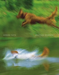
The Edward Tufte books are well known classics now, but I distinctly remember my first encounter with The Visual Display of Quantitative Information in 1995. At the time I was working for a market research company in Denver. I noticed the book sitting on the president’s desk while I was in his office doing some typical small business IT stuff. I had never heard of it, and I was intrigued. I started casually paging through it – and I was absolutely enthralled. I couldn’t put it down. After Karl arrived, I told him how amazing the book was; I had to have my own copy. He expressed some surprise that he had no luck getting his market analysts to look at the book, but his crazy IT guy just happened to see it in passing and treated it like some new kind of religion.
Although computers had captured my imagination since childhood, I never considered that part of this attraction had nothing to do with the computer, but the data inside of it. Data that was often displayed in very mundane ways. I had no idea that information could be so beautiful.
It’s a powerful concept. One of the more compelling examples is this illustration from Tufte’s second book, Envisoning Information, on page 63, where he reduces a mundane illustration from a government manual to its most essential elements:
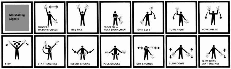
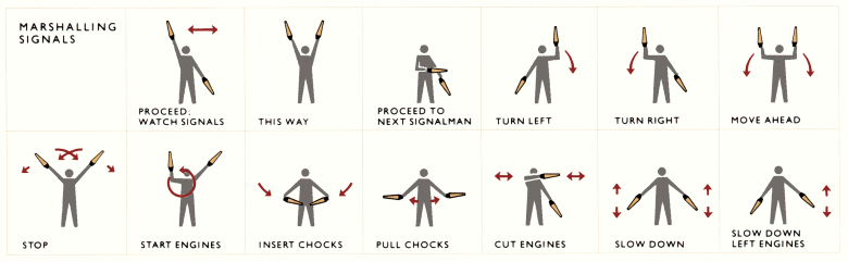
This example is powerful precisely because it is so very mundane – the illustration barely registers. With a few simple changes, a generic illustration is transformed into a strikingly powerful visual explanation. It’s easy to see where these critically important visual cues could be applied to every kind of human-computer interaction. And that’s why the three Tufte books are essential for anyone with any interest in visual design:
- The Visual Display of Quantitative Information
- Visual Explanations
- Envisioning Information
Tufte’s books have a strictly practical bent, but they do carry an implied question that he never fully addresses: when does the display of information stop being utilitarian and start being art? Can it be both? Should it be both? There are quite a few web sites mapping this strange territory somewhere between utility and beauty.
Laurens Lapre’s site is dedicated to procedurally generated art; I found his gradient spaces particularly compelling.
Ben Fry’s site definitely has a little of both: the amazing, well-known visual zip decode page, and a dump of raw data from a classic Nintendo Entertainment System cartridge he calls Mario Soup:
In another art project, Super Mario Clouds, the same cartridge is reprogrammed to display nothing but an idyllic display of floating 8-bit clouds.