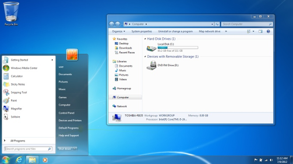
The Start Menu must be stopped
As I struggle to open applications on my PC, I was reminded of a few entries in Scott Hanselman’s blog:
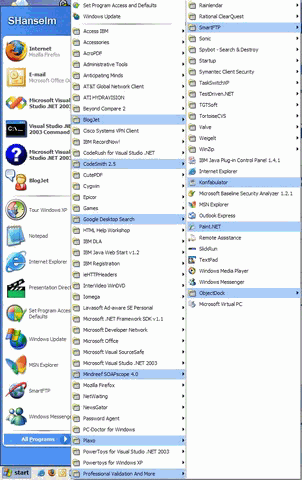
Personally I have enough crap in my start menu to fill my 1400x1060 screen... arguably only 30% of the icons represent applications, the rest are just flotsam. (May 11, 2003)
As I sit here and look at my Start Menu, that fills my 1600x1200 screen and runs off the right edge... (October 10, 2003)
Anyway, I’m about 40% done installing my programs as you can see by my Start Menu. I’ll know I’m done when the Start Menu completely fills my 1400x1050 screen. (December 7, 2004)
I’m not picking on Scott here. I just happened to notice a theme in his posts that jibed with my personal experience. The Windows start menu makes launching applications far more difficult than it should be. A giant horizontal menu may have seemed like a good idea back when Windows 95 was launched – but clearly, it isn’t. I curse every time I have to launch an app that isn’t pinned to my start menu, or in the recently launched program list:
- The list is not in alphabetical order by default. It’s in install order. You can manually sort it by right clicking the list and selecting Sort.
- Software vendors tend to put their applications in folders using the name of their company. So if I want to use CrazyApp, I have to remember to look for the MonkeyCorp menu. Why should we expect the user to know or care what the company name is?
- Some items don’t go into folders. These items show up at the bottom of the list. If you’re looking for Word under the Microsoft folder, or the Office folder, you’re out of luck. It’s set up with its own icon at the bottom of the list. And why the bottom? I have no idea.
- Some items show up at the top of the list for no obvious reason. That’s because those items are set up for All Users. Again – how is a user supposed to know this?
- Once you have more than one “row” of applications, cascading folders that pop up from the left row obscure the information in the right row. This design clearly doesn’t scale.
- If you want to rearrange the list of applications, you can do so by dragging the items in the menus. However, this is incredibly difficult to do within a series of cascading menus. Try dragging an item from within a folder to another folder, for example. Or right-clicking an item to delete it, which sometimes results in the entire start menu closing.
The deeper problem with the start menu is that it’s, well, a menu. Menus have poor usability. A single “Start” point for the user is a fine idea, but it really starts to break down when you make it into more than a simple, visible list of items, as the All Programs link does. A 2003 usability study showed that all menus are inferior to Yahoo-style index lists, and horizontal menus have the worst usability of all:
The poorest performer, both objectively and subjectively, was the Horizontal layout. Participants in this condition took longer to find the task information, and they had the opinion, though non-significantly, that this layout was more disorientating than the other two layouts. It is possible that the distance this layout was from the center of the screen contributed to its poorer participant performance. In fact, one participant commented that this layout “was more difficult to see and reach than the others because of its height on the screen.”
It’s clear that traditional menus have no place on web pages, and should be used sparingly in GUIs. And that’s the critical problem with the Start Menu: it abuses menus. For launching applications, it’s a usability train wreck. I’m sure they’ll be fixing this with Vista [and they do], but in the meantime, what’s a poor computer user to do?