The God Login
I graduated with a Computer Science minor from the University of Virginia in 1992. The reason it’s a minor and not a major is because to major in CS at UVa you had to go through the Engineering School, and I was absolutely not cut out for that kind of hardcore math and physics, to put it mildly. The beauty of a minor was that I could cherry pick all the cool CS classes and skip everything else.
One of my favorite classes, the one I remember the most, was Algorithms. I always told people my Algorithms class was the one part of my college education that influenced me most as a programmer. I wasn’t sure exactly why, but a few years ago I had a hunch so I looked up a certain CV and realized that Randy Pausch – yes, the Last Lecture Randy Pausch – taught that class. The timing is perfect: University of Virginia, Fall 1991, CS461 Analysis of Algorithms, 50 students.
I was one of them.
No wonder I was so impressed. Pausch was an incredible, charismatic teacher, a testament to the old adage that your should choose your teacher first and the class material second, if you bother to at all. It’s so true.
In this case, the combination of great teacher and great topic was extra potent, as algorithms are central to what programmers do. Not that we invent new algorithms, but we need to understand the code that’s out there, grok why it tends to be fast or slow due to the tradeoffs chosen, and choose the correct algorithms for what we’re doing. That’s essential.
And one of the coolest things Mr. Pausch ever taught me was to ask this question:
What’s the God algorithm for this?
Well, when sorting a list, obviously God wouldn’t bother with a stupid Bubble Sort or Quick Sort or Shell Sort like us mere mortals, God would just immediately place the items in the correct order. Bam. One step. The ultimate lower bound on computation, O(1). Not just fixed time, either, but literally one instantaneous step, because you’re freakin’ God.

This kind of blew my mind at the time.
I always suspected that programmers became programmers because they got to play God with the little universe boxes on their desks. Randy Pausch took that conceit and turned it into a really useful way of setting boundaries and asking yourself hard questions about what you’re doing and why.
So when we set out to build a login dialog for Discourse, I went back to what I learned in my Algorithms class and asked myself:
How would God build this login dialog?
And the answer is, of course, God wouldn’t bother to build a login dialog at all. Every user would already be logged into GodApp the second they loaded the page because God knows who they are. Authoritatively, even.
This is obviously impossible for us, because God isn’t one of our investors.
But... how close can we get to the perfect godlike login experience in Discourse? That’s a noble and worthy goal.
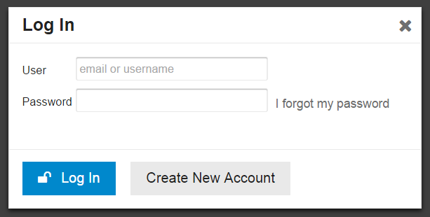
Wasn’t it Bill Gates who once asked why the hell every programmer was writing the same File Open dialogs over and over? It sure feels that way for login dialogs. I’ve been saying for a long time that the best login is no login at all and I’m a staunch supporter of logging in with your Internet Driver’s license whenever possible. So we absolutely support that, if you’ve configured it.

But today I want to focus on the core, basic login experience: user and password. That’s the default until you configure up the other methods of login.
A login form with two fields, two buttons, and a link on it seems simple, right? Bog standard. It is, until you consider all the ways the simple act of logging in with those two fields can go wrong for the user. Let’s think.
Let the user enter an email to log in
The critical fault of OpenID, as much as I liked it as an early login solution, was its assumption that users could accept an URL as their “identity.” This is flat out crazy, and in the long run this central flawed assumption in OpenID broke it as a future standard.
User identity is always email, plain and simple. What happens when you forget your password? You get an email, right? Thus, email is your identity. Some people even propose using email as the only login method.

It’s fine to have a username, of course, but always let users log in with either their username or their email address. Because I can tell you with 100% certainty that when those users forget their password, and they will, all the time, they’ll need that email anyway to get a password reset. Email and password are strongly related concepts and they belong together. Always!
(And a fie upon services that don’t allow me to use my email as a username or login. I’m looking at you, Comixology.)
Tell the user when their email doesn’t exist
OK, so we know that email is de-facto identity for most people, and this is a logical and necessary state of affairs. But which of my 10 email addresses did I use to log into your site?
This was the source of a long discussion at Discourse about whether it made sense to reveal to the user, when they enter an email address in the “forgot password” form, whether we have that email address on file. On many websites, here’s the sort of message you’ll see after entering an email address in the forgot password form:
If an account matches [email protected], you should receive an email with instructions on how to reset your password shortly.
Note the coy “if” there, which is a hedge against the security implications of revealing whether a given email address exists on the site just by typing it into the forgot password form.
We’re deadly serious about picking safe defaults for Discourse, so out of the box you won’t get exploited or abused or overrun with spammers. But after experiencing the real world “which email did we use here again?” login state on dozens of Discourse instances ourselves, we realized that, in this specific case, being user friendly is way more important than being secure.
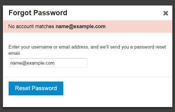
The new default is to let people know when they’ve entered an email we don’t recognize in the forgot password form. This will save their sanity, and yours. You can turn on the extra security of being coy about this, if you need it, via a site setting.
Let the user switch between Log In and Sign Up any time
Many websites have started to show login and signup buttons side by side. This perplexed me; aren’t the acts of logging in and signing up very different things?
Well, from the user’s perspective, they don’t appear to be. This Verge login dialog illustrates just how close the sign up and log in forms really are. Check out this animated GIF of it in action.
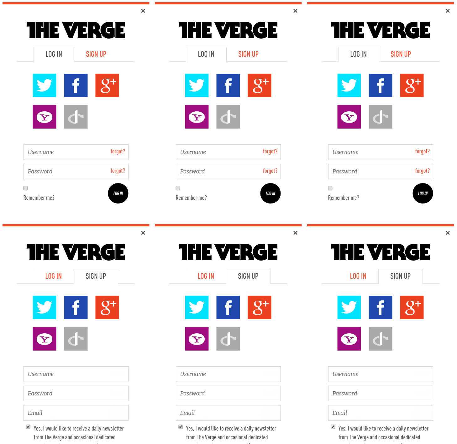
We’ve acknowledged that similarity by having either form accessible at any time from the two buttons at the bottom of the form, as a toggle:

And both can be kicked off directly from any page via the Sign Up and Log In buttons at the top right:

Pick common words
That’s the problem with language, we have so many words for these concepts:
- Sign In
- Log In
- Sign Up
- Register
- Join <site>
- Create Account
- Get Started
- Subscribe
Which are the “right” ones? User research data isn’t conclusive.
I tend to favor the shorter versions when possible, mostly because I’m a fan of the whole brevity thing, but there are valid cases to be made for each depending on the circumstances and user preferences.
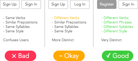
Sign In may be slightly more common, though Log In has some nautical and historical computing basis that makes it worthy:
A couple of years ago I did a survey of top websites in the US and UK and whether they used “sign in”, “log in”, “login”, “log on”, or some other variant. The answer at the time seemed to be that if you combined “log in” and “login”, it exceeded “sign in”, but not by much. I’ve also noticed that the trend toward “sign in” is increasing, especially with the most popular services. Facebook seems to be a “log in” hold-out.
Work with browser password managers
Every login dialog you create should be tested to work with the default password managers in…
At an absolute minimum. Upon subsequent logins in that browser, you should see the username and password automatically autofilled.
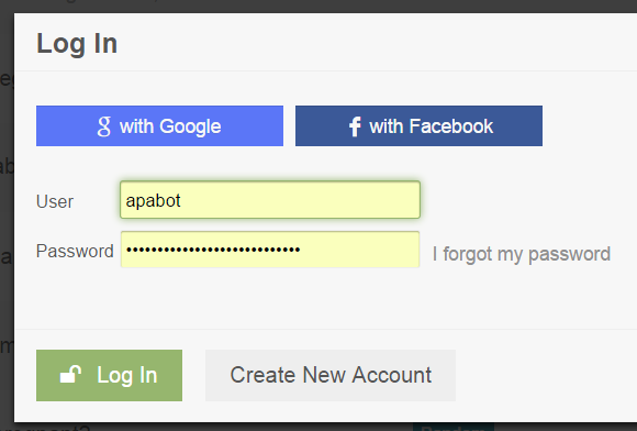
Users rely on these default password managers built into the browsers they use, and any proper modern login form should respect that, and be designed sensibly, e.g. the password field should have type="password" in the HTML and a name that’s readily identifable as a password entry field.
There’s also LastPass and so forth, but I generally assume if the login dialog works with the built in browser password managers, it will work with third party utilities, too.
Handle common user mistakes
Oops, the user is typing their password with caps lock on? You should let them know about that.

Oops, the user entered their email as [email protected] instead of [email protected]? Or [email protected] instead of [email protected]? You should either fix typos in common email domains for them, or let them know about that.
(I’m also a big fan of native browser “reveal password” support for the password field, so the user can verify that she typed in or autofilled the password she expects. Only Internet Explorer and I think Safari offer this, but all browsers should.)
Help users choose better passwords
There are many schools of thought on forcing helping users choose passwords that aren’t unspeakably awful, e.g. password123 and iloveyou and so on.
There’s the common password strength meter, which updates in real time as you type in the password field.
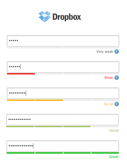
It’s clever idea, but it gets awful preachy for my tastes on some sites. The implementation also leaves a lot to be desired, as it’s left up to the whims of the site owner to decide what password strength means. One site’s “good” is another site’s “get outta here with that Fisher-Price toy password.” It’s frustrating.
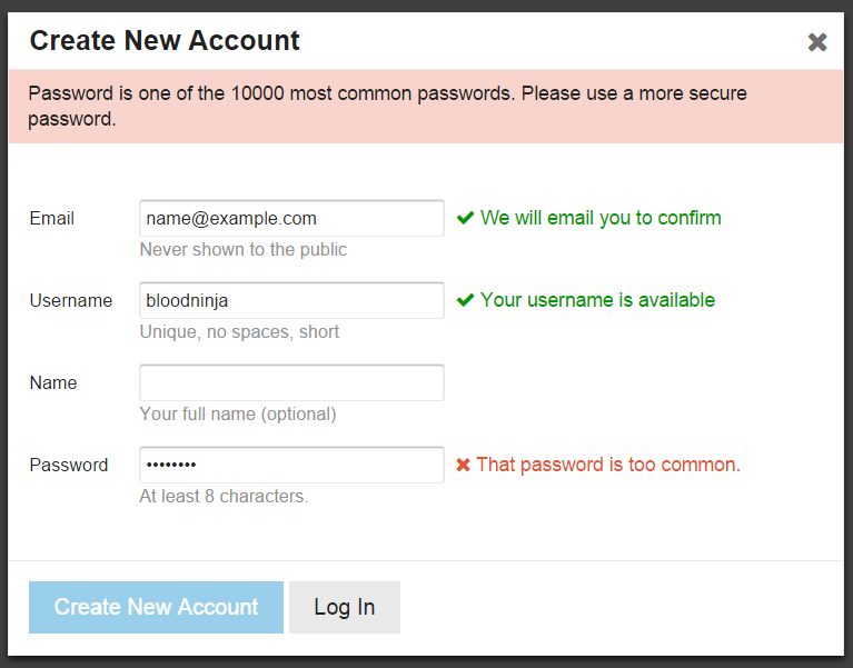
So, with Discourse, rather than all that, I decided we’d default on a solid absolute minimum password length of 8 characters, and then verify the password to make sure it is not one of the 10,000 most common known passwords by checking its hash.
Don’t forget the keyboard
I feel like keyboard users are a dying breed at this point, but for those of us that, when presented with a login dialog, like to rapidly type
[email protected], tab, p4$$w0rd, enter
…please verify that this works as it should. Tab order, enter to submit, etcetera.
Rate limit all the things
You should be rate limiting everything users can do, everywhere, and that’s especially true of the login dialog.
If someone forgets their password and makes 3 attempts to log in, or issues 3 forgot password requests, that’s probably OK. But if someone makes a thousand attempts to log in, or issues a thousand forgot password requests, that’s a little weird. Why, I might even venture to guess they’re possibly… not human.

You can do fancy stuff like temporarily disable accounts or start showing a CAPTCHA if there are too many failed login attempts, but this can easily become a griefing vector, so be careful.
I think a nice middle ground is to insert standard pauses of moderately increasing size after repeated sequential failures or repeated sequential forgot password requests from the same IP address. So that’s what we do.
Stuff I forgot
I tried to remember everything we went through when we were building our ideal login dialog for Discourse, but I’m sure I forgot something, or could have been more thorough. Remember, Discourse is 100% open source and by definition a work in progress – so as my friend Miguel de Icaza likes to say, when it breaks, you get to keep both halves. Feel free to test out our implementation and give us your feedback in the comments, or point to other examples of great login experiences, or cite other helpful advice.
Logging in involves a simple form with two fields, a link, and two buttons. And yet, after reading all this, I’m sure you’ll agree that it’s deceptively complex. Your best course of action is not to build a login dialog at all, but instead rely on authentication from an outside source whenever you can.
Like, say, God.


