The End of Pagination
What do you do when you have a lot of things to display to the user, far more than can possibly fit on the screen? Paginate, naturally.
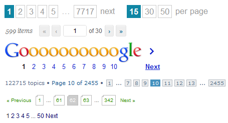
There are plenty of other real world examples in this 2007 article, but I wouldn’t bother. If you’ve seen one pagination scheme, you’ve seen them all. The state of art in pagination hasn’t exactly changed much – or at all, really – in the last 5 years.
I can understand paginating when you have 10, 50, 100, maybe even a few hundred items. But once you have thousands of items to paginate, who the heck is visiting page 964 of 3810? What’s the point of paginating so much information when there’s a hard practical limit on how many items a human being can view and process in any reasonable amount of time?
Once you have thousands of items, you don’t have a pagination problem. You have a search and filtering problem. Why are we presenting hundreds or thousands of items to the user? What does that achieve? In a perfect world, every search would result in a page with a single item: exactly the thing you were looking for.
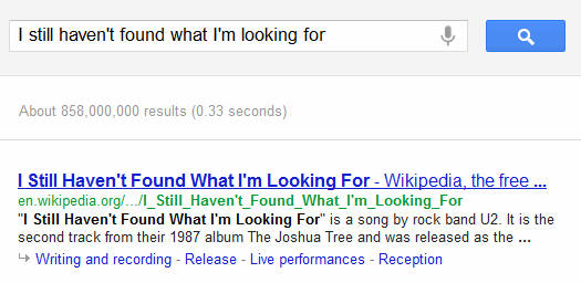
But perhaps you don’t know exactly what you’re looking for: maybe you want a variety of viewpoints and resources, or to compare a number of similar items. Fair enough. I have a difficult time imagining any scenario where presenting a hundred or so items wouldn’t meet that goal. Even so, the items would naturally be presented in some logical order so the most suitable items are near the top.
Once we’ve chosen a suitable order and a subset of relevant items… do we really need pagination at all? What if we did some kind of endless pagination scheme, where we loaded more items into the view dynamically as the user reaches the bottom? Like so:
It isn’t just oddball disemvowelled companies, either. Twitter's timeline and Google’s image search use a similar endless pagination approach. Either the page loads more items automatically when you scroll down to the bottom, or there’s an explicit “show more results” button.
Pagination is also friction. Ever been on a forum where you wished like hell the other people responding to the thread had read all four pages of it before typing their response? Well, maybe some of them would have if the next page buttons weren’t so impossibly small, or better yet, not there at all because pagination was automatic and seamless. We should be actively removing friction where we want users to do more of something.
I’m not necessarily proposing that all traditional pagination be replaced with endless pagination. But we, as software developers, should avoid mindlessly generating a list of thousands upon thousands of possible items and paginating it as a lazy one-size-fits-all solution. This puts all the burden on the user to make sense of the items. Remember, we invented computers to make the user’s life easier, not more difficult.
Once you’ve done that, there’s a balance to be struck, as Google’s research tells us:
User testing has taught us that searchers much prefer the view-all, single-page version of content over a component page containing only a portion of the same information with arbitrary page breaks.
Interestingly, the cases when users didn’t prefer the view-all page were correlated with high latency (e.g., when the view-all page took a while to load, say, because it contained many images). This makes sense because we know users are less satisfied with slow results. So while a view-all page is commonly desired, as a webmaster it’s important to balance this preference with the page’s load time and overall user experience.
Traditional pagination is not particularly user friendly, but endless pagination isn’t without its own faults and pitfalls, either:
- The scroll bar, the user’s moral compass of “how much more is there?” doesn’t work in endless pagination because it is effectively infinite. You’ll need an alternate method of providing that crucial feedback, perhaps as a simple percent loaded text docked at the bottom of the page.
- Endless pagination should not break deep linking. Even without the concept of a “page,” users should be able to clearly and obviously link to any specific item in the list.
- Clicking the browser forward or back button should preserve the user’s position in the endless scrolling stream, perhaps using
pushState. - Pagination may be a bad user experience, but it’s essential for web spiders. Don’t neglect to accommodate web search engines with a traditional paging scheme, too, or perhaps a Sitemap.
- Provide visible feedback when you’re dynamically loading new items in the list, so the user can tell that new items are coming, and their browser isn’t hung – and that they haven’t reached the bottom yet.
- Remember that the user won’t be able to reach the footer (or the header) any more, because items keep appearing as they scroll down in the river of endless content. So either move to static headers and footers, or perhaps use the explicit “load more” button instead of loading new content automatically.
For further reading, there’s some excellent Q&A on the topic of pagination at ux.stackexchange.
Above all else, you should strive to make pagination irrelevant because the user never has to look at more than a few items to find what they need. That’s why I suspect Google hasn’t done much with this technique in their core search result pages; if they aren’t providing great results on page 1, it doesn’t really matter what kind of pagination they use because they’re not going to be in business much longer. Take that lesson to heart: you should be worried most of all about presenting a relevant list of items to the user in a sensible order. Once you’ve got that licked, then and only then should you think about your pagination scheme.


