Technological Racism
Brian Kuhn recently described the real risk of technocentrism.
[. . .] people use (or have rejected) particular operating systems, tools, and software that has in turn shaped their perceptions when it comes to making judgments on the various merits of particular technologies. People tend to categorize or identify themselves with particular “technological cultures”; some of the most common being type of operating system they use, development platform, and programming language. Participation and identification with these cultures brings with it a tendency to look at the world primarily from the perspective of one’s own technological culture, or technocentrism.
If you do not make an effort to be aware of being technocentric, it is easy to become a zealot of the the technology you identify most with. I find myself guilty of this at times, and see the results of technocentrism most often in the back and forth arguments of many blog comment posts. You can find this sort of rabid fanaticism and heated arguments all over the Internet, and in my opinion it is to the detriment of all participants.
[We can all] co-exist without all of us ending up resorting to some sort of technology jihad.
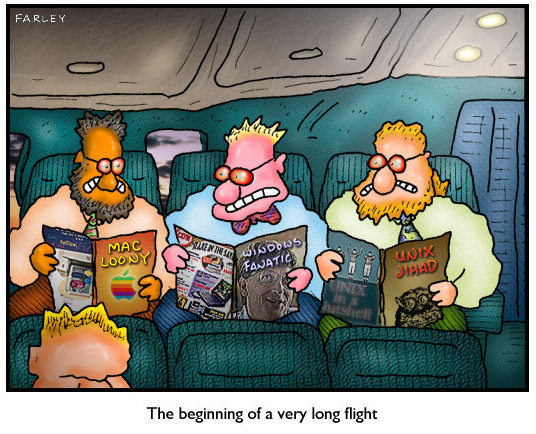
Developers are no strangers to technology jihads; it’s an occupational hazard. But creating a website that intentionally and maliciously makes content look worse in Internet Explorer 6, well, that’s crossing the line from technocentrism into the disturbing realm of technological racism.
If you happen to be using a non-Internet Explorer browser, let me quickly explain the insanity that is unfolding. It seems some people have intentionally modified their blogs/web sites so that they render differently based on the browser you are using. Usually browser detection is used to ensure that a web site renders properly for a variety of platforms, but now we see that this ability can be used for the reverse. If you are using a version of Internet Explorer you get the web site in black and white coloring and it tends to be very, very ugly. If you are using another browser such as FireFox, it renders in color and the font is actually readable. Internet Explorer users also get a message like “Why pay for black and white when you can get full color for free?” at the top of the page.
Although I fully realize that IE6 is the new Netscape 4.7x, such heavy-handed methods are more likely to hurt the cause than advance it. But perhaps Brian’s criticism was ultimately taken to heart; the site in question changed to an alert at the top of the page (visible only in IE) instead of actively making the page content painful to read.
All That Malarkey, a popular CSS design website, does the same thing, but with a decidedly more tongue-in-cheek bent. Here’s a side-by-side shot of the same All That Malarkey page in IE6 and IE7:


It’s a funny nod to the black-and-white fashion style of 2 Tone musical artists. If you scroll to the bottom, the joke is revealed:

It’s clever, but the use of color to discriminate between browsers in both cases is unfortunate; it evokes comparisons with our cultural history of racism and segregation.
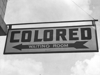
I empathize with the pain that IE6 causes. I really do. But keep the goal in mind: getting people to switch away from a browser that’s nearly six years old. The zealotry and vitriol of technological racism is not a particularly effective way to realize change. The best way to get rid of IE6 is through gentle evangelism. Don’t waste your time attacking the status quo. Instead, spend your time making the alternatives more attractive by supporting and encouraging them.
You’ll always get more flies with honey than vinegar.


