From the dawn of the web – at least since Netscape Navigator 4.x – it has been possible to resize the text on a web page. This is typically done through the View menu.
This was fine in the early, primitive days of the web, when page layouts were simple and
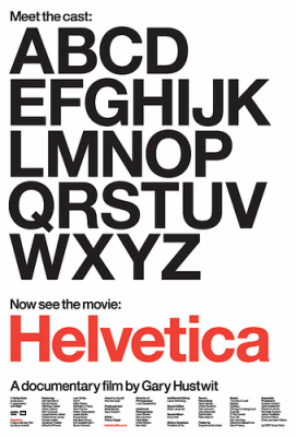
Over the Christmas break, my wife and I visited New York City for the first time. One of the many highlights of our trip was the Museum of Modern Art, which is running a year-long special exhibit, 50 Years of Helvetica. It’s a tiny exhibit tucked away in a
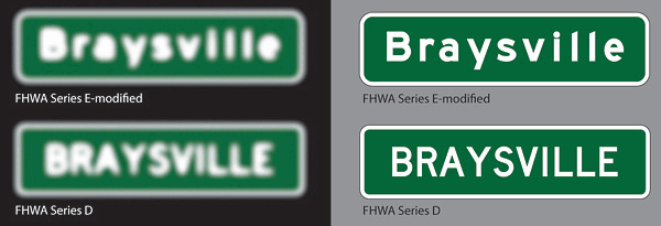
If you think of fonts as a bit of design esoterica, consider this New York Times article on the new Clearview typeface that will appear on all new highway road signs here in the United States:
The problem sounded modest enough: Add more information to the state’s road signs
I’ve finally determined What’s Wrong With Apple’s Font Rendering. As it turns out, there actually wasn’t anything wrong with Apple’s font rendering, per se. Apple simply chose a different font rendering philosophy, as Joel Spolsky explains:
Apple generally believes that the goal of the algorithm
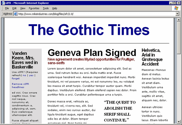
Although I’m no fan of Macromedia Adobe Flash, I have to admit the sIFR JavaScript/Flash typography hack is remarkably well thought out and quite effective. Here’s a small GIF movie of it in action:
It always bugged me that our only alternative for decent web typeface rendering
If you’re not reading the Wichita State Software Usability Research Laboratory newsletter regularly, you should be. It’s an amazing source of usability experiments with actual data, hypotheses, citations, statistics, and all that other stuff that puts the science back into computer science.
A 2001 SURL experiment compared the
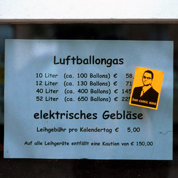
You may be familiar with the font Comic Sans MS:
Over the last 5 years, my wife and I noticed that this annoying font is inordinately popular “in the wild” – we’ve seen it in the strangest places. Enough so that it has become a running joke whenever we see
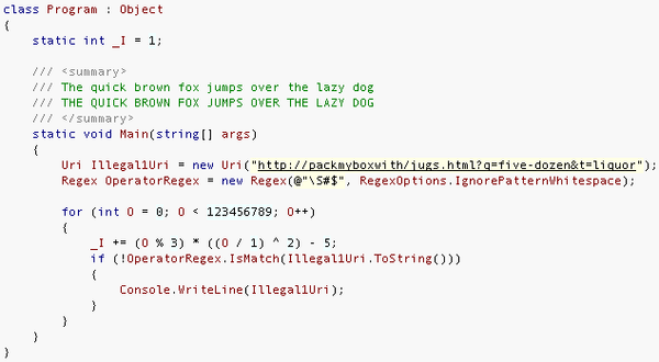
Mike Gunderloy’s book, Coder to Developer, suggests, as part of configuring your IDE, that you explore programming specific fonts. I was intrigued, because I hadn’t ever considered that. I’ve been using Courier New 9 for years. A little searching turned up a few links:
* This programming font