Comic Sans, the Font Of The Gods
You may be familiar with the font Comic Sans MS:

Over the last 5 years, my wife and I noticed that this annoying font is inordinately popular “in the wild” – we’ve seen it in the strangest places. Enough so that it has become a running joke whenever we see it.
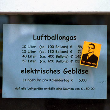
We may be weird, but we’re not alone: there’s a Ban Comic Sans website.
Like the tone of a spoken voice, the characteristics of a typeface convey meaning. The design of the typeface is, in itself, its voice. Often this voice speaks louder than the text itself. Thus when designing a “Do Not Enter” sign the use of a heavy-stroked, attention-commanding font such as Impact or Arial Black is appropriate. Typesetting such a message in Comic Sans would be ludicrous. Though this is sort of misuse is frequent, it is unjustified. Clearly, Comic Sans as a voice conveys silliness, childish naivete, irreverence, and is far too casual for such a purpose. It is analogous to showing up for a black tie event in a clown costume.
There’s also a rather amusing history of comic sans presentation which I recommend – now we know to blame Vincent Connare for this font. Vincent does his best to defend the font on his website:
Comic Sans was designed because when I was working at Microsoft I received a beta version of Microsoft Bob. It was a comic software package that had a dog called Rover at the beginning and he had a balloon with messages using Times New Roman.
Comic Sans was NOT designed as a typeface but as a solution to a problem with the often overlooked part of a computer program’s interface, the typeface used to communicate the message [in a comic character’s message balloon].
There was no intention to include the font in other applications other than those designed for children when I designed Comic Sans. The inspiration came at the shock of seeing Times New Roman used in an inappropriate way.
Proving, yet again, that anything which came from Microsoft Bob cannot be good. The misappropriation of Comic Sans is truly epidemic. At this point, we’re bracing for the inevitable Comic Serif.