Sometimes a Word is Worth a Thousand Icons
Pop quiz, hotshot. What do these toolbar icons do – and what application are they from?

Okay, maybe that’s a bit too monochrome. Does color help?

Okay, let’s try something less abstract. Does a more traditional look help?

So we can see there’s some kind of VCR-like functionality, and some arrows. And Furrygoat’s Law is at work, because I smell some RSS in there... somewhere. Perplexing.
I think you can see where this is going. Sometimes, the best icon choice isn’t an icon. It’s a word. Jef Raskin explains in his book The Humane Interface:
Icons contribute to the visual attractiveness of an interface and, under the appropriate circumstances, can contribute to clarity; however, the failings of icons have become clearer with time. For example, both the Mac and Windows 95 operating systems now provide aids to explain icons: when you point at the icon, a small text box appears that tells you what the icon stands for. The obvious reaction, which I have observed repeatedly when users first see this facility, is – why not just use the words in the first place?
Instead of icons explaining, we have found that icons often require explanation. If you wanted to obscure or to encode an idea to keep it from prying eyes, substituting icons for the words might not be a bad start. The problem with icons can be considered an issue of diminished visibility: the interface presents an icon, but the meaning of the icon is not visible, or it may give the wrong message to someone for whom the graphic is unfamiliar or has a different interpretation. For example, an icon that shows the palm of an upraised hand indicates “halt” in the United States, but signifies “here’s excrement in your face” in Greece.
Now take a look at this alternate, ultra-minimal toolbar skin:

Which of these toolbar skins would you rather use?
I’m not proposing that all icons be replaced with words. Of all the user-created toolbar skins on this page, the best are invariably a combination of icons and words. Graphics alone isn’t enough.
Consider Microsoft Word with all possible toolbars visible:
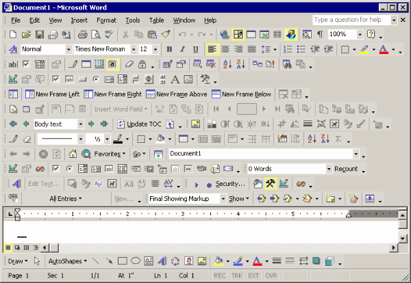
Which of these toolbar buttons are decipherable to you? My eye is inexorably drawn to the toolbar buttons with icons and text. The rest are lost in a morass of 16x16 graphics noise.
It’s experiments like this that convince me the Office 12 UI team is really on to something with the ribbon. Even the traditional menu separators are plumped up with text now.