Coding Horror

programming and human factors

When Hardware is Free, Power is Expensive

Bill Gates has often said that over time, the cost of computer hardware approaches zero. Here's one such example:

Ten years out, in terms of actual hardware costs you can almost think of hardware as being free.

History has proven him right. Computer hardware isn't literally free, of course. But it's effectively free relative to the level of computing power you're getting for your dollar. What does it mean when computer hardware is effectively free, and getting even more free every day?

For one thing, computer software starts to look incredibly expensive. But let's put aside the ratio of software cost to hardware cost for now.

If you're Google, or any other company building out massive datacenter farms, cheap hardware is a strategic advantage. It means you can build larger and larger datacenters for less money. Computers may be smaller and cheaper than ever, but they still require electricity to operate. You now have a new problem. The electrical power used to drive all that free hardware you've amassed becomes your greatest expense:

Over the last three generations of Google's computing infrastructure, performance has nearly doubled, Barroso said. But because performance per watt remained nearly unchanged, that means electricity consumption has also almost doubled.

If server power consumption grows 20 percent per year, the four-year cost of a server's electricity bill will be larger than the $3,000 initial price of a typical low-end server with x86 processors. Google's data center is populated chiefly with such machines. But if power consumption grows at 50 percent per year, "power costs by the end of the decade would dwarf server prices," even without power increasing beyond its current 9 cents per kilowatt-hour cost, Barroso said.

Computer hardware costs may be approaching zero, but power costs are fixed – or rising. The thirst for power in the face of increasingly large datacenters has driven Google to build datacenters in out-of-the-way places where power costs are low:

Google, for example, has watched its energy consumption almost double during the past three generations of upgrades to its sprawling computing infrastructure. It recently unveiled a major new datacenter site in a remote part of Oregon, where power costs are a fraction of those at Google's home base in Silicon Valley. But cheap power may not be enough. Last year, Google engineer Luiz Andr Barroso predicted that energy costs would dwarf equipment costs – "possibly by a large margin" – if power-hungry datacenters didn't mend their ways. Barroso went on to warn that datacenters' growing appetite for power "could have serious consequences for the overall affordability of computing, not to mention the overall health of the planet."

Google doesn't just build their own servers. They build their own power supplies, too:

The power supply to servers is one place that energy is unnecessarily lost. One-third of the electricity running through a typical power supply leaks out as heat, [Urs Hlzle] said. That's a waste of energy and also creates additional costs in the cooling necessary because of the heat added to a building.

Rather than waste the electricity and incur the additional costs for cooling, Google has power supplies specially made that are 90% efficient. "It's not hard to do. That's why to me it's personally offensive" that standard power supplies aren't as efficient, he said.

While he admits that ordering specially made power supplies is more expensive than buying standard products, Google still saves money ultimately by conserving energy and cooling, he said.

Google wants to extend that same efficiency outside their datacenter to your home PC. The three page Google whitepaper High-efficiency power supplies for home computers and servers (pdf) outlines how and why:

At Google, we run many computers in our data centers to serve your queries, so energy conservation and efficiency are important to us. For several years we've been developing more efficient power supplies to eliminate waste from power supplies. Instead of the typical efficiencies of 60-70%, our servers' power supplies now run at 90% efficiency or better, cutting down the energy losses by a factor of four.

We believe this energy-saving power supply technology can be applied to home
computers, too. So we've been working with Intel and other partners to propose a new power supply standard. The opportunity for savings is immense – we estimate that if deployed in 100 million PCs running for an average of eight hours per day, this new standard would save 40 billion kilowatt-hours over three years, or more than $5 billion at California's energy rates.

I can vouch for this: power is incredibly expensive in California, to the point that running even a single PC 24/7 can have a noticeable impact on your power bill.

Google's proposal to increase the efficiency of PC power supplies mirrors a push for efficiency that's been going on for a while in the PC enthusiast space. It's partly a reflection of the quiet PC movement: less heat always equal less noise. But it can also have a bottom-line impact on how much you pay the power company each month.

I'm not aware of any standard PC power supplies that reach the lofty 90% efficiency goal Google claims. What Google's proposing is a deeper, more fundamental change to the way the PC power supply is built – simplifying from multiple voltages (+12v, -12v, 5v, and 3.3v) to a single voltage (12v). But a standard PC power supply of sufficient quality can reach up to 85% efficiency. Consider the following graph comparing the efficiency of two PC power supplies:
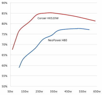
Computer power supply efficiency comparison graph

The graph shows the difference between a typical PC power supply and one of the most energy efficient power supplies currently on the market. The data table tells the story in raw watts:

NeoPower 480 Power Supply
AC Input 110 142 220 276 336 390 515 596
DC Output 65 90 150 200 250 300 400 460
Efficiency 59% 63% 68% 72% 74% 77% 78% 77%
Waste 45 52 70 76 86 90 115 136

Corsair HX520W Power Supply
AC Input 64 88 115 183 236 295 350 486 638
DC Output 43 63 89 148 199 251 298 407 519
Efficiency 68% 72% 77% 81% 84% 85% 85% 84% 81%
Waste 21 24 26 35 37 44 52 79 119

It's a decent result; efficiency increases by more than 10 percent across the board. But there's a catch: the power supply efficiency curve peaks at around 250 watts.

Most desktop PCs barely use 200 watts of power. It's extremely difficult to build a desktop computer that uses 250 watts of power without adding a high-powered $300+ gaming class video card to the mix – or even two of them in SLI mode. Furthermore, you'll only reach that level of power usage under extreme load – with the video card and CPU both operating at near 100% usage. In other words, only when you're playing a video game. The difference between idle and gaming load power usage can be more than 100w.

Unless you're a gamer, you won't even come close to 200 watts of power usage, even under full load. And how often is your PC operating at full load? If you're like most users, almost never. Your PC is statistically idle 99% of the time it is turned on. Idle power consumption for a typical desktop PC ranges between 120 and 150 watts. Thus, the real challenge is to deliver 90%+ efficiency at typical idle power consumption levels – 120-150 watts.

The savings from upgrading to an efficient power supply on a single PC are rarely worth it. I'll demonstrate using my old server as an example. It draws 160 watts of power at idle, and is turned on 24/7, 365 days a year. If I was to hypothetically install a power supply in this server that was 15 percent more efficient – a best-case scenario – how much power would I save per year?

160 watts * (8,760 hours per year) / 1000 = 1401.6 kilowatt-hours
136 watts * (8,760 hours per year) / 1000 = 1191.4 kilowatt-hours

At the insanely expensive California power rates in my area, that equates to the following dollar amount per year:

1401.6 kilowatt-hours * 14.28 cents / 100 = $200.15
1191.4 kilowatt-hours * 14.28 cents / 100 = $170.13

I'd save a whopping thirty bucks per year. That's not even enough to cover the cost of the energy-efficient power supply! I'd have to amortize the cost of the power supply over three years to justify the expense.

All this tells us is that Google's problems aren't necessarily our personal problems. Not exactly news. But if you multiply that result by the tens of thousands of servers in Google's server farm, all operating at near 100% load, it's a whole different ballgame. Efficiency is a strategic business decision for Google. Considering the millions upon millions of computers in the world, more efficient PC power supplies are also part of the greater public good. Do no evil, indeed.

Discussion

JavaScript: The Lingua Franca of the Web

Mike Shaver, a founding member of the Mozilla team, has strong feelings about how the web became popular:

If you choose a platform that needs tools, if you give up the viral soft collaboration of View Source and copy-and-paste mashups and being able to jam jQuery in the hole that used to have Prototype in it, you lose what gave the web its distributed evolution and incrementalism. You lose what made the web great, and what made the web win.

The radically open source, viral nature of the View Source menu is certainly a key part of the web's success. But that's only part of the story. The increasing maturity of the JavaScript implementation in modern browsers is the foundation of the web's present and future:

One ingredient of [Web 2.0] is certainly Ajax, which I can still only just bear to use without scare quotes. Basically, what "Ajax" means is "Javascript now works." And that in turn means that web-based applications can now be made to work much more like desktop ones.

Like many programmers, I initially wrote off JavaScript as a toy language. Even Douglas "my middle name is JavaScript" Crockford was guilty of this misconception:

When JavaScript was first introduced, I dismissed it as being not worth my attention. Much later, I took another look at it and discovered that hidden in the browser was an excellent programming language. My initial attitudes were based on the initial positioning of JavaScript by Sun and Netscape. They made many misstatements about JavaScript in order to avoid positioning JavaScript as a competitor to Java. Those misstatements continue to echo in the scores of badly written JavaScript books aimed at the dummies and amateurs market.

Regardless of your original feelings towards the language, JavaScript has come a long way since the bad old days of 1995. We've got CPU power to burn on the client; so much power, in fact, that even an interpreted, dynamic language like JavaScript can be a credible client-side development environment. The language has been standardized as ECMA-262, edition 3 since 1999, so there's now a reasonable expectation of compatibility across browsers.

More and more websites leverage JavaScript to stretch the boundaries of what the browser can do. The idea of browsing today's web with JavaScript disabled is almost quaint. With the success of so many startups based on nothing but JavaScript, HTML, and the server-side language of their choice, you'd think JavaScript would enjoy some hard-won respect by now. But I still see a lot of angst and ennui towards JavaScript from developers, even today. Scott Koon had a clever way of putting it:

[JavaScript won] by default. People wanted to build better web applications. Programming against Flash movies sucked. Javascript was already in all the browsers. If you're the last man left on earth, it doesn't matter how ugly you are when the women come to re-populate the planet.

Some programmers will do almost anything to avoid getting their feet dirty in the highly imperfect world of JavaScript. Vendors are all too willing to offer up their alternatives:

Despite all the pretenders to the throne, JavaScript isn't going away any time soon. JavaScript is the world's most ubiquitous computing runtime. It's time we learned to accept and embrace JavaScript rather than blindly fighting it. That doesn't mean we can't explore alternatives-- but the best way to transcend the limitations of JavaScript is to immerse yourself in those limitations. At least that way you know what you're fighting for, and what the alternatives really mean.

Is JavaScript annoying at times? Sure. Is it aggravating to deal with all the cross-browser issues you'll inevitably run into? Absolutely. Is debugging in the browser a pain in the butt? You bet it is, although FireBug helps. But JavaScript, in its way, is as groundbreaking as it is infuriating:

JavaScript's C-like syntax, including curly braces and the clunky for statement, makes it appear to be an ordinary procedural language. This is misleading because JavaScript has more in common with functional languages like Lisp or Scheme than with C or Java. It has arrays instead of lists and objects instead of property lists. Functions are first class. It has closures. You get lambdas without having to balance all those parens.

JavaScript is the lingua franca of the web. Ignore it at your peril.

If you're looking to get reacquainted with JavaScript, the best single resource on the web is still Douglas Crockford's site. I can also recommend Douglas Crockford's series of Yahoo videos, which provide an excellent overview of modern thinking in JavaScript.

You can download the companion slides for these presentations from the excellent Yahoo User Interface Blog.

There are some exciting JavaScript alternatives on the horizon. Some will be successful; some won't. In all the hubbub over new tools and new choices, don't forget that JavaScript remains an excellent choice for rich internet application development -- and as the existing lingua franca of the web, its success is guaranteed.

Discussion

Productivity Tip: Upgrade Your Pentium 4

In C# and the Compilation Tax, several commenters noted that they have "fast dual-core computers", and yet background compilation performance was unsatisfactory for them on large projects. It's entirely possible that this is Visual Studio's fault. However, I'd like to point out that not all dual core computers are created equal. Not by a long shot.

Take a look at this Visual C++ compilation benchmark. Details of the benchmark methodology are available on this page, but for now let's assume this is typical compilation performance in a typical IDE. The baseline score of 100 represents a 2.6 GHz Pentium D 805 CPU.

Visual C++ Compilation time CPU benchmark results

Clearly the multiple core future has already arrived-- every CPU you see here is a dual-core model. Many Pentium 4 models come in dual-core flavor.

The CPU at the bottom of the benchmark results isn't just any garden variety Pentium 4, though. It's the Pentium 965 "Extreme Edition", the absolute pinnacle of the Pentium 4 CPU family. It's a 3.73 GHz dual-core, dual-hyperthreaded CPU that originally retailed for almost a thousand dollars. The fastest possible Pentium 4 is nearly 50 percent slower at compilation than a midrange Athlon 64 or Core 2 Duo CPU. But wait! It gets worse!

Consider WorldBench - Mozilla 1.4 results. The times shown are in seconds; lower scores are better.

WorldBench - Mozilla 1.4 benchmark CPU results

Bringing up the rear, by a large margin, are two members of the Pentium 4 CPU family. The 3.6 GHz Pentium D 960 is almost twice as slow as the 2.6 GHz Core 2 Duo E6700 in Mozilla.

Perhaps this is why Tech Report called the Pentium 4 "[a] CPU based on a lame-duck microarchitecture."

If you're running a Pentium 4 CPU-- even a "fast" 3.4 GHz+ dual-core model-- you could more than double your performance by upgrading to a middle-of-the-road Core 2 Duo CPU. And I'm not talking about meaningless synthetic performance benchmark numbers; I'm talking about performance in real world apps that software developers use every day, meat and potatoes stuff like web browsers and compilers.

If you're using a Pentium 4 CPU of any kind, consider upgrading at the earliest possible opportunity. Given how much software developers are paid, it makes no economic sense to hobble them with old, slow PCs based on the underperforming Pentium 4 CPU. Demand your rights. You can pick up a midrange Core 2 Duo system, sans monitor, for under a thousand dollars. Isn't the value of your time worth at least that?

Discussion

Reducing User Interface Friction

Tantek elik recently wrote a great entry on cognitive load in user interface, comparing instant messaging and email:

To instant message (IM) someone, you merely:

  1. switch to your IM client
  2. double click their name
  3. type your message
  4. press return

To email someone, you have to:

  1. switch to your email client
  2. choose "New/Compose Message" from the interface
  3. type the recipient's name (autocomplete in most email programs typically helps to reduce this to 3-4 keystrokes)
  4. type tab or return to go to the next field (typically another to or cc field)
  5. type tab or return again to go to the subject field
  6. think up a subject (or ideally skip it)
  7. type a subject (or ideally skip it)
  8. type tab or return again to go to the message body field
  9. type in your message
  10. click send

Ideally, assuming no subject (which is atypical), and only typing 3 letters to autocomplete the recipients name, that's ten steps-- more than 3x the interface overhead of IM.

Jan Miksovsky covers similar ground when enumerating the hurdles at the entrance to a website:

  1. Figure out what the service does, and whether it meets your needs.
  2. Find the entry point for signing up.
  3. Pick a user ID.
  4. If the user ID isn't an email address, enter their email address.
  5. Pick a password.
  6. Enter the password again to confirm it.
  7. Pick the password several more times to comply with arbitrary security requirements.
  8. Write down the password somewhere before you forget the new variation of your usual password that finally made it past the arbitrary security requirements.
  9. Enter personal data used to configure the service to your needs. Comply with (or carefully turn down) requests for demographic data for marketing purposes. This may include opting out of requests to be added to email newsletters.
  10. Agree to terms of use and other legal agreements.
  11. Activate their account. The user might need to switch to a completely different application-- their email client-- and look for a message from the service.
  12. Download software. If the service entails client software or browser plug-ins, the user has an additional dozen hurdles to jump through: the browser's save dialog, progress dialog, "Are you sure you want to run this?" dialog, an elevate-to-administrator security dialog, and probably a firewall dialog-- not to mention the software's own overly long sequence of setup questions.

John Gruber offers another example comparing calendar entry overhead:

My typical usage [in iCal]:

  1. Double-click on the date of the event in month view.
  2. Type the event name.
  3. Tab past Location.
  4. Tab past "all-day" checkbox.
  5. Tab past Month.
  6. Tab past Day.
  7. Tab past Year.
  8. Enter the hour.
  9. Enter the minutes.
  10. Swap the AM/PM.

Compare and contrast to the event entry UI for the calendar feature in Backpack:

  1. Double-click on the date of the event in month view.
  2. Type the time and name of the event.

Whether you call it cognitive load, a sequence of hurdles, interface overhead, or just plain excise, it all adds up to the same thing: interface friction for the user. Sand in the gears of their mind. One more unnecessary thing they have to think about before using your application.

How many steps does it take to do something in your application? Have you counted? Have you thought about ways to reduce or eliminate those steps for your users? If not, you absolutely should be. Fire up your application and start counting as you click and type through the most common user scenarios. I think you'll be unpleasantly surprised.

Some interface friction is inevitable. But it is possible to reduce interface friction to an absolute minimum. One of the best "frictionless" sign-up user interfaces I've ever seen is at reddit. If you click any element that requires login, you're presented with an overlay <div> that allows you to sign up in a single step and also complete the action you originally clicked on, in one fell swoop:

Reddit login

Reduced interface friction goes a long way toward explaining the popularity of services like twitter and tumbr. What's the minimum amount of effort a user can expend to produce something? The answer could be a key competitive advantage.

That single input box on the Google homepage starts to look more and more like an optimal user experience. It might be unrealistic to reduce your application's UI to a single text box-- but you should continually strive to reduce the friction of your user interface.

Discussion

Meet The Inventor of the Mouse Wheel

The mouse wheel is so integral to my mousing experience now that it's difficult to imagine using a GUI without one. Although I clearly remember using mice without scroll wheels, I can't recall exactly when the transition occurred-- when mouse wheels became a standard, expected feature on every mouse as they are today.

The first reference to a mouse with a wheel I can find is the Genius EasyScroll mouse, which was released in 1995.

genius easyscroll mouse, 1995

With those terrible aesthetics, it's not surprising that mouse wheels weren't truly popularized until the first Microsoft Intellimouse was released in 1996.

original intellimouse explorer, 1996

I would argue that the mouse wheel is the first true mouse innovation since the invention of the mouse itself. Given its importance, I've often wondered exactly how the mouse wheel was invented, but I could never find a source of any kind.

Matt Young was kind enough to forward me a link finally revealing who invented the mouse wheel: Microsoft's Eric Michelman, as described in his article The History of the Scroll Wheel:

Back in 1993, as I was watching many Excel users do their work, I noticed the difficulty they had moving around large spreadsheets. Finding and jumping to different sections was often difficult. I had the idea that perhaps a richer input device would help.

My original idea was the zoom lever. This was simply a lever, presumably for your non-mouse hand (i.e. on the left side of your keyboard if you're right-handed). When you push it away from you the spreadsheet zooms out. When you pull it towards you, it zooms back in.

I prototyped this by hooking a joystick up to my computer and using DDE to connect it to Excel for zooming. Using a joystick button along with the stick, I also had it do "data zooming", which was drilling in and out through Excel outlines.

This all seemed useful, so I showed it to the Hardware division at Microsoft. They were initially cool to the idea, which I presented as a zoom lever, and it didn't go anywhere at that point.

At this point most people thought it was kind of wacky. Focusing on zooming was a very Excel-centric approach. More specifically, it was a very 2-D centric approach. That is, using an application that presents 2-dimensional data, like a spreadsheet or graphics, it's very useful to zoom in and out. But the other main style of application is a linear flow application like Word, and there it's not as useful. You could do zooming with Word, where zooming out shows you a multi-page view and then you click on a desired page and zoom into it, but that's not as natural as with a spreadsheet or graphics and images.

A number of people suggested adding panning and scrolling functionality. In particular I remember Chris Graham saying zooming was just too limiting and it should pan as well. In response to this feedback, I added panning to the prototype, so moving the joystick side-to-side and back-and-forth scrolled Excel in the corresponding direction.

Around this time, the hardware guys came back and said that they had considered adding a wheel to the mouse, but they didn't know what it would be used for. Document navigation answered that question, so they said that if I could get Office to support it, they would build it. This really meant Excel and Word since they were the "800 lb gorillas" -- if Excel and Word supported something, then the other Office apps would follow, and if Office as a whole supported something, then everyone else would follow too (this was the early 1993 when Office was the heart of most people's computer usage).

Eric was completely fixated on the idea that the wheel should be for zooming by default, but finally relented when he met resistance from legendary technology journalist Walt Mossberg. Before they shipped it, they added a button under the wheel, and made the default wheel action "scroll".

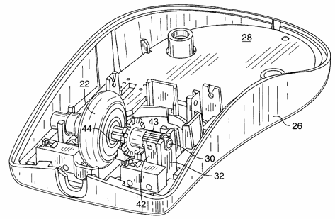
mouse wheel patent figure

The rest, as they say, is history.

After that, mouse wheels-- and the third mouse button under the wheel-- quickly became popular, standard features on every mouse. Although work started on this feature in 1993, and the hardware didn't ship until 1996, the first mouse wheel patent filing from Microsoft is dated 1999.

So here's to you, mouse wheel. Whether you're zooming or scrolling, we owe you-- and Eric Michelman-- a debt of gratitude.

Discussion