Usability vs. Learnability
In this 1996 Alertbox, Jakob Nielsen champions writing for the web in an inverted pyramid style:
Journalists have long adhered to the inverse approach: start the article by telling the reader the conclusion (“After long debate, the Assembly voted to increase state taxes by 10 percent”), follow by the most important supporting information, and end by giving the background. This style is known as the inverted pyramid for the simple reason that it turns the traditional pyramid style around. Inverted-pyramid writing is useful for newspapers because readers can stop at any time and will still get the most important parts of the article.
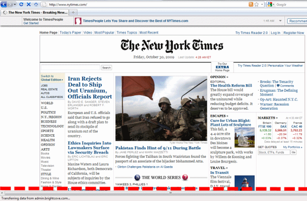
On the Web, the inverted pyramid becomes even more important since we know from several user studies that users don’t scroll, so they will very frequently be left to read only the top part of an article. Very interested readers will scroll, and these few motivated souls will reach the foundation of the pyramid and get the full story in all its gory detail.
For some reason, the idea that “content should never appear below the fold because users don’t scroll” was a very widely held belief well into the millennium. I don’t know what user studies Mr. Neilsen is referring to; even the ancient 1998 reference Web Site Usability: A Designer’s Guide found no evidence to support this claim:
The Fidelity site, more than any other site we tested, went to great lengths to have many of its pages completely above the fold. The result is lots of pages, each with small amounts of content. There was no evidence to suggest that this strategy helped or hurt.
In fact, we never saw any user frustration with scrolling. For instance, when we counted “first clicks” – the first place people clicked when they came to a new site – clicks were just as likely to be above the fold as they were to be below it. If scrolling below the fold was a source of frustration, we would have expected to see some sort of negative correlation between first clicks below the fold and success, but we didn’t.
In 2003, Jakob added an addendum to his Alertbox, which reads:
In 1996, I said that “users don’t scroll.” This was true at the time: many, if not most, users only looked at the visible part of the page and rarely scrolled below the fold. The evolution of the Web has changed this conclusion. As users got more experience with scrolling pages, many of them started scrolling.
You should certainly try to put the most important information at the top of whatever it is you’re writing, be it a website, a program, an email, a resume, etc. Believe me, I’ve learned this the hard way; you’re lucky if they read anything, much less the first paragraph.
But to claim that users don’t scroll is downright ridiculous, even for 1996. Let’s say you had a user who didn’t know how to scroll a web page. How long would it take this user, however timid they may be, to learn that they needed to scroll when browsing the web? A user who can’t learn to scroll within a few hours certainly won’t be using the internet for very long.
In Joel Spolsky’s excellent User Interface Design for Programmers, he notes the difference between Usability and Learnability:
It takes several weeks to learn how to drive a car. For the first few hours behind the wheel, the average teenager will swerve around like crazy. They will pitch, weave, lurch, and sway. If the car has a stick shift they will stall the engine in the middle of busy intersections in a truly terrifying fashion.
If you did a usability test of cars, you would be forced to conclude that they are simply unusable.
This is a crucial distinction. When you sit somebody down in a typical usability test, you’re really testing how learnable your interface is, not how usable it is. Learnability is important, but it’s not everything. Learnable user interfaces may be extremely cumbersome to experienced users. If you make people walk through a fifteen-step wizard to print, people will be pleased the first time, less pleased the second time, and downright ornery by the fifth time they go through your rigmarole.
Sometimes all you care about is learnability: for example, if you expect to have only occasional users. An information kiosk at a tourist attraction is a good example; almost everybody who uses your interface will use it exactly once, so learnability is much more important than usability. But if you’re creating a word processor for professional writers, well, now usability is more important.
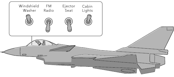
And that’s why, when you press the brakes on your car, you don’t get a little dialog popping up that says “Stop now? (yes/no).”
I was greatly impressed with the expanded book version of Joel’s User Interface Design for Programmers page. I sort of assumed that the book was a mildly enhanced reprint of the HTML, but 7 of the 18 chapters are completely new material. Based on a few quick Google searches, they really are new. And the full color printing is fantastic!
I’ve read a bunch of UI books, and Joel’s is easily in my top three. I’ll definitely be adding it to my recommended developer reading list.