Measuring Font Legibility
If you think of fonts as a bit of design esoterica, consider this New York Times article on the new Clearview typeface that will appear on all new highway road signs here in the United States:
The problem sounded modest enough: Add more information to the state’s road signs without adding clutter or increasing the physical size of the sign itself. But with the existing family of federally approved highway fonts – a chubby, idiosyncratic and ultimately clumsy typeface colloquially known as Highway Gothic – there was little you could add before the signs became visually bloated and even more unreadable than they already were. “I knew the highway signs were a mess, but I didn’t know exactly why,” Meeker recalled.
Around the same time Meeker and his team were thinking about how to solve the problem of information clutter in Oregon, the Federal Highway Administration was concerned with another problem. Issues of readability were becoming increasingly important, especially at night, when the shine of bright headlights on highly reflective material can turn text into a glowing, blurry mess. Highway engineers call this phenomenon halation and elderly drivers, now estimated to represent nearly a fifth of all Americans on the road, are most susceptible to the effect.
I’ve always considered road signs a rich field for study, as signage design has many parallels to modern GUI design in computer science. The accompanying slideshow for the article provides this image which illustrates the halation problem.
You could improve readability by simply making the font bigger. But this would result in billions of dollars spent on larger signs that increase visual clutter on the roadways. The Clearview font is an attempt to fundamentally improve readability with better design – a completely redesigned typeface, optimized for highway use.
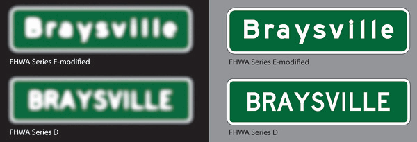
Here’s a detailed comparison of the old FHWA typeface, Highway Gothic, and the new Clearview:
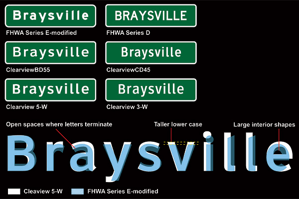
This isn’t just aesthetics – it also results in a practical benefit for drivers. That’s the best kind of design, and like all the best designs, they provide the data to prove it:
Intrigued by the early positive results, the researchers took the prototype out onto the test track. Drivers recruited from the nearby town of State College drove around the mock highway. From the back seat, Pietrucha and Garvey recorded at what distance the subjects could read a pair of highway signs, one printed in Highway Gothic and the other in Clearview. Researchers from 3M came up with the text, made-up names like Dorset and Conyer – words that were easy to read. In nighttime tests, Clearview showed a 16 percent improvement in recognition over Highway Gothic, meaning drivers traveling at 60 miles per hour would have an extra one to two seconds to make a decision.
I’ve talked before about font legibility experiments, where fonts designed for the web allowed users to read faster. This isn’t opinion; it’s backed by actual experimental data. There was a more recent experiment from the same source that also found even more benefits from the newest typefaces designed around RGB anti-aliasing. That’s why I think Microsoft’s font rendering strategy is ultimately smarter than Apple’s.
So before you write off a design exercise as seemingly trivial as font choice, consider whether that tiny bit of design could improve the user experience, if only a little. And more importantly – how would you measure the improvement?