Logging in with the Keyboard
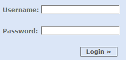
The standard login form is everywhere. It’s unavoidable. And it’s a giant pain in the butt.

As much as we see login forms every day, you’d think we would have mastered them by now. Unfortunately, we haven’t. Here’s what I’ve observed users doing, over and over again:
- Move the mouse to the username field.
- Click the mouse button.
- Type a username.
- Move the mouse to the password field.
- Click the mouse button.
- Type a password.
- Move the mouse to the login button.
- Click the mouse button.
Every time I watch someone do this, a little part of me dies inside. And I see it all the time.
I’m not just talking about casual users like our parents. I’m talking about our fellow software developers, and other users who work with the computer for most of the day. People who really should know better.
What kills me about this is all the needless, painful transitions between the mouse and the keyboard. Your fingers are already on the keyboard while you’re typing – just add a little Tab and Enter to the mix! I’m no keyboard Nazi. All I want is to save users a few precious seconds as they slog through the endless logins during their work day. And it’s so darn easy, too:
- Type a username.
- Press the Tab key.
- Type a password.
- Press the Enter key.
See? Wasn’t that nice?* Now it’s your turn to play Keyboard Appleseed and spread the word so your fellow coworkers can spend less time logging in – and more time getting actual work done.
*Although this is the accepted standard behavior for login forms, it is possible for incompetent developers to screw this up. But that advice doesn’t apply to the developers reading this blog... right?


