Information Density and Dr. Bronner
Edward Tufte, in his new book, Beautiful Evidence, continues on his crusade for information density. Here’s a representative recap of a Tufte seminar from 2001:
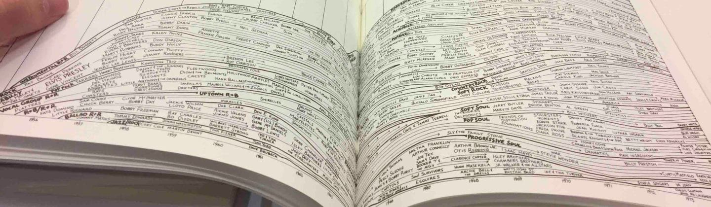
Tufte spent most of his talk walking around the room while talking on a wireless mike. He had two projectors set up, but for the most part he only displayed pages or pictures from his books, instructing the audience to follow along in their own copies (which had been provided to every attendee). He occasionally carried around some other props, in particular a few 400-year old books from his personal library. This style not only entertained and engaged the audience, it also emphasized one of his main points, which is that progress is often measured in data density - how many bits per unit of area can be accommodated by a hard drive or a display.
In terms of text display, a page in a phone book can hold 36K of information, while the best display can only show about 5K. If you look at something like a topographical map, the resolution available on paper is a factor of ten, at least, beyond what can be shown on a screen.
Tufte feels that the same mantra about data density should be applied to web sites, and in fact to the entire contents of the computer display that the user sees when navigating a web site. Thus, he dislikes task bars, menu bars, status bars, and other GUI screen overhead, since they constrict how much of the display can be used for content. Once you get to the actual site, he has similar disdain for banner ads, navigation bars, graphical frills, and the like.
Tufte feels that the main measure of a web site (or any computer interface) should be the percentage of the screen that is actually devoted to the task at hand. He wants web pages to use words instead of icons, because [words] can display information more compactly. He does not like navigation bars, but instead wants as many choices as possible on the main page.
You’ll find the same theme repeated in all of Tufte’s books: progress is measured in information density.
Although I definitely understand the desire for maximizing content and minimizing UI clutter, I have a hard time squaring the desire for maximum information density with the current Web 2.0 drive for minimalist content.
These days, you rarely see screens packed densely with content and hundreds of links, but that’s what Tufte seems to be asking for. We even make fun of the Yahoo home page because it has become so dense over time. Are we wrong, and Tufte is right? Average display resolutions haven’t increased that much between 1996 and 2006; we went from 800x600 to 1280x1024 or thereabouts. And we have the RGB magic of ClearType which increases effective horizontal resolution by about 3x.
Maybe the Yahoo home page design overreaches because it’s now being designed as if it was a printed page. We have higher resolutions, sure, but computer displays are still nowhere near the resolution of a printed page. Perhaps the current trend of design minimalism is simply eliminating wishful thinking: mating the very low resolution of a computer screen (as compared to a printed page) with a corresponding reduction in content.
But Tufte isn’t the only design guru to worship at the altar of information density. Jef Raskin, in The Humane Interface, talks about this at some length. He even references Tufte directly:
We seem to have a real fear of displaying data in our interfaces. We know that people can quickly find one among a few items much more quickly than they can find one among dozens: there is less to look through. But it does not follow, as some seem to think, that it is therefore better to have fewer items on each screen. If you have hundreds of items and split them up among dozens of screens, you lose more in navigation time than you gain in searching for the individual item, even if the one you seek is swimming in a sea of similar-looking items.
Visual designer Edward Tufte’s first three principles for displaying information are:
- Above all else, show the data.
- Maximize the data-ink ratio.
- Erase nondata ink.
All we need to do is substitute pixels for ink for his advice to apply to display-based devices. A serious, professional user wants screens packed with useful stuff. Screens should be well labeled, with methods to make finding things easier and dense with the information that represents the real value of each screen.
One of the most remarkable examples of information density, at least in a commercial product, is Dr. Bronner’s soaps:
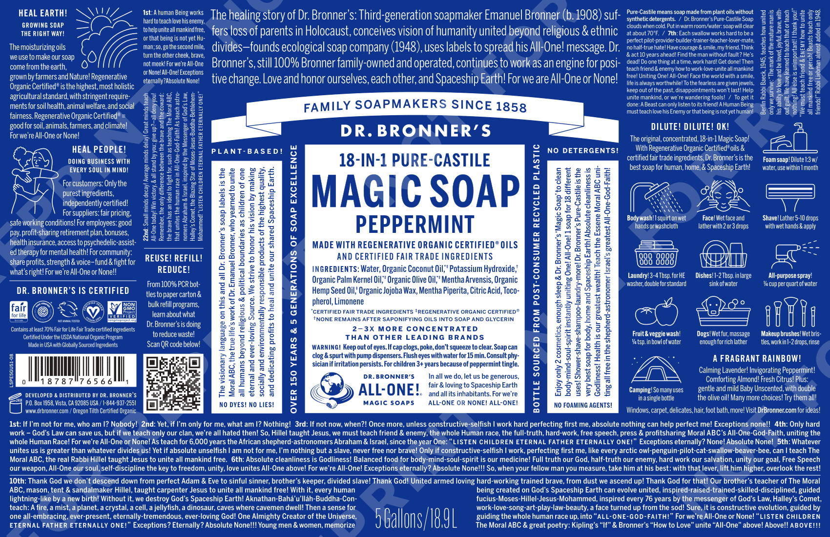
Click the image to see a larger version. You can also obtain PDF versions of the labels directly from the company website (scroll to the bottom).
I remember the first time I saw a Dr. Bronner product; the incredible density of the tiny text on the label drew me to it. Yes, they’re filled with half-crazy religious ravings. Not so fun in person, but if someone is this jazzed about a bar of soap, it’s somehow endearing. You can see a small video clip of Bronner ranting in person via the Dr. Bronner’s Magic Soapbox documentary trailer.
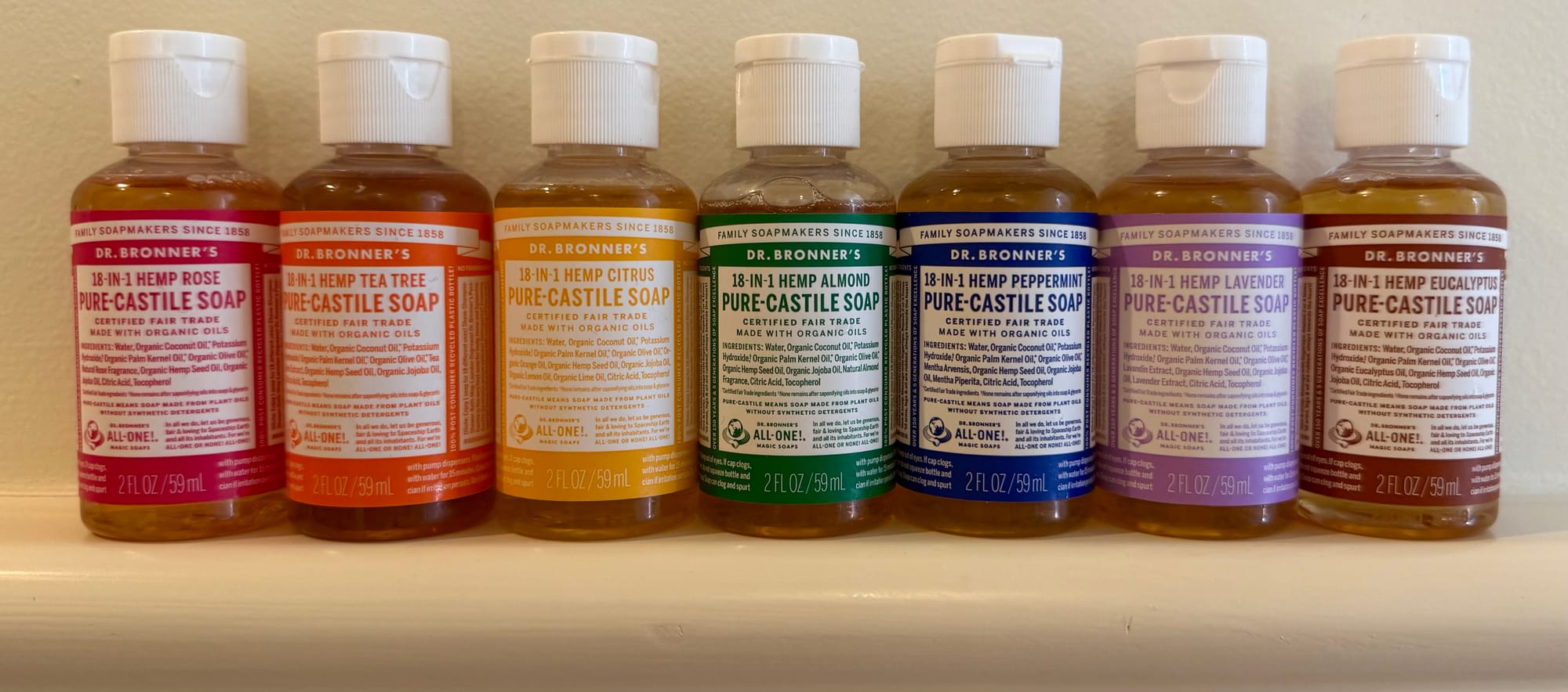
You’d think a label filled with reams of tiny, indecipherable text would be the kiss of death for any commercial product. Not so for eccentric Dr. Bronner and his soaps. Is it a victory for information density? Maybe. I think Craigslist is conceptually pretty close to what Dr. Bronner was doing.