Don’t Click Here: The Art of Hyperlinking
I’ve often thought there is a subtle art to the humble hyperlink, that stalwart building block of hypertext, the stuff that Ted Nelson’s Xanadu dream was made of.
The word hypertext was coined by Nelson and published in a paper delivered to a national conference of the Association for Computing Machinery in 1965. Adding to his design for a nonsequential writing tool, Nelson proposed a feature called “zippered lists,” in which elements in one text would be linked to related or identical elements in other texts. Nelson’s two interests, screen editing and nonsequential writing, were merging. With zippered lists, links could be made between large sections, small sections, whole pages, or single paragraphs. The writer and reader could manufacture a unique document by following a set of links between discrete documents that were “zipped” together.
Many precedents for the idea of hypertext existed in literature and science. The Talmud, for instance, is a sort of hypertext, with blocks of commentary arranged in concentric rectangles around the page. So are scholarly footnotes, with their numbered links between the main body of the text and supplementary scholarship.
In July 1945, long before Nelson turned his attention to electronic information systems, Vannevar Bush published an essay titled “As We May Think” in The Atlantic Monthly, which described a hypothetical system of information storage and retrieval called “memex.” Memex would allow readers to create personal indexes to documents, and to link passages from different documents together with special markers. While Bush’s description was purely speculative, he gave a brilliant and influential preview of some of the features Nelson would attempt to realize in Xanadu.
The inventor’s original hypertext design predicted most of the essential components of today’s hypertext systems. Nonetheless, his talk to the Association for Computing Machinery had little impact. There was a brief burst of interest in this strange researcher, but although his ideas were intriguing, Nelson lacked the technical knowledge to prove that it was possible to build the system he envisioned.
I distinctly remember reading this 1995 Wired article on Ted Nelson and Xanadu when it was published. It had a profound impact on me. I’ve always remembered it, long after that initial read. I know it’s novella long, but it’s arguably the best single article I’ve ever read in Wired; I encourage you to read it in its entirety when you have time. It speaks volumes about the souls of computers – and the software developers who love them.
Xanadu was vaporware long before the term even existed. You might think that Ted Nelson would be pleased that HTML and the world wide web have delivered much of the Xanadu dream, almost 40 years later. But you’d be wrong:
HTML is precisely what we were trying to prevent – ever-breaking links, links going outward only, quotes you can’t follow to their origins, no version management, no rights management.
I suspect Wikipedia may be closer to Ted’s vision of Xanadu: a self-contained constellation of highly interlinked information, with provisions for identity, versioning, and rights management.
But enough about the history of the hyperlink. How can we use them effectively in the here and now? I thoroughly enjoyed Philipp Lenssen’s recent link usability tips. I liked it so much, in fact, that I’m using it as a template for a visual compendium of link usability tips – the art of hyperlinking.
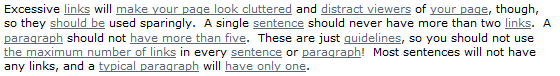
- Don’t link everything. Using too many links will turn your text into noise. This works in two dimensions: excessive linking makes text difficult to read, and excessive linking causes deflation in the value of all your existing links. Link in moderation. Only link things important enough to warrant a link.
- The first link is the most important one. The first link will garner most of the reader’s attention, and the highest clickthrough rates. Choose your first link appropriately. Start with the important stuff. Don’t squander your first link on a triviality.
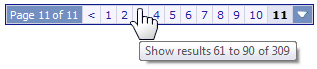
- Ensure your links are large enough to easily click. When building links, don’t run afoul of Fitt’s Law. If what you’re linking is small, make it bigger. If you can’t make it bigger, at least fluff it up a bit with clickable borders so it’s easier for people to accurately click. In the below screenshot, only the numbers are linked, which is a shame.
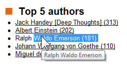
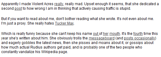
- Don’t link things the user might want to select and copy. Woe upon the poor user who needs to select and copy hyperlinked text. It requires a complex ballet of very precise mouse movements to get it to work at all. Here, I’m trying to select the name “Ralph Waldo Emerson,” which is part of the hyperlink. Granted, this is not a terribly common scenario – it’s probably the most subtle tip on Philipp’s list. But when it happens, it’s awkward and unpleasant, so do give it some consideration.
- Don’t title your link “Click Here.” Don’t even use the words “Click” or “Here” anywhere in your link text. Describe what the link will do for the user when they click on it.

- Don’t radically alter link behavior. Links are the cornerstone of the web. Users have built up years of expectations based on existing behavior in their web browsers. When you change the way hyperlinks work, you’re redefining a fundamental part of the web. Is this really what you want? Is this really what your readers want?
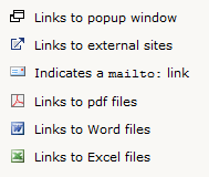
- Don’t include icons on every link. If we’re linking in moderation, we should be using link icons in extreme moderation. If every other link has an icon, it’s noise. Only highly unusual or irregular links should include icons. I’d also argue that your text, if written properly, can easily communicate the type of link as well as an icon can, but this gets into the realm of personal preference.
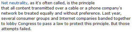
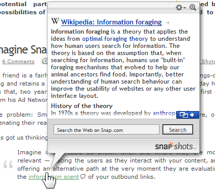
- Don’t make your content depend on links to work. Not everyone will click on your hyperlinks. Either they’re too busy to click every single link you put in front of them, or maybe they’re reading your article in another format where they can’t click on the links: print, offline, or mobile. Either way, it’s important to provide the context necessary to make your content understandable without the need to visit whatever is behind those hyperlinks. (If you’re wondering what this example is about, I should warn you – it’s not worth it. For once the inanity of Digg comments was totally appropriate: “retarded blog war.”)
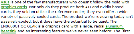
- Don’t hide your links. Hyperlinks should look like hyperlinks. Give them a distinct style, so they cannot be confused with any of the other text on the page. Definitely choose a unique color not used anywhere else on your page, and consider using the well-worn convention of the link underline when necessary. What’s clickable here?
- Don’t obfuscate your URLs. Users can preview where your link will ultimately send them by hovering their mouse over it and viewing the URL in the status bar. Avoid using redirects or URL shortening services which make the URL totally opaque. The user shouldn’t have to take a leap of faith when clicking on your links.
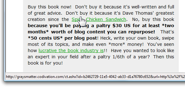
- Don’t mix advertising and links. These look like hyperlinks, but they’re actually advertising. Which type of link is which, again? And why should the user have to think about this?
To head off any potential hate mail headed my way, these are guidelines, not rules. If you know what you’re doing, you also know that rules were made to be broken in the right circumstances. The problem is that most people writing HTML don’t know what they’re doing. A search for “click here” is ample proof of that.
Most of this is advice on writing HTML – which, in my estimation, is basic writing advice in today’s online world. Hyperlinking should be taught alongside Strunk & White as far as I’m concerned. Knowing how to hyperlink effectively is fundamental. But as software developers, we can go farther when writing code – we can control the text of the links we generate, too. I touched on this briefly in Don’t Devalue The Address Bar, but it’s worthy of an entire blog post. In the meantime, Keyvan Nayyeri’s Simplify your URLs is a fantastic starting point.