Avoiding The Uncanny Valley of User Interface
Are you familiar with the uncanny valley?
No, not that uncanny valley. Well, on second thought, yes, that uncanny valley.
In 1978, the Japanese roboticist Masahiro Mori noticed something interesting: The more humanlike his robots became, the more people were attracted to them, but only up to a point. If an android become too realistic and lifelike, suddenly people were repelled and disgusted.
The problem, Mori realized, is in the nature of how we identify with robots. When an android, such as R2-D2 or C-3PO, barely looks human, we cut it a lot of slack. It seems cute. We don’t care that it’s only 50 percent humanlike. But when a robot becomes 99 percent lifelike – so close that it’s almost real – we focus on the missing 1 percent. We notice the slightly slack skin, the absence of a truly human glitter in the eyes. The once-cute robot now looks like an animated corpse. Our warm feelings, which had been rising the more vivid the robot became, abruptly plunge downward. Mori called this plunge “the Uncanny Valley,” the paradoxical point at which a simulation of life becomes so good it’s bad.
This phenomenon has also been noted in cartoons.
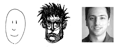
McCloud’s book Understanding Comics was the first place I ran into a concept which is a sort of corollary to the Uncanny Valley. Call it Lake Empathy: If a character is very simple, more iconic than realistic, it’s much easier for people to pour themselves into it – to view it not as a third party, but instead as a personal avatar.
For example, you probably see more of yourself in the character to the left than in the characters to the right.
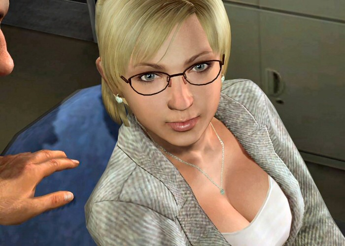
The seminal Understanding Comics was where I first encountered this concept, too. It’s a sort of digital Zeno’s Paradox. The more accurate your digital representation of a person, the more visible the subtle imperfections become. This is why computer generated people in recent movies like Polar Express feel even more unnatural than the highly abstract people in 1995’s Toy Story. (The current state of the art, at least by some accounts, is The Emily Project. You be the judge.)
But does the uncanny valley effect apply to software user interfaces, too? Bill Higgins thinks it does.
The problem is that our minds have a model of how humans should behave and the pseudo-humans, whether robotic or computer-generated images, don’t quite fit this model, producing a sense of unease – in other words, we know that something’s not right - even if we can’t precisely articulate what’s wrong.
There’s a lesson here for software designers, and one that I’ve talked about recently – we must ensure that we design our applications to remain consistent with the environment in which our software runs. In more concrete terms: a Windows application should look and feel like a Windows application, a Mac application should look and feel like a Mac application, and a web application should look and feel like a web application.
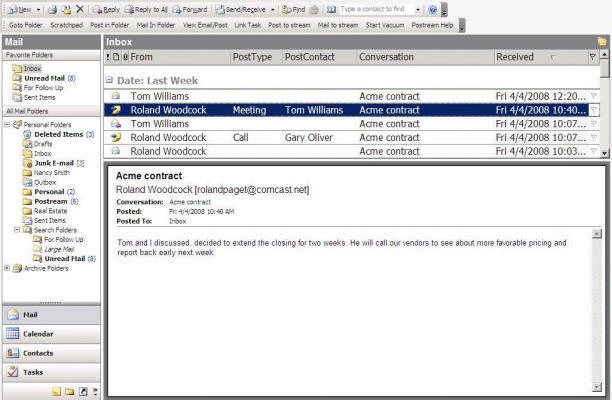
Bill extends this to web applications: a web app that apes the conventions of a desktop application is attempting to cross the uncanny valley of user interface design. This is a bad idea for all the same reasons; the tiny flaws and imperfections of the simulation will be grossly magnified for users. Consider the Zimbra web-based email that Bill refers to.
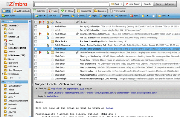
It’s pretty obvious that their inspiration was Microsoft Outlook, a desktop application.
In my experience, shoehorning desktop conventions into web applications rarely ends well. I was never able to articulate exactly why, but the uncanny valley theory goes a long way towards explaining it:
If you’re considering or actively building Ajax/RIA applications, you should consider the Uncanny Valley of user interface design. When you build a “desktop in the web browser”-style application, you’re violating users’ unwritten expectations of how a web application should look and behave. This choice may have significant negative impact on learnability, pleasantness of use, and adoption.
As I’ve mentioned before, one of the great strengths of web applications is that they aren’t bound by the crusty old conventions of desktop applications. They’re free to do things differently – and hopefully better. Web applications should play to their strengths, instead of attempting to clone desktop applications.
If you end up anywhere near the uncanny valley of user interface, that sense of unease you feel is perfectly normal. You’re clearly in the wrong place.