What’s Wrong With Apple’s Font Rendering?
I had read a few complaints that OS X font rendering was a little wonky, even from Joel Spolsky himself:
OS X antialiasing, especially, it seems, with the monospaced fonts, just isn’t as good as Windows ClearType. Apple has some room to improve in this area; the fonts were blurry on the edges.
I didn’t believe it until I downloaded the first beta of Safari 3 for Windows and saw it for myself.
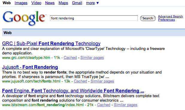
Font rendering in Safari 3 Beta:

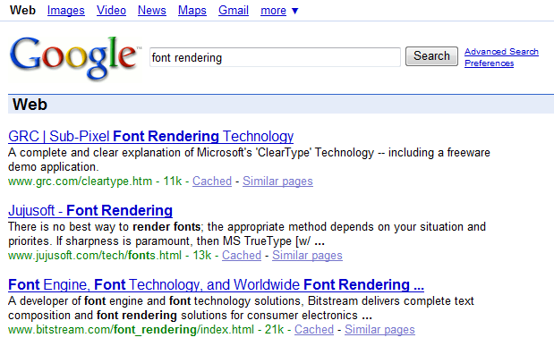
Font rendering in Internet Explorer 7:

All of these screenshots were taken under Windows Vista. It’s easier to see what’s happening if we zoom in a bit. These images are zoomed 200% with exact per-pixel resizing. Safari on the top, IE7 on the bottom:


At first I wasn’t even sure if Apple was using ClearType-alike RGB anti-aliasing, but it’s clear from the zoomed image that they are. It looks like they’ve skewed the contrast of the fonts to an absurdly low level. The ClearType Tuner PowerToy allows you to manually adjust the RGB font aliasing contrast level, as I documented in an earlier blog post, but I don’t think it can go as low as Apple has it set.
I am absolutely not trying to start an OS X versus Windows flame war here. I used the quote above for a reason: there really is no single best way to render fonts; results depend on your display, the particular font you’re using, and many other factors. That said, I’m curious why Apple’s default font rendering strategies, to my eye – and to the eyes of at least two other people – are visibly inferior to Microsoft’s on typical LCD displays. This is exactly the kind of graphic designer-ish detail I’d expect Cupertino to get right, so it’s all the more surprising to me that they apparently haven’t.
Update: I have a followup post that explains the font rendering difference. It looks like neither Apple or Microsoft is wrong; it’s a question of whether you respect the pixel grid.


