What Should The Middle Mouse Button Mean?
Despite Apple’s historical insistence that the computer mouse should only have one button – which led to the highly unfortunate convention of double-clicking – most mice have more than one button today. In his classic book The Humane Interface, Jef Raskin revisits the earliest days of his involvement with the Mac project and realizes that the single button mouse was a mistake. Mice were meant to have multiple buttons.
What I did not see at the time is that multiple buttons on a mouse can work well if the buttons are labeled. If the Macintosh mouse had had multiple buttons, if the buttons had been permanently labeled, and if they had only been used for their intended function, a multiple mouse button might have been a better choice. A better mouse might have two buttons, marked Select and Activate, on top and on the side, a button activated by a squeezing action of the thumb. This last button would be marked Grab. Some mice at present have a scroll wheel on top that is used primarily for scrolling. Better still would be a small trackball in that location. The mouse would control the position of the cursor; the trackball could be used, for example, to manipulate objects or to make selections from menus that float with the cursor.
Doug Engelbart, the inventor of the mouse, also thinks that mice should have multiple buttons:
[Doug Engelbart] believes a mouse should have many buttons... the only reason his original mouse design didn’t have more than three was because they didn’t have the technology at the time to make that possible.
Apple didn’t ship a multiple button mouse until the Mighty Mouse was released in August 2005. It has four effective buttons, and even sports the trackball that Jef Raskin imagined in his book five years earlier. However, I’ve read a lot of complaints about the Mighty Mouse, most of which stem from the substitution of actual buttons with touch-sensitive surfaces.
I’ve used two-button mice as far back as I can remember on the PC. The meaning of the first two mouse buttons are very well defined in every graphical user interface by now:
| Left click | select or activate an item |
| Right click | show contextual menu for an item |
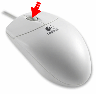
But modern mice actually have at least three buttons. Where’s the third button? Right under your mouse wheel.

Mouse wheels have been commonly available since 1996. In all those years, all those millions of mice shipped, no standard convention has emerged for what it means to press the middle mouse button.
Over the last two or three years, middle click has become strongly associated with tabbed user interfaces, at least in popular web browsers. Middle-clicking over a link opens it in a new tab; middle-clicking the tab itself closes that tab. This is happening in enough applications now that I think it’s fair to call opening and closing tabs with the middle button an emerging convention. Still, it’s a fairly loose convention, and the behavior is only defined for links and tabs respectively, and only in certain applications. What happens the rest of the time when you middle-click?
Another odd middle-click behavior that’s defined in both Internet Explorer and Firefox is the modal “autoscroll mode.” Middle click once on the page to activate this mode. Notice that the cursor changes. You can now use the mouse to determine the rate of scrolling. Middle-clicking again releases this mode and reverts to the normal mouse cursor.

I personally hate this behavior. I prefer to scroll explicitly with the wheel, and I often trigger this unwanted “mode” when I’ve slightly missed middle-clicking on a link. It can be turned off in the advanced options of Firefox but I can find no way to turn it off in Internet Explorer.
In the UNIX and X Windows world, the middle button has also meant paste since way, way back in the 1980s. I can’t find any evidence of this behavior on Windows or the Mac, however. Pasting into text areas wouldn’t necessarily conflict with the tab behavior, but it’s an odd hodgepodge of behaviors to attach to a single button.
I hope over the next few years Microsoft and Apple can decide on a set of standard middle mouse button behaviors. It’s frustrating to me that millions and millions of mice have shipped with this button, and yet it’s a total crapshoot what will happen when you press the middle mouse button in any given application under any operating system. If the first and second mouse buttons have standard, well-defined meanings today – why can’t the third button, too?


