Unnecessary Dialogs: Stopping the Proceedings with Idiocy
Although I like Notepad2, it has some pathological alert dialog behavior, particularly when it comes to searching. Here’s an alert dialog I almost always get when searching a document:
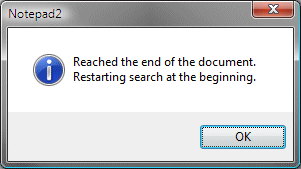
Thanks for the update, Notepad2. I really wanted a whole modal alert dialog to tell me this important fact. And if my search text is not found?
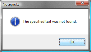
Because I couldn’t possibly tell if the text was not found without a giant... alert... dialog.
These are both unnecessary alert dialogs that, collectively, destroy the flow of my search task. It’s the GUI equivalent of that annoying little kid from Jerry Maguire telling me that:
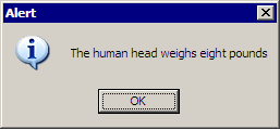
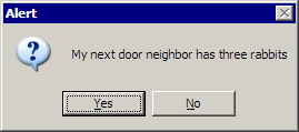
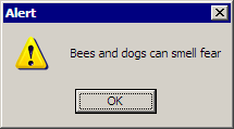
Meanwhile, I’m trying to get some freaking work done.
Alan Cooper, in his book About Face 2.0, calls this stopping the proceedings with idiocy. And that’s exactly what it is.
There is a particular form of excise that is so prevalent it deserves special attention. In Chapter 9, we introduced the concept of flow, where the user enters a highly productive mental state by working in harmony with his tools. Flow is a natural state, and people will enter it without much prodding. It takes some effort to break into flow after someone has achieved it. Interruptions like a ringing telephone will do it, as will an error message box. Most interruptions are avoidable; a few aren’t. But interrupting a user’s flow for no good reason is stopping the proceedings with idiocy and is one of the most disruptive forms of excise.
Poorly designed software will make assertions that no self-respecting individual would ever make. It states unequivocally, for example, that a file doesn’t exist merely because it is too stupid to look for it in the right place, and then implicitly blames you for losing it. A program will cheerfully execute an impossible query that hangs up your system until you decide to reboot. Users view such software behavior as idiocy, and with just cause.
The canonical example of unnecessary dialogs, the delete confirmation dialog, lives on in Windows Vista:
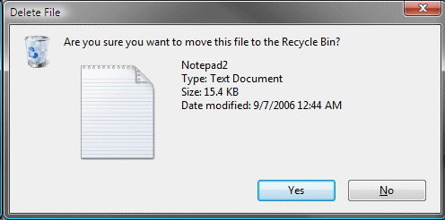
The real irony here is that moving files to the recycle bin is a completely recoverable action. It doesn’t matter what I click in this dialog. If I mistakenly “delete” files this way, I can simply recover them from the recycle bin. This alert dialog is utterly superfluous. It’s just another button I have to click through to get my work done. Sure, I can disable it (and I have), but the fact that the delete confirmation dialog exists at all is a giant sock in the nose for usability professionals everywhere.
Here’s how strongly I feel about this: every time you send your users to an alert dialog, you have failed them. In a perfect world, we should never see a single alert dialog. Ever.
Heck, I’m not even sure the dialog box itself was ever a good idea. There’s a lot of evidence that users never read dialogs and quickly train themselves to mindlessly click through them. Consider Mike’s latest experience:
Over the weekend I was at a meeting of parents where many laptops were open and we were all looking at a spreadsheet. One parent opened the spreadsheet in Excel and was confronted by that big dialog boxes that warns you about macros.
It was classic. She just stopped and said “What am I supposed to do!? What does this mean!?” She did not read one single word of the dialog box text. Being me and all, I said “What does it say?” and more-or-less made her read the text, mostly on principle. Not that it probably helped much, because even when she’d read that “macros can be harmful” or whatever it says, she asked me “But it’s ok to open this spreadsheet?” Yes, it was. Who knows what she would have done if she’d been on her own. I’m not sure she knows what a macro actually is.
The web has been a dialog-free world for years, and nobody seems to miss them very much. Maybe this is why. I dream of the day when we can produce a dialog-free GUI.


