Writing code? That’s the easy part. Getting your application in the hands of users, and creating applications that people actually want to use – now that’s the hard stuff.
I’ve been a long time fan of Krug’s book Don’t Make Me Think. Not just because it’
If you’ve ever wrangled a user interface, you’ve probably heard of Fitts’ Law. It’s pretty simple – the larger an item is, and the closer it is to your cursor, the easier it is to click on. Kevin Hale put together a great visual summary of Fitts’ Law,
After I posted my blog entry on Treating User Myopia I got a lot of advice. Some useful, some not so useful. But the one bit of advice I hadn’t anticipated was that we were not making good use of the area “above the fold.” This surprised me. Does
I try not to talk too much about the trilogy here, because there’s a whole other blog for that stuff. But some of the lessons I’ve learned in the last year while working on them really put into bold relief some of my earlier blog entries on usability
When it comes to user interface design, I’m no guru, but I do have one golden rule that I always try to follow:
Make the right thing easy to do and the wrong thing awkward to do.
The things you want users to do should be straightforward and clear
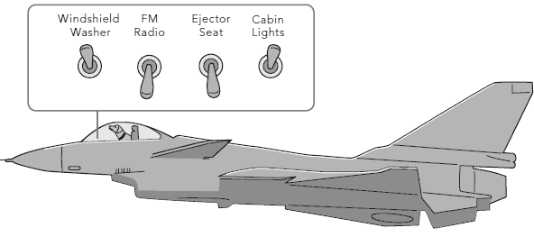
I was struck, the other day, by how much I had to think when attempting to heat up my sandwich in the microwave. There are so many controls: a clock, a set of food-specific buttons, defrost and timer controls, and of course a full numeric keypad. Quick! What do you
Cyrus Najmabadi* hates tabs in web browsers:
Ok, I seriously don’t get tabs on Windows. Hell, I don’t get tabs on OSX either. In the latter there’s a great system called Expos, and in the former the taskbar does the job. Once I start using tabs, things
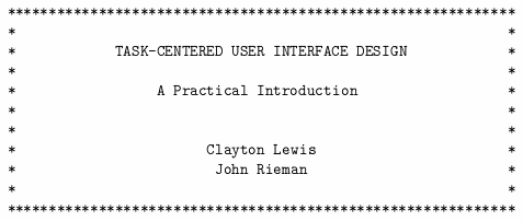
Task-Centered User Interface Design is a 1993 book delivered in digital shareware form, and also available as a PDF. Although it’s almost fifteen years old, it’s still highly relevant – a testament to the timelessness of studying human interface design principles. It was written by Clayton Lewis and John
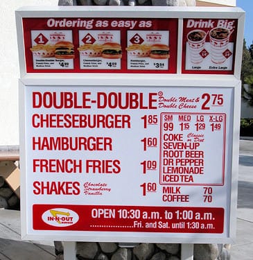
In-N-Out Burger is a fast food institution here in California. Part of their appeal, I think, is their radically simplified menu.
Instead of forcing customers to process a complex menu with a hundred choices, In-N-Out got real and pared it down to what really matters: a burger, fries, and a
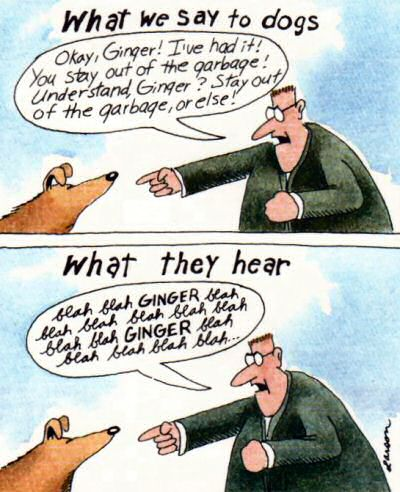
Tantek Çelik recently wrote a great entry on cognitive load in user interface, comparing instant messaging and email:
To instant message (IM) someone, you merely:
1. switch to your IM client
2. double click their name
3. type your message
4. press return
To email someone, you have to:
1.
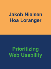
Jakob Nielsen’s new book, Prioritizing Web Usability, is a worthy companion to the previous two. Now it’s a trilogy:
1. Designing Web Usability: The Practice of Simplicity (2000)
2. Homepage Usability: 50 Websites Deconstructed (2002)
3. Prioritizing Web Usability (2006)
You can tell Jakob and his co-authors are
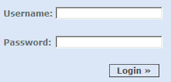
The standard login form is everywhere. It’s unavoidable. And it’s a giant pain in the butt.
As much as we see login forms every day, you’d think we would have mastered them by now. Unfortunately, we haven’t. Here’s what I’ve observed users doing, over