Revisiting Programming Fonts
I’ve experimented with programming fonts and IDE color schemes plenty in the past. But now that I’ve given in to the inevitability of ClearType on large LCDs, I’ve basically settled on Consolas. It’s hard to beat Consolas. It’s darn close to the ultimate monospace programming font in my estimation. That’s why I was so intrigued when I read about Inconsolata, a non-denominational OpenType relative of Consolas, which unlike Consolas, works equally well with ClearType enabled or disabled.
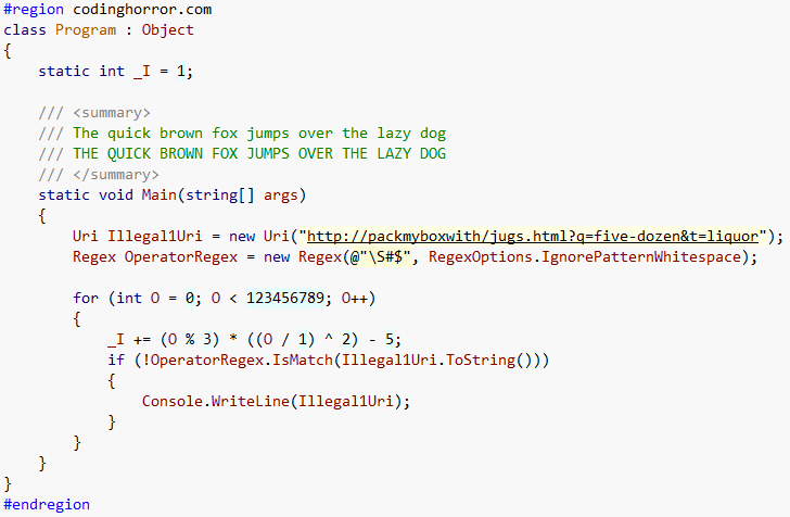
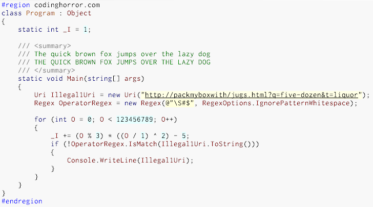
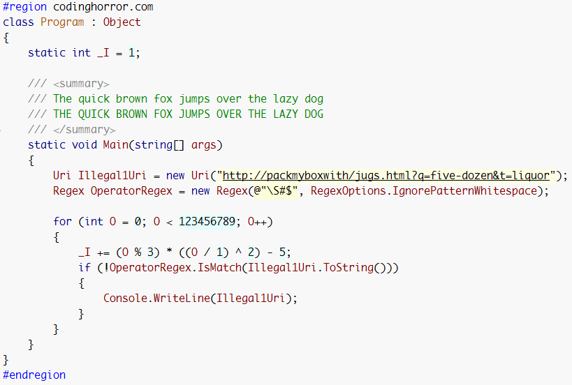
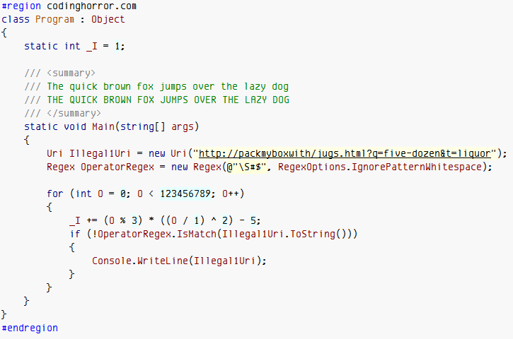
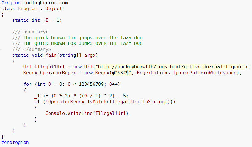
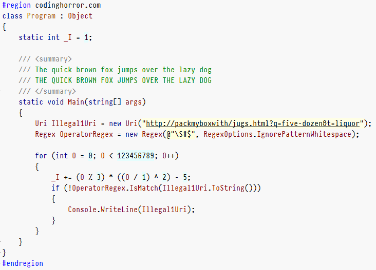
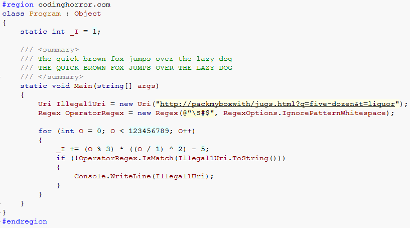
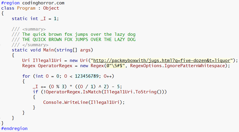
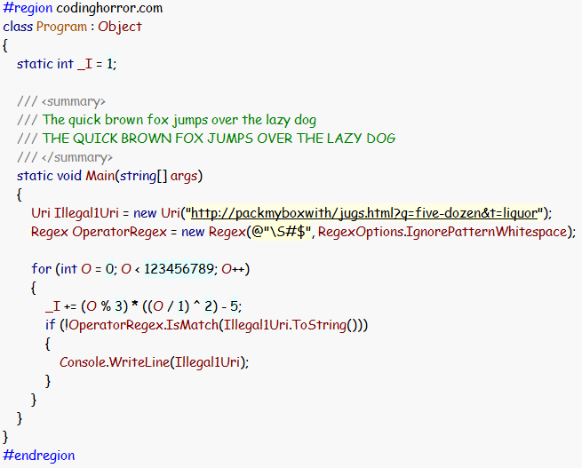
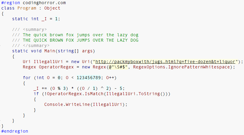
Once I tried out Inconsolata, I figured I might as well revisit all the common, popular programming fonts under the same conditions. So here goes. These are rendered under Windows Vista, with ClearType enabled, using my standard programming font comparison code sample.
Consolas, 11 point.
Inconsolata, 11 point.
Monaco, 11 point.
Envy R, 11 point.
Vera Sans Mono, 11 point.
Pragmata, 11 point.
Courier New, 11 point.
Lucida Typewriter, 11 point.
The Font of the Gods, 11 point.
Andale Mono, 11 point.
Choice of programming font is as much a personal preference as anything else. Decide for yourself what works for you. I’ll limit my comments to a few observations:
- Please don’t use the default Courier New typeface. Be kind to your eyes.
- Personally, I still don’t think anything beats Consolas; it’s an outstanding monospace typeface design, highly optimized for ClearType display on LCDs.
- I’ll never understand the appeal of Monaco amongst the Mac crowd. It’s an unreadable mess to my eye.