Reducing User Interface Friction
Tantek Çelik recently wrote a great entry on cognitive load in user interface, comparing instant messaging and email:
To instant message (IM) someone, you merely:
- switch to your IM client
- double click their name
- type your message
- press return
To email someone, you have to:
- switch to your email client
- choose “New/Compose Message” from the interface
- type the recipient’s name (autocomplete in most email programs typically helps to reduce this to 3-4 keystrokes)
- type tab or return to go to the next field (typically another to or cc field)
- type tab or return again to go to the subject field
- think up a subject (or ideally skip it)
- type a subject (or ideally skip it)
- type tab or return again to go to the message body field
- type in your message
- click send
Ideally, assuming no subject (which is atypical), and only typing 3 letters to autocomplete the recipients name, that’s ten steps – more than 3x the interface overhead of IM.
Jan Miksovsky covers similar ground when enumerating the hurdles at the entrance to a website:
- Figure out what the service does, and whether it meets your needs.
- Find the entry point for signing up.
- Pick a user ID.
- If the user ID isn’t an email address, enter their email address.
- Pick a password.
- Enter the password again to confirm it.
- Pick the password several more times to comply with arbitrary security requirements.
- Write down the password somewhere before you forget the new variation of your usual password that finally made it past the arbitrary security requirements.
- Enter personal data used to configure the service to your needs. Comply with (or carefully turn down) requests for demographic data for marketing purposes. This may include opting out of requests to be added to email newsletters.
- Agree to terms of use and other legal agreements.
- Activate their account. The user might need to switch to a completely different application – their email client – and look for a message from the service.
- Download software. If the service entails client software or browser plug-ins, the user has an additional dozen hurdles to jump through: the browser’s save dialog, progress dialog, “Are you sure you want to run this?” dialog, an elevate-to-administrator security dialog, and probably a firewall dialog – not to mention the software’s own overly long sequence of setup questions.
John Gruber offers another example comparing calendar entry overhead:
My typical usage [in iCal]:
- Double-click on the date of the event in month view.
- Type the event name.
- Tab past Location.
- Tab past “all-day” checkbox.
- Tab past Month.
- Tab past Day.
- Tab past Year.
- Enter the hour.
- Enter the minutes.
- Swap the AM/PM.
Compare and contrast to the event entry UI for the calendar feature in Backpack:
- Double-click on the date of the event in month view.
- Type the time and name of the event.
Whether you call it cognitive load, a sequence of hurdles, interface overhead, or just plain excise, it all adds up to the same thing: interface friction for the user. Sand in the gears of their mind. One more unnecessary thing they have to think about before using your application.
How many steps does it take to do something in your application? Have you counted? Have you thought about ways to reduce or eliminate those steps for your users? If not, you absolutely should be. Fire up your application and start counting as you click and type through the most common user scenarios. I think you’ll be unpleasantly surprised.
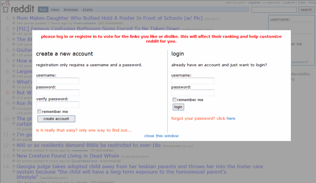
Some interface friction is inevitable. But it is possible to reduce interface friction to an absolute minimum. One of the best “frictionless” sign-up user interfaces I’ve ever seen is at reddit. If you click any element that requires login, you’re presented with an overlay <div> that allows you to sign up in a single step and also complete the action you originally clicked on, in one fell swoop:
Reduced interface friction goes a long way toward explaining the popularity of services like twitter and tumbr. What’s the minimum amount of effort a user can expend to produce something? The answer could be a key competitive advantage.
That single input box on the Google homepage starts to look more and more like an optimal user experience. It might be unrealistic to reduce your application’s UI to a single text box – but you should continually strive to reduce the friction of your user interface.