Presentation Zen
So I’ve been critical of other people’s presentations. Which naturally leads to a few questions:
- What makes a presentation good?
- Why don’t you try giving a presentation?
I realize that giving presentations isn’t easy. But I still feel that some speakers haven’t done the basic due diligence that’s necessary to give a good presentation. It’s either that or they just don’t care. So I’m giving them the benefit of the doubt here.
Well, one easy way to deliver a better presentation is to keep it simple. Garr Reynolds’ Gates, Jobs & the Zen Aesthetic illustrates this brilliantly:
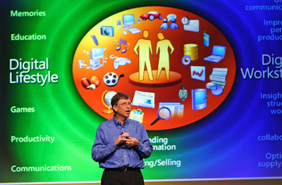
Not simple.
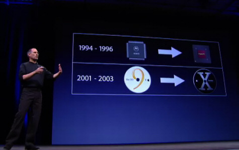
Simple.
Which presentation would you rather be attending?
As Garr noted, when it comes to presentations, less is more:
You do not need to (nor can you) pound every detail into the head of each member of your audience either visually or verbally. Instead, the combination of your words, along with the visual images you project, should motivate the viewer and arouse his imagination helping him to empathize with your idea and visualize your idea far beyond what is visible in the ephemeral PowerPoint slide before him.
Lawrence Lessig is a professor at Stanford Law, founder and chairman of Creative Commons and a board member of the EFF.
Among other things, he’s noted for exactly this kind of minimalist presentation style. Consider his most recent presentation, Is Google Book Search fair use?
Lessig doesn’t just ignore the classic “no more than five bullets per slide” rule in his presentation, he practically defenestrates it. He uses a single phrase or image per slide. Sometimes there’s only a single word on each slide!
It’s better to experience it than it is to read about it. Download the full torrent, or watch his presentation.
This style clearly works for Lessig, but can it work for other speakers? Dick Hardt gave a presentation on Identity 2.0 at OSCON 2005 in the Lessig style – he even attributes it to Lessig in his final slide. It’s a bit more frantic than Lessig’s presentation, but I found it every bit as effective.
I urge you to watch these presentations. Compare how you felt about them with the many other presentations you’ve seen. And if, like me, you were utterly transfixed by content presented this way, consider moving toward minimalism in your next presentation.


