ui
Trees, TreeViews, and UI
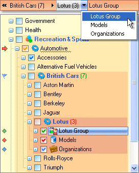
I somehow doubt this is what Joyce Kilmer was thinking of when he wrote the poem, Trees: I think that I shall never see A poem lovely as a tree. It’s unfortunate that the TreeView is one of the standard widgets in a usability designer’s toolkit, because trees