On Necessity
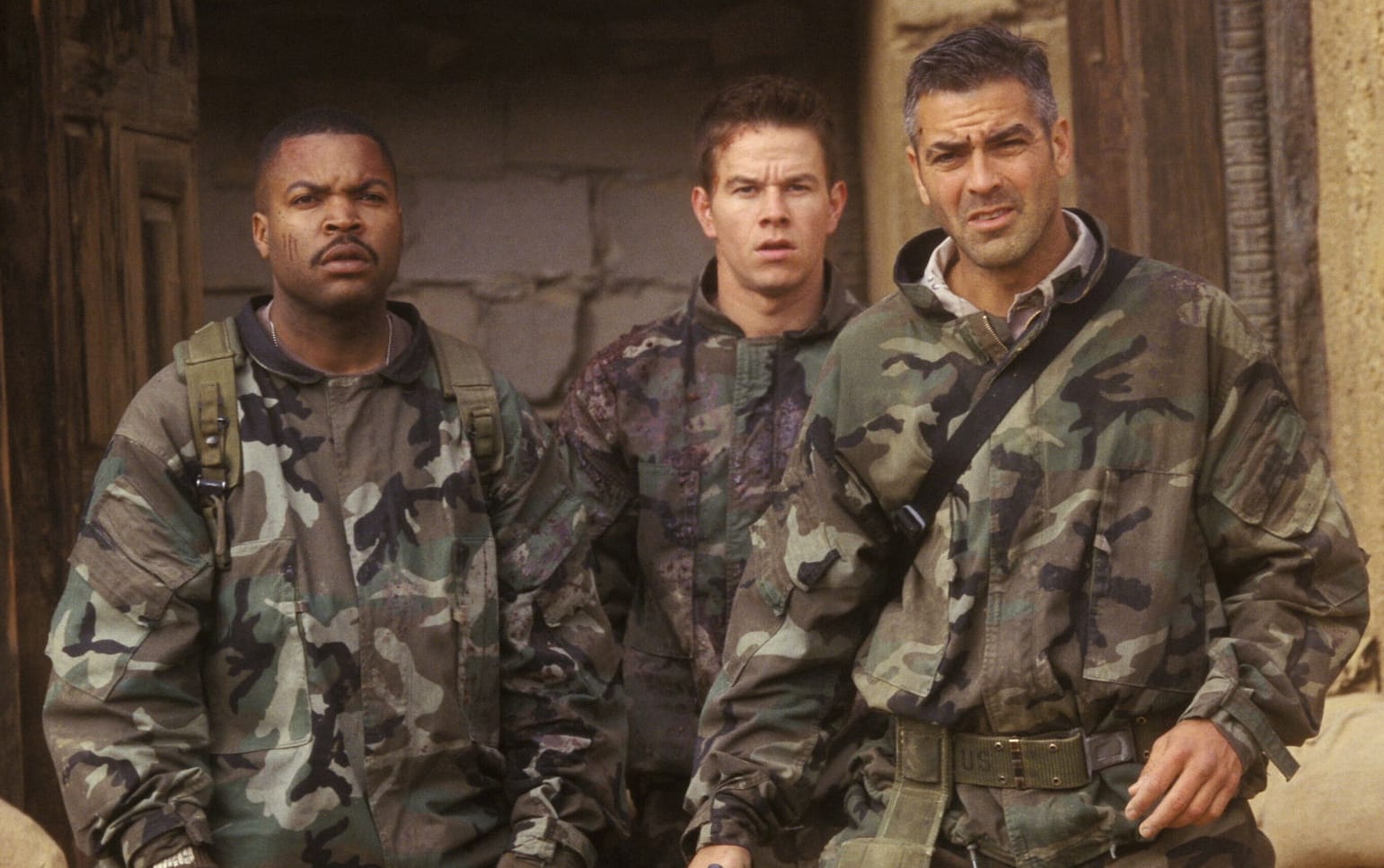
When working with users, I am frequently reminded of this conversation in David O. Russell’s movie Three Kings:
GATES
What is the most important thing in life?
TROY
What are you talking about?
GATES
What’s the most important thing?
TROY
Respect?
GATES
Too dependent on other people.
VIG
What, love?
GATES
That’s a little Disneyland, isn’t it?
DOC
God’s will?
GATES
Close.
TROY
What is it then?
GATES
Necessity.
TROY
As in..?
GATES
As in people do what is most necessary to them at any given moment. Right now what is most necessary to Saddam’s troops is to put down the uprising. We can do what we want, they won’t touch us.
TROY
All right. I’ll be wearing fashionable Kevlar.
This is a wartime version of what Steve Krug, in his book Don’t Make Me Think, calls satisficing:
When we’re designing pages, we tend to assume that users will scan the page, consider all of the available options, and choose the best one.
In reality, though, most of the time we don’t choose the best option – we choose the first reasonable option, a strategy known as satisficing. As soon as we find a link that seems like it might lead to what we’re looking for, there’s a very good chance that we’ll click it.
I’d observed this behavior for years, but its significance wasn’t really clear to me until I read Gary Klein’s book, Sources of Power: How People Make Decisions. Klein spent 15 years studying naturalistic decision making: how people like firefighters, pilots, chess masters, and nuclear power plant operators make high-stakes decisions in real settings with time pressure, vague goals, limited information, and changing conditions.
Klein’s team of observers went into their first study (of field commanders at fire scenes) with the generally accepted model of rational decision making: Faced with a problem, a person gathers information, identifies the possible solutions, and chooses the best one. They started with the hypothesis that because of the high stakes and extreme time pressure, fire captains would be able to compare only two options, an assumption they thought was conservative. As it turned out, the fire commanders didn’t compare any options. They took the first reasonable plan that came to mind and did a quick mental test for problems. If they didn’t find any, they had their plan of action.
Make sure you’re designing for what is necessary, rather than what is possible.
Designs that assume more investment on the part of the user are doomed, because they are designing for idealized behavior rather than actual behavior. Users really don’t care about your application – they have specific goals and will do only the absolute minimum necessary to achieve those goals.
For web sites, Steve lists a few reasons users may behave this way:
- We’re usually in a hurry
- There’s not much of a penalty for guessing wrong
- Weighing options may not improve our chances
- Guessing is more fun
For a more in-depth discussion, I highly recommend picking up a copy of Don’t Make Me Think.


