Let’s Build a Grid
Khoi Vinh, the design director for the New York Times, explains how essential grids are to web design in his SXSW presentation with Mark Boulton, Grids Are Good (Right?).
So much web design work relies on establishing a grid and the constraints on that grid: ad sizes, display size, browser display area minus chrome, and so forth. Grids are, quite literally, everywhere. But learning how to effectively utilize grids – without becoming a slave to them – can make the difference between a competent layout and a great layout.
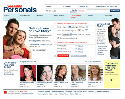
The case study in the presentation is Yahoo!, which offers “rudimentary but unimaginative use of grid.” The redesign, Yeeaahh!, offers a more flexible and interesting grid alignment that feels less like a <table> tag writ large.
 |  |
The point wasn’t to improve on Yahoo’s design. The idea was to use the redesign to illustrate the various methods and principles that experienced designers use in grid layouts. Can you see the grid at work on this redesigned page?
How about now?
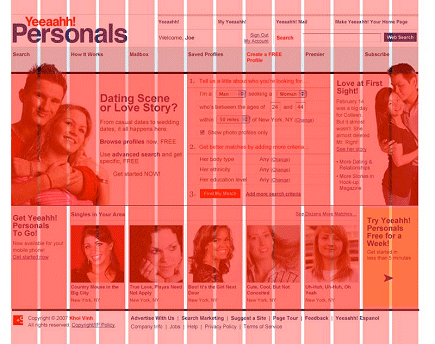
Learning to see the grids is the first step. The presentation slides are quite instructive; you can download the slides (8mb pdf) directly from Khoi’s site.
The grid pictured above is an advanced scenario, created by and for expert designers. But basic CSS grid layouts are a fairly well understood science by now. They offer a cookbook of layouts for neophyte designers to choose from.
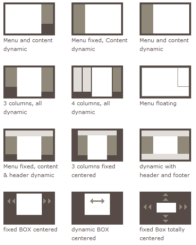
When you’re not sure where to begin with your UI design, start by building a grid. But grids don’t have to be a straitjacket. Approached with the proper mindset, they can be liberating. Embracing the constraints of a grid in your design – and knowing when to break those constraints – is a crucial skill for designers, both neophyte and expert.


