Keeping The Menu Simple
In-N-Out Burger is a fast food institution here in California. Part of their appeal, I think, is their radically simplified menu.
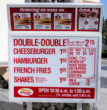
Instead of forcing customers to process a complex menu with a hundred choices, In-N-Out got real and pared it down to what really matters: a burger, fries, and a drink. It’s a limited experience, but it’s also a tightly focused one. The menu may be small, but you can still customize it – for advanced In-N-Out customers, there’s the secret menu.
Most software lacks the discipline to present the tightly controlled user experience of the In-N-Out menu. Instead, we befuddle users with the software equivalent of a fourteen-course restaurant menu. Software developers lapse into complexity by default, because it’s the path of least resistance.
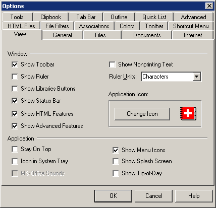
Why can’t we build software the In-N-Out way, and keep the menu simple? Stop trying to do everything. Don’t make users think. Focus on doing a few things exceptionally well, and leave the giant, confusing menu of options for your competitors.


