Incremental Feature Search in Applications
I’m a big fan of incremental search. But incremental search isn’t just for navigating large text documents. As applications get larger and more complicated, incremental search is also useful for navigating the sea of features that modern applications offer.
Office 2007’s design overhaul is arguably one of the most significant innovations in GUI applications since the invention of menus and toolbars:
Of course, as you know if you’ve read Part 1 of the story, many of today’s UI paradigms attributed to Apple were introduced well before the Lisa or the Macintosh. Regardless of who gets credit for them, they’re good paradigms. There’s nothing wrong with menus and toolbars-based UI for certain applications. Truth be told, these paradigms served Office well for a number of releases.
It’s not that menus and toolbars are bad or that the people who created them weren’t smart. The problem is that Office has outgrown them. There’s a point beyond which menus and toolbars cease to scale well. A flat menu with 8 well-organized commands on it works just great; a three-level hierarchical menu containing 35 loosely-related commands can be a bit of a disaster.
In short, we’re not trying to destroy anything. Our goal is to create a new standard user interface for full-featured productivity applications. The original team who built Word or Excel couldn’t have imagined how much their products would be able to do today. I want us to step back, to think through the question: “what kind of interface would they have built knowing how Word turned out?”
It’s absolutely true that menus and toolbars don’t scale. The Office 2007 ribbon takes cues from web design to make navigating the thousands of features in Word, Excel, and PowerPoint much easier. But the ribbon, although it’s a major improvement over menus and toolbars, isn’t perfect, either:
I was working with Excel all day yesterday, trying to find a command I know existed in Excel 2003 and can be found quite easily. I was clicking every tab and hovering over all the buttons. I must have gone through the Ribbon at least 5 times. In the end, the stupid command wasn’t even in the ribbon to begin with. You had to manually add it to the “Quick Access Toolbar.” If I had “Scout,” I could have saved at least the frustration of not being able to find a tool that I know is there, not to mention the time and effort wasted.
I know a star developer who is expert at Word, and the same exact thing happened to her. How do you find what isn’t in the ribbon? Well, you could use incremental search to find it. Microsoft has an experimental beta of an incremental ribbon search feature for Office 2007, codenamed “Scout:”

Unfortunately, it looks like internal politics at Microsoft may have killed the ribbon search add-in, which is a shame. A search feature doesn’t take anything away from the ribbon. They serve two different audiences, and complement each other perfectly. I’m with Long Zheng: the ribbon search feature should be shipped as a PowerToy.
The first time I saw an application use an incremental feature searching technique was back in 2004. The options dialog for Quest’s Toad database utility became so complex that it required a search function to find anything in it. At the time, I wasn’t too keen on the idea of an options dialog that complicated, but I have since bowed to its inevitability. Applications get more feature-rich over time, and navigation methods have to evolve to keep up.
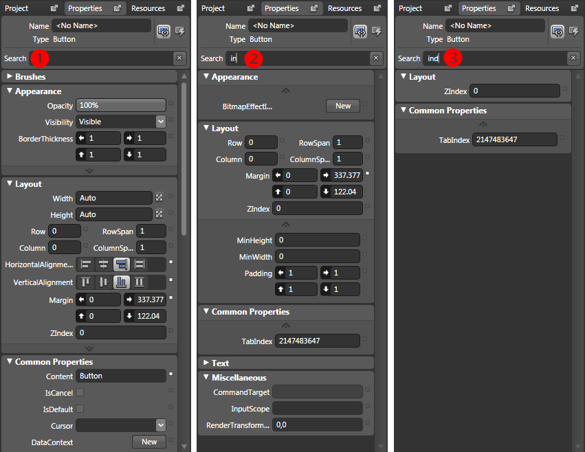
You probably already know that Vista’s revamped start menu takes advantage of incremental searching. But other Microsoft applications are starting to adopt this paradigm as well. Take Microsoft’s new Expression design tools, for example. In most development tools, you’re facing down enormous lists of properties all the time. How do you find the particular property you’re looking for? You guessed it: incremental search.

In the above screenshot, I’m filtering the properties for a Windows Presentation Foundation button by typing “ind” in the properties search field. Note how the interface dynamically filters, showing only button properties that match what I’ve typed as I type it. Isn’t that much faster than scrolling through a list?
If the evolution of the web has taught us anything, it’s that dominant navigation metaphor. Simple applications may be able to get away with menus and toolbars, or better yet, a ribbon. But as the application grows larger and more complex, it’s faster to incrementally search for the feature we need.


