If You Don’t Change the UI, Nobody Notices
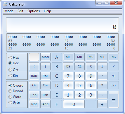
I saw a screenshot a few days ago that made me think Windows 7 Beta might actually be worth checking out.

That’s right, Microsoft finally improved the calculator app! We’ve been complaining for years that Microsoft ships new operating systems with the same boring old default applets the previous version had, which makes the entire operating system look bad:
I know it sounds trivial. But isn’t the fit and finish of little applets like these – Notepad, Calculator, Character Map, Paint, Disk Cleanup, Compressed Folders, and dozens of others – indicative of the care and design that goes into the entire operating system? If Microsoft can’t be bothered to bundle a version of Notepad that has basic amenities like a toolbar, what hope does the rest of the operating system have?
If you visually compare Calculator and Notepad in 2001-era Windows XP with their 2007 Windows Vista equivalents, you might conclude they’re identical. But, as Raymond Chen notes, this isn’t so:
I find it ironic when people complain that Calc and Notepad haven’t changed. In fact, both programs have changed. (Notepad gained some additional menu and status bar options. Calc got a severe workover.) I wouldn’t be surprised if these are the same people who complain, “Why does Microsoft spend all its effort on making Windows ‘look cool’? They should spend all their efforts on making technical improvements and just stop making visual improvements.”
And with Calc, that’s exactly what happened: Massive technical improvements. No visual improvement. And nobody noticed. In fact, the complaints just keep coming. “Look at Calc, same as it always was.”
The innards of Calc - the arithmetic engine - was completely thrown away and rewritten from scratch. The standard IEEE floating point library was replaced with an arbitrary-precision arithmetic library. This was done after people kept writing ha-ha articles about how Calc couldn’t do decimal arithmetic correctly, that for example computing 10.21 - 10.2 resulted in 0.0100000000000016. Today, Calc’s internal computations are done with infinite precision for basic operations (addition, subtraction, multiplication, division) and 32 digits of precision for advanced operations (square root, transcendental operators).
It’s arguably the perfect Raymond Chen post – technically dead on, while simultaneously proving that being technically dead on is utterly irrelevant. That’s Raymond Chen for you: he’s a riddle wrapped in a mystery inside an enigma, slathered in delicious secret sauce.
This is why the screenshot of the Windows 7 Calculator, although seemingly trivial, is so exciting to me. It’s evidence that Microsoft is going to pay attention to the visible parts of the operating system this time around. I’m a fan of Vista, despite all the nerd rage on the topic, but I’ll be the first to admit that Vista had all the polish of a particularly dull rock. Let’s just say the overall user experience was... uninspiring. This led many people to shrug, sigh “why bother?” and stick with crusty old XP.
This was unfortunate, because if you dug into Vista, you’d find quite a few substantive technical improvements over the now-ancient Windows XP. But many of those improvements were under the hood, and thus invisible to the typical user.

Remember, if the user can’t find it, the function’s not there. Don’t bother improving your product unless it results in visible changes the user can see, find, and hopefully appreciate.


