But It’s Just One More
The Windows Live Local mapping service is surprisingly difficult to use. It certainly looks simple enough:

Like everyone else, the first thing I do when I encounter a new mapping solution is try my current address. In this case it’s my work address. But when I press enter, I get this error:
No results were found. Try another search, or if entering an address, enter it in the Where box. Click help to learn more.
This is admittedly a sample size of one. But everyone I know makes this mistake when using Windows Live Local search for the first time. Yes, the two text boxes are labeled. Sort of. But users won’t read anything you put on the screen, even so-called professional computer users like ourselves. There’s simply one textbox too many on that form.
It may seem irrational to declare that two of anything is one too many, but consider these stopwatches:

Here’s a stopwatch with one button. So this button must start, stop, and reset the time. It’s a little overloaded, but like an Apple mouse, at least nobody gets confused. In theory.

Let’s add one more button. Maybe one button starts and stops, and the other resets? Or maybe one button starts and the other stops. But which one? It’ll take a bit of trial and error to get this to work.

Now we add another button. And an extra sweeping hand. I don’t even know where to begin. The complexity just went up exponentially.
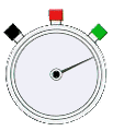
This stopwatch has three colored buttons. And no sweeping hand. The colors definitely help: red means stop, green means go. So I’m guessing black is reset.
The last stopwatch illustrates that it is possible to add interface elements without adding confusion. But you have to do it very carefully. If you have to add “just one more...” of any UI element, be sure that you’re not adding the one UI element that breaks the camel’s back.


