Basic Design Principles for Software Developers
In my previous post, I urged developers to learn a mainstream graphics editing program. This is purely a mechanical skill, so it seemed reasonable for developers to give it a shot. If we can absorb extremely complex development environments, compilers, and databases, why not a graphics editor? But as a few commenters pointed out, competence in a graphics editor isn’t enough; you also have to learn some basic design principles to use the tool effectively. Turn the tables for a moment: would it be reasonable to expect designers to learn our favorite development IDE, purely as a tool, without any guidance on how to write code, too?
Probably not. That’s why I’m so glad Graham Stewart reminded me to mention The Non-Designer’s Design Book.
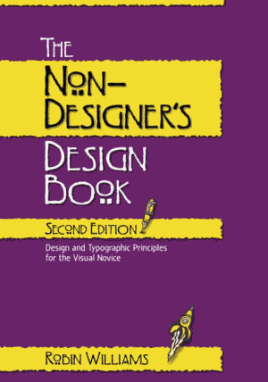
I bought my copy of this book way back in 1996, when I was a software developer with zero design skills, looking for a little guidance. I’m not a designer now by any means – but when you start at zero, there’s nowhere to go but up. I love the opening quote from the book, which touches on a theme I discussed recently that got a lot of press:
More matter is being printed and published today than ever before, and every publisher of an advertisement, pamphlet, or book expects his material to be read. Publishers, and even more so, readers want what is important to be clearly laid out. They will not read anything that is troublesome to read, but are pleased with what looks clear and well arranged, for it will make their task of understanding easier. For this reason, the important must stand out and the unimportant be subdued...
The technique of modern typography must also adapt itself to the speed of our times. Today, we cannot spend as much time on a letter heading or other piece of jobbing as was possible even in the nineties.
In the above quote by Jan Tschichold, he’s referring to the eighteen-nineties. The quote dates back to 1935, but it’s as true today as it ever was.
The book does look suspiciously amateurish, with its garish purple and yellow cover and odd font choices. Nonetheless, I found The Non-Designer’s Design Book to be a tremendously helpful introduction to practical, real world design principles for a neophyte. Paging through it today, it’s still as useful and interesting as ever. It outlines the first baby step towards a lifelong design education in clear, simple terms:
Many years ago I received a tree identification book for Christmas. I was at my parents’ home, and after all the gifts had been opened I decided to go out and identify the trees in the neighborhood. Before I went out, I read through part of the book. The first tree in the book was the Joshua tree because it only took two clues to identify it. Now the Joshua tree is a really weird-looking tree and I looked at that picture and said to myself, “Oh, we don’t have that kind of tree in Northern California. That is a weird-looking tree, and I’ve never seen one before.”
So I took my book and went outside. My parents lived in a cul-de-sac of six homes. Four of those homes had Joshua trees in the front yard. I had lived in that house for thirteen years, and I had never seen a Joshua tree. I took a walk around the block, and there must have been a sale at the nursery when everyone was landscaping their new homes – at least 80 percent of the homes had Joshua trees in the front yards. And I had never seen one before! Once I was conscious of the tree – once I could name it – I saw it everywhere.
You begin at the beginning: by learning to see the design all around you. All it takes to distinguish yourself is a little judicious application of the design guidelines in this book – guidelines so universal they apply to web sites as easily as they do to traditional client GUI applications. And once you do, you’ll begin to see how these rules apply everywhere.
I’m sure there are other good introductory design books out there. I can personally vouch that this one stands the test of time. The author produced a number of related books, but the reviews on those are mixed at best; most point back to this classic. And here’s one clever little feature of this book that I just noticed after all these years – instead of Lorem Ipsum dummy text, the author uses Anguish Languish, which is way more fun.


