Avoiding “Blank Page Syndrome”
One thing I dislike about classic WIMP GUI applications is the way they typically present you with a blank page at startup. Here’s what Word 2003 looks like just after I launch it:
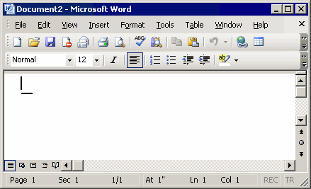
This leads to Blank Page Syndrome: when presented with infinite choice, it’s sometimes hard to get started. Which reminds me of what happens when I walk in to Blockbuster Video with no idea what movie I want to see. I end up aimlessly wandering the isles of Blockbuster, spending way more time than I need to browsing a cubic ton of movies I’m vaguely interested in. And I’ll probably end up renting Fried Green Tomatoes. Again.*
When I set up a new project in Basecamp, instead of a blank project screen, I see a sample of what the project will look like when it’s populated. While this approach may not be appropriate for every app, it should always be considered as an alternative to the blank page:
- It’s a powerful illustration of Show, Don’t Tell in action: the example shows me what the application actually does.
- The use of real data in the example helps me visualize my goal. This is what I’ll get if I use the application.
- The example is a highly contextual alternative to “help pages” or “the manual.” As if I’m gonna read those.
- It’s not a wizard. I am not constrained to a list of tedious questions with Next and Forward buttons; I can do whatever I want from here.
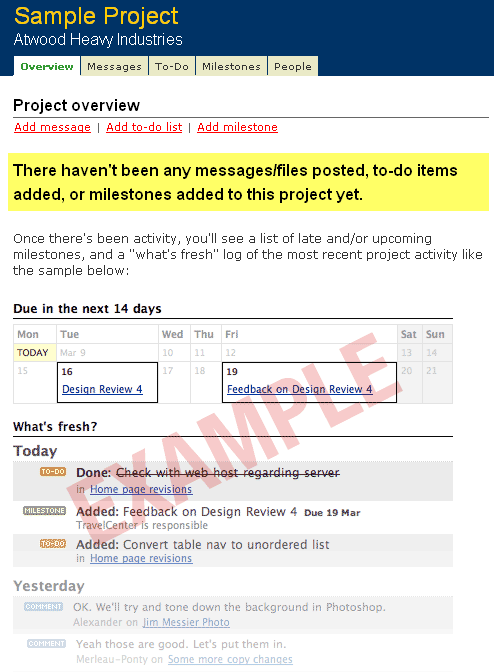
All this before you’ve even begun using the application. This is a fantastic alternative to the tabula rasa default.
However, there is one important caveat: be sure users can tell this isn’t real data! You laugh, but if the FUI isn’t clearly tagged with red EXAMPLE text, users will click on it. I learned this the hard way in a website usability review. There’s nothing more cringeworthy than watching users try to click on a screenshot. And I was trying to help them!
*Thank goodness for Netflix and its queue.


