A tale of two UIs
God bless whoever at Microsoft decided to build Calculator Plus, an unsupported free upgrade for calc.exe. On the other hand... who decided it was a good idea to skin the UI by default?

My eyes! The goggles, they do nothing! Now compare that “upgraded” UI to the windows default, which is thankfully still selectable via the View menu:
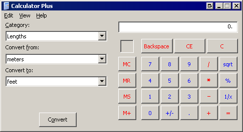
Perhaps boring, but far more usable. I know skinning is a matter of opinion to some degree, but – come on. At least have a professional graphic designer put together a skin if you’re going to traumatize the user with a non-standard UI. And even then, I doubt you should be doing it. You better have a damn good reason to deviate from the standard OS look and feel that users expect. For comparison, Windows Media Center does have a good reason to implement a radically different UI – it’s designed to be used from the couch with a remote.