Where the Heck is My Focus?
The web is quite mouse-centric. Ever tried navigating a typical website without your mouse? I’m not saying it can’t be done – if you’re sufficiently motivated, you can indeed navigate the web using nothing but your keyboard – but it’s painful.
There’s nothing wrong with the point-and-click navigation model of the mouse, although it can degenerate into mystery meat navigation if you’re not careful. I don’t expect web designers to create keyboard-centric websites; the mouse is a natural and intuitive enough way to navigate web sites. But so is the keyboard, in certain circumstances. What frustrates me is when web developers fail to pay attention to the most rudimentary of keyboard support in their designs.
Let’s pick on eBay. Here’s the eBay sign in form.
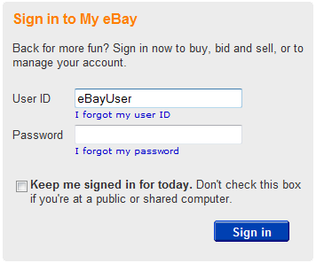
This form is a perfect example of keyboard navigation trumping mouse navigation. Done right, it reduces user interface friction to a minimum:
- Type your user name
- Press Tab to advance to the next field
- Type your password
- Press Enter
Of course, that assumes the user knows how to use the keyboard. In my experience, this is not a safe assumption. I’ve seen many users log in using the excruciatingly slow mouse way, and it’s not pretty. At the risk of creating a legion of back seat drivers, I suggest that when you see coworkers users using the mouse to log in, you should gently– gently – let them know that they might be able to save some time by sticking with the keyboard for these little online forms. I’m not saying you should go commando, but a tiny bit of keyboard expertise will serve you in good stead.
This is an incredibly simple little login form. And yet there are at least three ways web developers can screw this form up for keyboard use. That’s why I added the caveat done right, above. It almost never is, and keyboard users always seem to get the shaft. To make this HTML form work properly with keyboard input, the eBay developers have to:
- Set the focus to the first field so I can start typing in my user ID.
- Structure the HTML form fields so that when I press the Tab key, it advances through them in a logical order.
- Ensure that the HTML form submits when I press the Enter key.
You might expect the tab order on the eBay login form to proceed in the same order you read the form (in Western cultures, anyway):
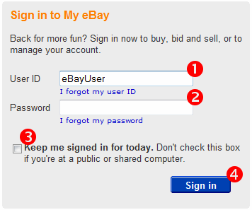
If so, you would be wrong. I guess two out of three ain’t bad. The tab order, for some unknown reason, goes directly from Password to the Sign In button, completely skipping over the “remember me” checkbox directly under it. This is a mild omission, to be sure. I’ve seen far worse, web forms with tab orders that resembled a Rubik’s cube. But tab order on a login form is so fundamental – when web developers screw up basic tab ordering on a form with four fields, that’s veering dangerously close to “I don’t give a damn about my craft” territory.
All the developers you know remember to test their web forms using the keyboard. Right?
But even if developers do remember to test for basic keyboard behavior, there’s a deeper problem here. Keyboard navigation relies heavily on the focus. In order to move from one area to the next, you have to be able to reliably know where you are. Unfortunately, web browsers make it needlessly difficult to tell where the focus is. Can you tell which field has the focus in Internet Explorer 7?
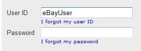
I think it’s fair to call that incredibly subtle. Let’s see how Firefox 2 does.
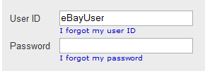
Wow. Good luck with that. Now how about the same form in Safari 3?
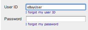
No wonder users rely on the mouse so much. Most browsers do an embarrassingly bad job of making the focus obvious, so users feel compelled to click on fields to orient themselves.
The focus behavior is just as bad when the focus moves to the sign in button. It’s technically an image masquerading as a button, but this is still a fairly common technique; it should be handled well. Is it?
 |  |  |
| Internet Explorer 7 | Firefox 2 | Safari 3 |
Of the three, only Safari really gets focus right in my estimation. Here’s hoping the next versions of Firefox and Internet Explorer copy this more obvious focus indicator. If users can orient themselves using a clear, unambiguous focus, they’re a lot more likely to warm up to a little time-saving keyboard navigation.


