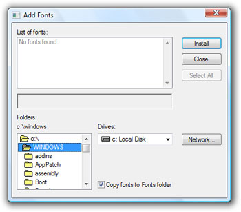
Whatever Happened to UI Consistency?
Although I rather like Windows Vista – I think the amount of Vista nerd rage out there is completely unwarranted – there are areas of Vista I find hugely disappointing. And for my money, nothing is more disappointing than the overall fit and finish of Vista, which is truly abysmal. It’s arguably the worst of any operating system Microsoft has ever released.
What do I mean by fit and finish? Well, take a look at Long Zheng’s Windows UI Taskforce examples. Vista is absolutely filled with bits of user interface that are inconsistent with the new Vista design.

You’re never more than two clicks away from some discontinuity or visual gaffe that zaps you right back into the seven year old Windows XP “experience.” Or worse. Consider Chris Pirillo’s observations on his Windows Vista beta 2 install:
Windows Calendar font and icon alignment are all wonky.
The Windows Media toolbar pop-up preview window is using Arial.
Safely Remove Hardware dialog is in Microsoft Sans Serif.
This goes on for about, oh, eleven pages. Granted, these comments refer to the beta, but the shipping version of Vista is every bit as schizophrenic in design. There’s very little consistency.
It also seems every individual team at Microsoft has a profoundly different idea of what the user interface should look like, as Paul Thurrott notes:
And what’s up with the glaringly inconsistent UI across Windows Vista and all of its applications? Some windows have menus, some don’t, and some have hidden menus. Some have these new black toolbars, some don’t. And so on. Why isn’t there a team of people just working on consistency issues?
Aren’t these trivial, nitpicky complaints? Yes. They are. And that’s entirely the point. This little stuff matters.
If all those individual teams at Microsoft can’t be bothered to follow the design conventions of their own operating system – how can they possibly be building applications that I would actually want to use? In software, attention to detail is everything; all these glaring little oversights in Vista’s user experience collectively add up to a huge vote of “no confidence” in the whole shebang. A mismatched font here, an ugly pixelated icon there, soon enough you feel that you’re living in a neighborhood with an awful lot of broken windows.
If Microsoft’s developers can’t muster the basic level of craftsmanship necessary to make Vista’s bundled applications consistently look and work the same as the rest of the operating system, how can users or third party developers be expected to give a damn about the user experience? Honestly, it’s embarrassing.
John Gruber has been critical of Apple’s minor UI inconsistencies in the past.
Consistency in and of itself has been a fundamental pillar of the Mac user experience from 1984 onward. But with Apple no longer leading the way, it’s fading. “At least it’s still more consistent than Windows” is not high praise.
That comment was made well before Vista was released. Nobody’s perfect, but from what I’ve seen of OS X and Vista, I’d say Apple cares a lot more about consistency of user interface today. Microsoft has all but abdicated their responsibilities with Vista.
But the saddest part of this whole situation is that it doesn’t have to be this way. Every major operating system is released alongside a set of design guidelines, guidebooks for developing applications that are consistent with the conventions and standard applications provided by the OS.
- Windows XP Design Guidelines
- Apple Human Interface Guidelines
- Vista Design Guidelines (pdf)
- GNOME Human Interface Guidelines
As a young developer, I remember eagerly paging through the early design guidelines for Windows 95 and the Mac OS. You can always do worse than following the well-worn paths the OS designers have conveniently laid out in front of you. Much, much, worse. And many have.
Of course, all design guidelines begin at home. These guides are only as good as the underlying operating systems they’re based on, which are de facto reference implementations. It’s hard to take Vista’s design guidelines seriously, since Microsoft’s own development teams clearly didn’t.
If you’re a software developer, please don’t make this mistake. Understand the design guidelines for your platform – and for God’s sake, follow them!
For a great platform agnostic primer on the importance of UI consistency and design guidelines, look no further than GUI Bloopers 2.0.

The original version of GUI Bloopers has been on my recommended reading list for years, and this greatly updated version was long overdue. There’s a sample chapter (pdf) on the official book website if you’d like to get a sense of what the book is about. Jeff Johnson, the author, also provides an excellent companion reading list on his website, which also includes the Web Blooper of the Month archive.
Like everyone else, I’d prefer to use only the most beautifully designed applications. If you can’t be beautiful, at least be consistent. Start with the basic level of consistency afforded by following the design guidelines of your chosen platform, and you might just avoid the “homely” and “ugly” end of the spectrum.


