Universally Annoying Remotes
What is it with consumer electronics and the uncontrolled proliferation of remotes? We recently upgraded to an EDTV plasma, which I am very happy with, but the nature of the inputs forced another remote on to the coffee table. That brings us to a total of four: HTPC, Tivo, Receiver, and TV. The remote situation is now officially out of control. So I started looking for a solution.
I’ve gone the universal remote route before. In 1998, I did some research and bought a Marantz RC-2000. Having 3 or 4 remotes is annoying, but teaching a learning remote to control multiple devices in a seamless way is... also annoying. I found myself reaching for the real remotes too often. I gave it a few months, but I was ultimately unhappy with the results and ended up selling the Marantz on eBay. I hate having a remote collection on the coffee table, but a single remote nobody can figure out is hardly any better.
I figured I’d give universal remotes another shot. It has been more than five years; hopefully the technology has improved. I’m very fond of the Tivo remote, for the reasons outlined in this New York Times article, so I was very encouraged when I found this CNET review of the Harmony H659. It’s almost a clone of the Tivo remote, but with a universal LCD at the top, and cool USB PC programming features. What I liked most about it, though, was the decision Harmony made to focus on activities rather than devices:
Activities are logical, intuitive and efficient. Imagine the typical steps needed to watch a DVD movie: power everything on, change the television input and screen mode, set audio input and decoding format, dim the lights, then finally start the movie playing. On a typical remote you’d need to jump around to 3 or 4 devices before the task is completed. But with an activity-based remote, you’d simply press the "Watch a Movie" button, sit back, and relax.
This is a much more usable approach to designing a universal remote – which is probably why the company was purchased by Logitech. There are now no less than five different Harmony remote models:
 |  |  |
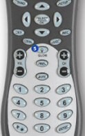
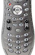
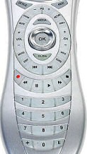
From left to right, that’s the original H659, the moderately updated H680 (identical to the H676), and the redesigned H688. Buttons may be prettier when they’re grouped together in one smooth plastic swoosh, but it’s nearly impossible to figure out what button you need to press. Predictably, people hated the new button layout:
More significant, though, is that the bold keypad layout is, in some ways, a step back from the Harmony 659. The centralized five-way navigation pad, oval-shaped control ring, and video transport buttons correctly put the bulk of the DVD, DVR, and digital set-top box commands (menu, info, guide, page up/down, and track up/down) easily within thumb’s reach. Unfortunately, the mushy rubber buttons and contiguous key layout make it very hard to distinguish keys by feel, especially compared to the well-spaced, harder chiclet-style keys of the 659.
The user reviews are full of the same comments. A simple round of usability testing would have surely isolated this problem. Or they could have saved some money and just stuck with copying what works – the Tivo remote.
The good news is, the remotes are all identical internally and work the same. You don’t have to buy the poorly designed H688; the H680 and H676 offer the same features and a much better button layout. They’re also cheaper! I browsed some of the threads on the Remote Central Harmony forums and everyone is having generally positive experiences with the harmony series. It looks promising. I hope it works out this time – I’d much rather have one remote than four.


