Trees, TreeViews, and UI

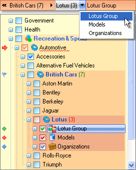
I somehow doubt this is what Joyce Kilmer was thinking of when he wrote the poem, Trees:
I think that I shall never see
A poem lovely as a tree.
It’s unfortunate that the TreeView is one of the standard widgets in a usability designer’s toolkit, because trees aren’t usable. They’re a pain in the ass. They may be necessary for developers who are forced to work in the strict, rigid world of software development, but they are unnatural, restrictive, and just plain unnecessary for average users. Where do I begin?
- Trees force a rigid hierarchy
There’s an episode of the old television show Gomer Pyle, USMC where the quartermaster gets sick and Gomer is put in charge of the Army PX. Gomer proceeded to reorganize every item in the PX into three categories: animal, vegetable, or mineral. Hilarity ensued. Lesson: rigid categorization may seem like a good idea, but it doesn’t work very well in practice. - Trees are difficult to browse
Good luck finding anything in a tree; it’s a navigational nightmare. Expanding and collapsing folders constantly causes items of interest to fall out of view, and loss of context in the hierarchy. Expand enough, and you’ll end up scrolling not only up and down but also left to right. Interactively searching trees is awkward, if even supported. - Categorization is an expert activity
If left to their own devices, your users aren’t likely to do any better than Gomer Pyle – unless they happen to be experts in library science and information mapping. Categorization is extraordinarily difficult to do correctly unless you’re an expert in the field. And even then, there is disagreement. - Trees imply a parent/child relationship
On top of all the rigid hierarchy baggage, there’s an additional connotation of ownership – both physical and logical – that goes along with putting items a tree. Are you sure that item has one clearly defined owner and one clearly defined parent?
Any time you’re tempted to add a TreeView to your application, consider carefully. Whenever I’ve encountered TreeViews, I’ve found that a flatter, less rigid representation of the data is almost always possible – and much easier for users to understand and manipulate. Don’t blindly fall back on a full-blown tree without weighing the alternatives.
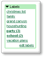
It’s true that TreeViews are appropriate for a few specialized situations. A HR diagram of managers and employees, for example. In my experience, however, trees get horribly abused. The canonical example of unnecessary tree use is in email clients. Google has an excellent solution in Google Mail’s labels:
The old way
You create an elaborate filing system of folders and subfolders, then decide where to file a single message.
The Gmail way
Instead of folders, Gmail uses labels to give you the functionality of folders, but with more flexibility. In Gmail, a single conversation can have several labels, so you’re not forced to choose one particular folder for each message you receive. That way, if a conversation covers more than one topic, you can retrieve it with any of the labels that you’ve applied to it. And, of course, you can always search for it.

I’ve aggressively adopted the label approach, because it’s so much more reflective of the fluid way things are organized in the real world. Programmers may love rigidity – to each item its appropriate folder and meticulously named class hierarchy – but users prefer simple, flat lists.


